Floating Actions
Floating actions component creates a floating button at the bottom of the screen.
You can move the floating button from left end to right end.
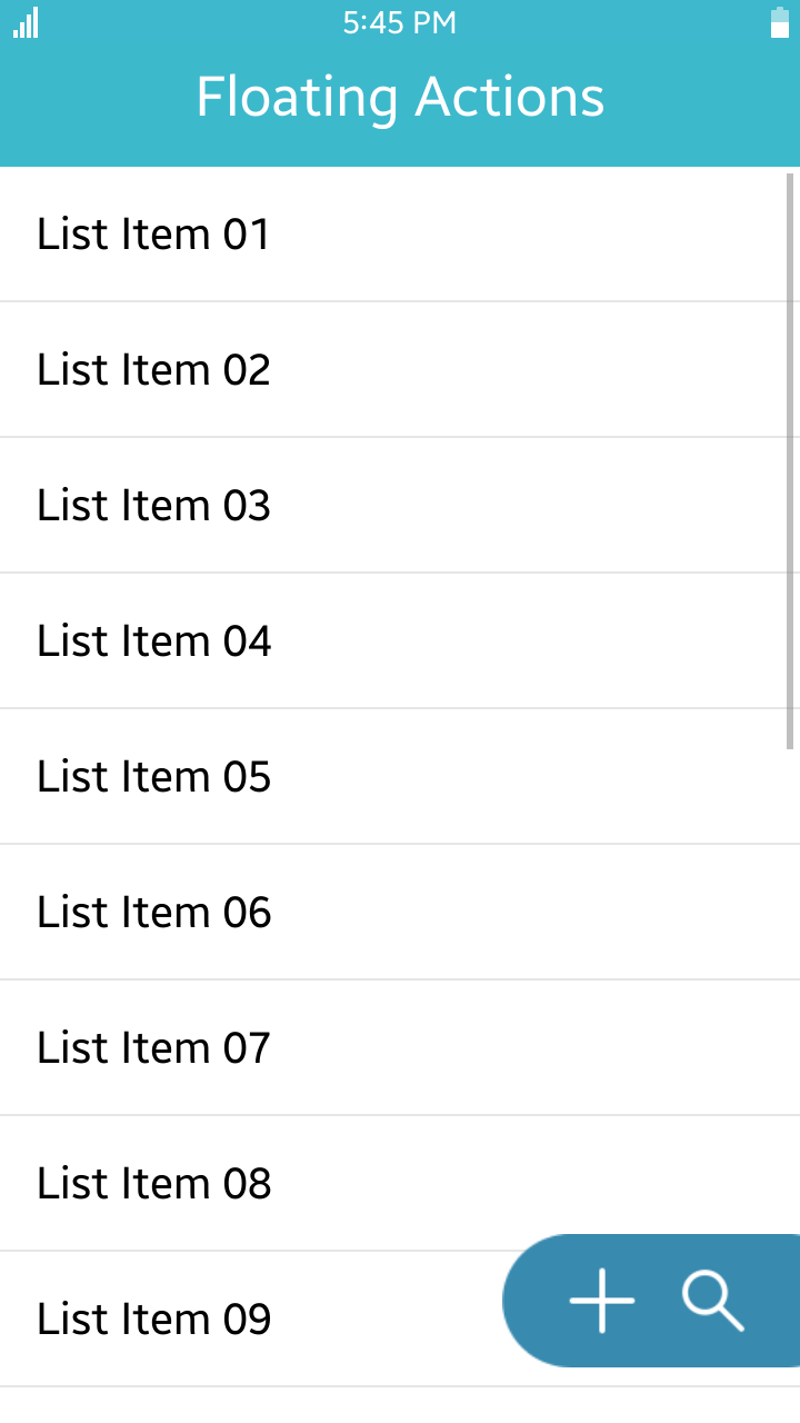
Table of Contents
Default selector
By default, all elements with the class="ui-floatingactions" or data-role="floatingactions" attribute are displayed as floating actions components.
Manual Constructor
To manually create a floating actions component, use the component constructor from the tau namespace:
The constructor requires an HTMLElement parameter to create the component, and you can get it with the document.getElementById() method. The constructor can also take a second parameter, which is an object defining the configuration options for the component.
HTML code:
<div class="ui-floatingactions" id="floating">
   <button class="ui-floatingactions-item" data-icon="floating-add"/>
   <button class="ui-floatingactions-item" data-icon="floating-search"/>
</div>
JS code:
var elFloatingActions = document.getElementById("floating"),
    floatingActions = tau.widget.FloatingActions(elFloatingActions);
Options
| Option | Input type | Default value | Description |
|---|---|---|---|
| data-from-rgba | string | "rgba(66, 162, 207, 1)" | color when the floating button is positioned at the left end |
| data-to-rgba | string | "rgba(54, 132, 168, 1)" | color when the floating button is positioned at the right end |
| data-opacity | number | 0.9 | opacity when the floating button is clicked |
| data-duration | number | 300 | animation duration for color and opacity (unit of time : millisecond) |