Popup
The popup component shows in the middle of the screen a list of items in a pop-up window. It automatically optimizes the pop-up window size within the screen. The following table describes the supported popup classes.
| Class | Description |
|---|---|
ui-popup |
Defines the element as a popup component. |
ui-popup-toast |
Defines the element as a toast popup (small popup). |
Table of Contents
HTML Examples
The pop-up window can contain a header, content, and footer area like the page element.
To open a pop-up window from a link, use the data-rel attribute in HTML markup as in the following code:
<a href="#popup" class="ui-btn" data-rel="popup">Open popup when clicking this element.</a>
And also, popup is opened by link with ID as mentioned. So the id in the link and the the id the of popup page listed below should have the same id to be opened.
The following table shows examples of various types of popups. If you want to implement the examples with above 'opening' code, be sure to meet the same id.
| Type | Code example |
|---|---|
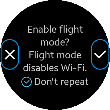
| Basic popup with header, content, and footer | <div id="popup" class="ui-popup">
<div class="ui-popup-header">Power saving mode</div>
<div class="ui-popup-content">
Turning on Power
saving mode will
limit the maximum
power
</div>
<div class="ui-popup-footer">
<button id="cancel" class="ui-btn">Cancel</button>
</div>
</div>
|
| Popup with 2 buttons in the footer | <div id="2btnPopup" class="ui-popup">
<div class="ui-popup-header">Delete</div>
<div class="ui-popup-content">
Delete the image?
</div>
<div class="ui-popup-footer ui-grid-col-2">
<button id="2btnPopup-cancel" class="ui-btn">Cancel</button>
<button id="2btnPopup-ok" class="ui-btn">OK</button>
</div>
</div> |
| Popup with checkbox and radio button lists | <div id="listBoxPopup" class="ui-popup">
<div class="ui-popup-header">When?</div>
<div class="ui-popup-content" style="height:243px; overflow-y:scroll">
<ul class="ui-listview">
<li>
<label for="check-1" class="ui-popup-checkbox-label">Yesterday</label>
<input type="checkbox" name="checkset" id="check-1"/>
</li>
<li>
<label for="check-2" class="ui-popup-checkbox-label">Today</label>
<input type="checkbox" name="checkset" id="check-2"/>
</li>
<li>
<label for="check-3" class="ui-popup-checkbox-label">Tomorrow</label>
<input type="checkbox" name="checkset" id="check-3"/>
</li>
</ul>
<ul class="ui-listview">
<li>
<label for="radio-1" class="ui-popup-radio-label">Mandatory</label>
<input type="radio" name="radioset" id="radio-1"/>
</li>
<li>
<label for="radio-2" class="ui-popup-radio-label">Optional</label>
<input type="radio" name="radioset" id="radio-2"/>
</li>
</ul>
</div>
<div class="ui-popup-footer">
<button id="listBoxPopup-close" class="ui-btn">Close</button>
</div>
</div> |
| Popup with no header and footer | <div id="listNoTitleNoBtnPopup" class="ui-popup">
<div class="ui-popup-content" style="height:294px; overflow-y:scroll">
<ul class="ui-listview">
<li><a href="">Ringtones 1</a></li>
<li><a href="">Ringtones 2</a></li>
<li><a href="">Ringtones 3</a></li>
</ul>
</div>
</div> |
| Toast popup | <div id="PopupToast" class="ui-popup ui-popup-toast"> <div class="ui-popup-content">Saving contacts to the SIM card</div> </div> |
Popup Methods
To open or close the popup component programmatically, use the methods listed in the following table.
| Method | Description |
|---|---|
| tau.openPopup(to) | Opens a popup by calling the openPopup() method. The to argument is a pop-up container object or string. |
| tau.closePopup() | Closes a popup by calling the closePopup() method. |
To find the currently active popup, use the ui-popup-active class.
To bind the popup to a button, use the following code:
HTML code:
<div id="1btnPopup" class="ui-popup">
   <div class="ui-popup-header">Power saving mode</div>
   <div class="ui-popup-content"></div>
   <div class="ui-popup-footer">
      <button id="1btnPopup-cancel" class="ui-btn">Cancel</button>
   </div>
</div>
JS code:
   /* Popup opens with button click */
   button.addEventListener("click", function(ev)
   {
      tau.openPopup("#1btnPopup");
   });

   /* Popup closes with Cancel button click */
   document.getElementById('1btnPopup-cancel').addEventListener('click', function(ev)
   {
      tau.closePopup();
   });
Popup Events
The following table lists the events related to pop-ups.
| Event | Description |
|---|---|
| popupbeforecreate | Triggered when the pop-up is initialized, before most plugin auto-initialization occurs. |
| popupcreate | Triggered when the pop-up has been created in the DOM (for example, through Ajax) but before all UI Components have had an opportunity to enhance the contained markup. |
| popupbeforehide | Triggered on the pop-up we are transitioning away from, before the actual transition animation is kicked off. |
| popuphide | Triggered on the pop-up we are transitioning away from, after the transition animation has completed. |
| popupbeforeshow | Triggered on the pop-up we are transitioning to, before the actual transition animation is kicked off. |
| popupshow | Triggered on the pop-up we are transitioning to, after the transition animation has completed. |
To use popup events, use the following code:
HTML code:
<div id="popup" class="ui-popup">
   <div class="ui-popup-header"></div>
   <div class="ui-popup-content"></div>
</div>
JS code:
   /* Use popup events */
   var popup = document.getElementById("popup");
   popup.addEventListener("popupbeforecreate", function(ev)
   {
      /* Implement code for popupbeforecreate event */
   });
Because popup works in asynchronos way due to animation, the features of popup need to work under event like below code:
If popup is opened or closed by only openPopup() or closePopup() method,
it might occur exceptional errors or bugs.
So it is highly recommended to handle the feature by using event.
HTML code:
<!--Popup HTML code-->
<div id="popup" class="ui-popup">
   <div class="ui-popup-content"></div>
   <div class="ui-popup-footer">
      <div class="ui-btn" id="cancel-btn"></div>
   </div>
</div>
JS code:
   /* Use popup events */
   var popup = document.getElementById("popup"),
       cancel = document.getElementById("cancel-btn");

   openButton.addEventListener("click", function()
   {
      tau.openPopup("#popup");
   });
   popup.addEventListener("popupshow", function()
   {
      console.log("Implement code after popup show completely");
   });

   cancel.addEventListener("click", function()
   {
      tau.closePopup();
      console.log(window.getComputedStyle(popup).display); /* Block - not closed yet */
   });
   popup.addEventListener("popuphide", function()
   {
      console.log(window.getComputedStyle(popup).display); /* None - closed completely */
   });
Popup Transitions
Tizen Wearable Web UI framework does not apply transitions by default. To set a custom transition effect for a specific popup component, add the data-transition attribute to a link:
<a href="index.html" data-rel="popup" data-transition="slideup">I'll slide up</a>
To set a default custom transition effect for all pop-up windows, use the popupTransition property:
/* JavaScript code */
tau.defaults.popupTransition = "slideup";
The following table lists the popup transition properties.
| Property | Value | Description |
|---|---|---|
| popupTransition | none | Default value, no transition. |
| slideup | Makes the content of the pop-up slide up. |