This widget aims to position objects in a grid layout while actually creating and rendering only the visible ones, using the same idea as the genlist: the user defines a class for each item, specifying functions that will be called at object creation, deletion, etc. When those items are selected by the user, a callback function is issued. Users may interact with a gengrid via the mouse (by clicking on items to select them and clicking on the grid's viewport and swiping to pan the whole view) or via the keyboard, navigating through item with the arrow keys.
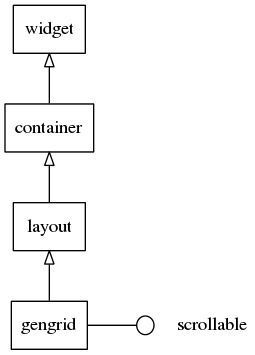
This widget inherits from the Layout one, so that all the functions acting on it also work for gengrid objects.
This widget implements the elm-scrollable-interface interface, so that all (non-deprecated) functions for the base Scroller widget also work for gengrids.
Some calls on the gengrid's API are marked as deprecated, as they just wrap the scrollable widgets counterpart functions. Use the ones we point you to, for each case of deprecation here, instead -- eventually the deprecated ones will be discarded (next major release).
Gengrid layouts
Gengrid may layout its items in one of two possible layouts:
- horizontal or
- vertical.
When in "horizontal mode", items will be placed in columns, from top to bottom and, when the space for a column is filled, another one is started on the right, thus expanding the grid horizontally, making for horizontal scrolling. When in "vertical mode" , though, items will be placed in rows, from left to right and, when the space for a row is filled, another one is started below, thus expanding the grid vertically (and making for vertical scrolling).
Gengrid items
An item in a gengrid can have 0 or more texts (they can be regular text or textblock Evas objects - that's up to the style to determine), 0 or more contents (which are simply objects swallowed into the gengrid item's theming Edje object) and 0 or more boolean states, which have the behavior left to the user to define. The Edje part names for each of these properties will be looked up, in the theme file for the gengrid, under the Edje (string) data items named "texts", "contents" and "states", respectively. For each of those properties, if more than one part is provided, they must have names listed separated by spaces in the data fields. For the default gengrid item theme, we have one text part ("elm.text"), two content parts ("elm.swallow.icon" and "elm.swallow.end") and no state parts.
A gengrid item may be at one of several styles. Elementary provides one by default - "default", but this can be extended by system or application custom themes/overlays/extensions (see themes for more details).
Gengrid item classes
In order to have the ability to add and delete items on the fly, gengrid implements a class (callback) system where the application provides a structure with information about that type of item (gengrid may contain multiple different items with different classes, states and styles). Gengrid will call the functions in this struct (methods) when an item is "realized" (i.e., created dynamically, while the user is scrolling the grid). All objects will simply be deleted when no longer needed with evas_object_del(). The #Elm_Gengrid_Item_Class structure contains the following members:
item_style- This is a constant string and simply defines the name of the item style. It must be specified and the default should be"default".func.text_get- This function is called when an item object is actually created. Thedataparameter will point to the same data passed to elm_gengrid_item_append() and related item creation functions. Theobjparameter is the gengrid object itself, while thepartone is the name string of one of the existing text parts in the Edje group implementing the item's theme. This function must return a strdup'()ed string, as the caller will free() it when done. See #Elm_Gengrid_Item_Text_Get_Cb.func.content_get- This function is called when an item object is actually created. Thedataparameter will point to the same data passed to elm_gengrid_item_append() and related item creation functions. Theobjparameter is the gengrid object itself, while thepartone is the name string of one of the existing (content) swallow parts in the Edje group implementing the item's theme. It must returnNULL, when no content is desired, or a valid object handle, otherwise. The object will be deleted by the gengrid on its deletion or when the item is "unrealized". See #Elm_Gengrid_Item_Content_Get_Cb.func.state_get- This function is called when an item object is actually created. Thedataparameter will point to the same data passed to elm_gengrid_item_append() and related item creation functions. Theobjparameter is the gengrid object itself, while thepartone is the name string of one of the state parts in the Edje group implementing the item's theme. ReturnEINA_FALSEfor false/off orEINA_TRUEfor true/on. Gengrids will emit a signal to its theming Edje object with"elm,state,xxx,active"and"elm"as "emission" and "source" arguments, respectively, when the state is true (the default is false), wherexxxis the name of the (state) part. See #Elm_Gengrid_Item_State_Get_Cb.func.del- This is called when elm_object_item_del() is called on an item or elm_gengrid_clear() is called on the gengrid. This is intended for use when gengrid items are deleted, so any data attached to the item (e.g. its data parameter on creation) can be deleted. See #Elm_Gengrid_Item_Del_Cb.
Usage hints
If the user wants to have multiple items selected at the same time, elm_gengrid_multi_select_set() will permit it. If the gengrid is single-selection only (the default), then elm_gengrid_select_item_get() will return the selected item or NULL, if none is selected. If the gengrid is under multi-selection, then elm_gengrid_selected_items_get() will return a list (that is only valid as long as no items are modified (added, deleted, selected or unselected) of child items on a gengrid.
If an item changes (internal (boolean) state, text or content changes), then use elm_gengrid_item_update() to have gengrid update the item with the new state. A gengrid will re-"realize" the item, thus calling the functions in the #Elm_Gengrid_Item_Class set for that item.
To programmatically (un)select an item, use elm_gengrid_item_selected_set(). To get its selected state use elm_gengrid_item_selected_get(). To make an item disabled (unable to be selected and appear differently) use elm_object_item_disabled_set() to set this and elm_object_item_disabled_get() to get the disabled state.
Grid cells will only have their selection smart callbacks called when firstly getting selected. Any further clicks will do nothing, unless you enable the "always select mode", with elm_gengrid_select_mode_set() as ELM_OBJECT_SELECT_MODE_ALWAYS, thus making every click to issue selection callbacks. elm_gengrid_select_mode_set() as ELM_OBJECT_SELECT_MODE_NONE will turn off the ability to select items entirely in the widget and they will neither appear selected nor call the selection smart callbacks.
Remember that you can create new styles and add your own theme augmentation per application with elm_theme_extension_add(). If you absolutely must have a specific style that overrides any theme the user or system sets up you can use elm_theme_overlay_add() to add such a file.
Gengrid smart events
This widget emits the following signals, besides the ones sent from Layout:
"activated"- The user has double-clicked or pressed (enter|return|spacebar) on an item. Theevent_infoparameter is the gengrid item that was activated."pressed"- The user pressed the an item. Theevent_infoparameter is the item that was pressed."released"- The user released the an item. Theevent_infoparameter is the item that was released."clicked,double"- The user has double-clicked an item. Theevent_infoparameter is the gengrid item that was double-clicked."clicked,right"- The user has right-clicked an item. Theevent_infoparameter is the item that was right-clicked. (since 1.13)"longpressed"- This is called when the item is pressed for a certain amount of time. By default it's 1 second."selected"- The user has made an item selected. Theevent_infoparameter is the gengrid item that was selected."unselected"- The user has made an item unselected. Theevent_infoparameter is the gengrid item that was unselected."realized"- This is called when the item in the gengrid has its implementing Evas object instantiated, de facto.event_infois the gengrid item that was created."unrealized"- This is called when the implementing Evas object for this item is deleted.event_infois the gengrid item that was deleted."changed"- Called when an item is added, removed, resized or moved and when the gengrid is resized or gets "horizontal" property changes."scroll,anim,start"- This is called when scrolling animation has started."scroll,anim,stop"- This is called when scrolling animation has stopped."drag,start,up"- Called when the item in the gengrid has been dragged (not scrolled) up."drag,start,down"- Called when the item in the gengrid has been dragged (not scrolled) down."drag,start,left"- Called when the item in the gengrid has been dragged (not scrolled) left."drag,start,right"- Called when the item in the gengrid has been dragged (not scrolled) right."drag,stop"- Called when the item in the gengrid has stopped being dragged."drag"- Called when the item in the gengrid is being dragged."scroll"- called when the content has been scrolled (moved)."scroll,drag,start"- called when dragging the content has started."scroll,drag,stop"- called when dragging the content has stopped."scroll,page,changed"- called when the visible page has changed."edge,top"- This is called when the gengrid is scrolled until the top edge."edge,bottom"- This is called when the gengrid is scrolled until the bottom edge."edge,left"- This is called when the gengrid is scrolled until the left edge."edge,right"- This is called when the gengrid is scrolled until the right edge."moved"- This is called when a gengrid item is moved by a user interaction in a reorder mode. Theevent_infoparameter is the item that was moved."index,update"- This is called when a gengrid item index is changed. Note that this callback is called while each item is being realized."highlighted"- an item in the list is highlighted. This is called when the user presses an item or keyboard selection is done so the item is physically highlighted. Theevent_infoparameter is the item that was highlighted."unhighlighted"- an item in the list is unhighlighted. This is called when the user releases an item or keyboard selection is moved so the item is physically unhighlighted. Theevent_infoparameter is the item that was unhighlighted."language,changed"- This is called when the program's language is changed. Call the elm_gengrid_realized_items_update() if items text should be translated."focused"- When the gengrid has received focus. (since 1.8)"unfocused"- When the gengrid has lost focus. (since 1.8)"item,focused"- When the gengrid item has received focus. (since 1.10)"item,unfocused"- When the gengrid item has lost focus. (since 1.10)"item,reorder,anim,start"- This is called when a gengrid item movement has just started by keys in reorder mode. Theevent_infoparameter is the item that is going to move. (since 1.10)"item,reorder,anim,stop"- This is called when a gengrid item movement just stopped in reorder mode. Theevent_infoparameter is the item that was moved. (since 1.10)
Supported elm_object common APIs
Supported elm_object_item common APIs
- elm_object_item_part_content_get
- elm_object_item_part_text_get
- elm_object_item_disabled_set
- elm_object_item_disabled_get
- elm_object_item_del
- elm_object_item_signal_emit
Unsupported elm_object_item common APIs due to the gengrid concept. Gengrid fills content/text according to the appropriate callback functions. Please use elm_gengrid_item_update() instead.
- elm_object_item_part_content_set()
- elm_object_item_part_content_unset()
- elm_object_item_part_text_set()
List of gengrid examples:
Enumeration Type Documentation
Function Documentation
| Evas_Object* elm_gengrid_add | ( | Evas_Object * | parent | ) |
Add a new gengrid widget to the given parent Elementary (container) object
- Parameters:
-
parent The parent object
- Returns:
- a new gengrid widget handle or
NULL, on errors
This function inserts a new gengrid widget on the canvas.
- See also:
- elm_gengrid_item_size_set()
- elm_gengrid_group_item_size_set()
- elm_gengrid_horizontal_set()
- elm_gengrid_item_append()
- elm_object_item_del()
- elm_gengrid_clear()
- Since :
- 2.3
- Examples:
- entry_example.c, gengrid_example.c, and index_example_02.c.
| EINA_DEPRECATED void elm_gengrid_bounce_get | ( | const Evas_Object * | obj, |
| Eina_Bool * | h_bounce, | ||
| Eina_Bool * | v_bounce | ||
| ) |
Get whether bouncing effects are enabled or disabled, for a given gengrid widget, on each axis
- Parameters:
-
obj The gengrid object h_bounce Pointer to a variable where to store the horizontal bouncing flag. v_bounce Pointer to a variable where to store the vertical bouncing flag.
- Deprecated:
- Use elm_scroller_bounce_get() instead.
- See also:
- elm_scroller_bounce_get()
| EINA_DEPRECATED void elm_gengrid_bounce_set | ( | Evas_Object * | obj, |
| Eina_Bool | h_bounce, | ||
| Eina_Bool | v_bounce | ||
| ) |
Enable or disable bouncing effect for a given gengrid widget
- Parameters:
-
obj The gengrid object h_bounce EINA_TRUE, to enable horizontal bouncing,EINA_FALSEto disable itv_bounce EINA_TRUE, to enable vertical bouncing,EINA_FALSEto disable it
The bouncing effect occurs whenever one reaches the gengrid's edge's while panning it -- it will scroll past its limits a little bit and return to the edge again, in a animated for, automatically.
- Note:
- By default, gengrids have bouncing enabled on both axis
- Deprecated:
- Use elm_scroller_bounce_set() instead.
- See also:
- elm_scroller_bounce_set()
| void elm_gengrid_item_class_free | ( | Elm_Gengrid_Item_Class * | itc | ) |
Remove an item class in a given gengrid widget.
- Parameters:
-
itc The itc to be removed.
This removes item class from the gengrid widget. Whenever it has no more references to it, item class is going to be freed. Otherwise it just decreases its reference count.
- Since :
- 2.3
- Examples:
- entry_example.c.
Add a new gengrid item class in a given gengrid widget.
- Returns:
- New allocated a gengrid item class.
This adds gengrid item class for the gengrid widget. When adding an item, gengrid_item_{append, prepend, insert} function needs item class of the item. Given callback parameters are used at retrieving {text, content} of added item. Set as NULL if it's not used. If there's no available memory, return can be NULL.
- See also:
- elm_gengrid_item_class_free()
- elm_gengrid_item_append()
- Since :
- 2.3
- Examples:
- entry_example.c, and gengrid_example.c.
| void elm_gengrid_item_class_ref | ( | Elm_Gengrid_Item_Class * | itc | ) |
Increments object reference count for the item class.
- Parameters:
-
itc The given item class object to reference
This API just increases its reference count for item class management.
- See also:
- elm_gengrid_item_class_unref()
- Since :
- 2.3
| void elm_gengrid_item_class_unref | ( | Elm_Gengrid_Item_Class * | itc | ) |
Decrements object reference count for the item class.
- Parameters:
-
itc The given item class object to reference
This API just decreases its reference count for item class management. Reference count can't be less than 0.
- Since :
- 2.3
| Eina_Bool elm_gengrid_item_cursor_engine_only_get | ( | const Elm_Object_Item * | it | ) |
Get if the (custom) cursor for a given gengrid item is being searched in its theme, also, or is only relying on the rendering engine.
- Parameters:
-
it a gengrid item
- Returns:
EINA_TRUE, if cursors are being looked for only on those provided by the rendering engine,EINA_FALSEif they are being searched on the widget's theme, as well.
- See also:
- elm_gengrid_item_cursor_engine_only_set(), for more details
- Since :
- 2.3
| void elm_gengrid_item_cursor_engine_only_set | ( | Elm_Object_Item * | it, |
| Eina_Bool | engine_only | ||
| ) |
Set if the (custom) cursor for a given gengrid item should be searched in its theme, also, or should only rely on the rendering engine.
- Parameters:
-
it item with custom (custom) cursor already set on engine_only Use EINA_TRUEto have cursors looked for only on those provided by the rendering engine,EINA_FALSEto have them searched on the widget's theme, as well.
- Note:
- This call is of use only if you've set a custom cursor for gengrid items, with elm_gengrid_item_cursor_set().
- By default, cursors will only be looked for between those provided by the rendering engine.
- Since :
- 2.3
| const char* elm_gengrid_item_cursor_get | ( | const Elm_Object_Item * | it | ) |
Get the type of mouse pointer/cursor decoration set to be shown, when the mouse pointer is over the given gengrid widget item
- Parameters:
-
it gengrid item with custom cursor set
- Returns:
- the cursor type's name or
NULL, if no custom cursors were set toitem(and on errors)
- See also:
- elm_object_cursor_get()
- elm_gengrid_item_cursor_set() for more details
- elm_gengrid_item_cursor_unset()
- Since :
- 2.3
| void elm_gengrid_item_cursor_set | ( | Elm_Object_Item * | it, |
| const char * | cursor | ||
| ) |
Set the type of mouse pointer/cursor decoration to be shown, when the mouse pointer is over the given gengrid widget item
- Parameters:
-
it gengrid item to customize cursor on cursor the cursor type's name
This function works analogously as elm_object_cursor_set(), but here the cursor's changing area is restricted to the item's area, and not the whole widget's. Note that that item cursors have precedence over widget cursors, so that a mouse over item will always show cursor type.
If this function is called twice for an object, a previously set cursor will be unset on the second call.
- Since :
- 2.3
| const char* elm_gengrid_item_cursor_style_get | ( | const Elm_Object_Item * | it | ) |
Get the current style set for a given gengrid item's custom cursor
- Parameters:
-
it gengrid item with custom cursor set.
- Returns:
- style the cursor style in use. If the object does not have a cursor set, then
NULLis returned.
- See also:
- elm_gengrid_item_cursor_style_set() for more details
- Since :
- 2.3
| void elm_gengrid_item_cursor_style_set | ( | Elm_Object_Item * | it, |
| const char * | style | ||
| ) |
Set a different style for a given custom cursor set for a gengrid item.
- Parameters:
-
it gengrid item with custom cursor set style the theme style to use (e.g. "default","transparent", etc)
This function only makes sense when one is using custom mouse cursor decorations defined in a theme file , which can have, given a cursor name/type, alternate styles on it. It works analogously as elm_object_cursor_style_set(), but here applied only to gengrid item objects.
- Warning:
- Before you set a cursor style you should have defined a custom cursor previously on the item, with elm_gengrid_item_cursor_set()
- Since :
- 2.3
| void elm_gengrid_item_cursor_unset | ( | Elm_Object_Item * | it | ) |
Unset any custom mouse pointer/cursor decoration set to be shown, when the mouse pointer is over the given gengrid widget item, thus making it show the default cursor again.
- Parameters:
-
it a gengrid item
Use this call to undo any custom settings on this item's cursor decoration, bringing it back to defaults (no custom style set).
- See also:
- elm_object_cursor_unset()
- elm_gengrid_item_cursor_set() for more details
- Since :
- 2.3
| void elm_gengrid_item_pos_get | ( | const Elm_Object_Item * | it, |
| unsigned int * | x, | ||
| unsigned int * | y | ||
| ) |
Get a given gengrid item's position, relative to the whole gengrid's grid area.
- Parameters:
-
it The Gengrid item. x Pointer to variable to store the item's row number. y Pointer to variable to store the item's column number.
This returns the "logical" position of the item within the gengrid. For example, (0, 1) would stand for first row, second column.
- Since :
- 2.3
- Examples:
- gengrid_example.c.
Get the gengrid item's select mode.
- Parameters:
-
it The gengrid item object
- Returns:
- The select mode (If getting mode is failed, it returns ELM_OBJECT_SELECT_MODE_MAX)
- See also:
- elm_gengrid_item_select_mode_set()
- Since :
- 2.3
| void elm_gengrid_item_select_mode_set | ( | Elm_Object_Item * | it, |
| Elm_Object_Select_Mode | mode | ||
| ) |
Set the gengrid item's select mode.
- Parameters:
-
it The gengrid item object mode The select mode
elm_gengrid_select_mode_set() changes item's select mode.
- ELM_OBJECT_SELECT_MODE_DEFAULT : The item will only call their selection func and callback when first becoming selected. Any further clicks will do nothing, unless you set always select mode.
- ELM_OBJECT_SELECT_MODE_ALWAYS : This means that, even if selected, every click will make the selected callbacks be called.
- ELM_OBJECT_SELECT_MODE_NONE : This will turn off the ability to select the item entirely and they will neither appear selected nor call selected callback functions.
- ELM_OBJECT_SELECT_MODE_DISPLAY_ONLY : This will apply no-finger-size rule with ELM_OBJECT_SELECT_MODE_NONE. No-finger-size rule makes an item can be smaller than lower limit. Clickable objects should be bigger than human touch point device (your finger) for some touch or small screen devices. So it is enabled, the item can be shrink than predefined finger-size value. And the item will be updated.
- See also:
- elm_gengrid_item_select_mode_get()
- Since :
- 2.3
| void elm_gengrid_item_tooltip_content_cb_set | ( | Elm_Object_Item * | it, |
| Elm_Tooltip_Item_Content_Cb | func, | ||
| const void * | data, | ||
| Evas_Smart_Cb | del_cb | ||
| ) |
Set the content to be shown in a given gengrid item's tooltip
- Parameters:
-
it The gengrid item. func The function returning the tooltip contents. data What to provide to func as callback data/context. del_cb Called when data is not needed anymore, either when another callback replaces func, the tooltip is unset with elm_gengrid_item_tooltip_unset() or the owneritemdies. This callback receives as its first parameter the givendata, beingevent_infothe item handle.
This call will setup the tooltip's contents to item (analogous to elm_object_tooltip_content_cb_set(), but being item tooltips with higher precedence than object tooltips). It can have only one tooltip at a time, so any previous tooltip content will get removed. func (with data) will be called every time Elementary needs to show the tooltip and it should return a valid Evas object, which will be fully managed by the tooltip system, getting deleted when the tooltip is gone.
In order to set just a text as a tooltip, look at elm_gengrid_item_tooltip_text_set().
- Since :
- 2.3
| const char* elm_gengrid_item_tooltip_style_get | ( | const Elm_Object_Item * | it | ) |
Get the style set a given gengrid item's tooltip.
- Parameters:
-
it gengrid item with tooltip already set on.
- Returns:
- style the theme style in use, which defaults to "default". If the object does not have a tooltip set, then
NULLis returned.
- See also:
- elm_gengrid_item_tooltip_style_set() for more details
- Since :
- 2.3
| void elm_gengrid_item_tooltip_style_set | ( | Elm_Object_Item * | it, |
| const char * | style | ||
| ) |
Set a different style for a given gengrid item's tooltip.
- Parameters:
-
it gengrid item with tooltip set style the theme style to use on tooltips (e.g. "default","transparent", etc)
Tooltips can have alternate styles to be displayed on, which are defined by the theme set on Elementary. This function works analogously as elm_object_tooltip_style_set(), but here applied only to gengrid item objects. The default style for tooltips is "default".
- Note:
- before you set a style you should define a tooltip with elm_gengrid_item_tooltip_content_cb_set() or elm_gengrid_item_tooltip_text_set()
- See also:
- elm_gengrid_item_tooltip_style_get()
- Since :
- 2.3
| void elm_gengrid_item_tooltip_text_set | ( | Elm_Object_Item * | it, |
| const char * | text | ||
| ) |
Set the text to be shown in a given gengrid item's tooltips.
- Parameters:
-
it The gengrid item text The text to set in the content
This call will setup the text to be used as tooltip to that item (analogous to elm_object_tooltip_text_set(), but being item tooltips with higher precedence than object tooltips). It can have only one tooltip at a time, so any previous tooltip data will get removed.
In order to set a content or something else as a tooltip, look at elm_gengrid_item_tooltip_content_cb_set().
- Since :
- 2.3
| void elm_gengrid_item_tooltip_unset | ( | Elm_Object_Item * | it | ) |
Unset a tooltip from a given gengrid item
- Parameters:
-
it gengrid item to remove a previously set tooltip from.
This call removes any tooltip set on item. The callback provided as del_cb to elm_gengrid_item_tooltip_content_cb_set() will be called to notify it is not used anymore (and have resources cleaned, if need be).
- Since :
- 2.3
| void elm_gengrid_page_relative_get | ( | const Evas_Object * | obj, |
| double * | h_pagerel, | ||
| double * | v_pagerel | ||
| ) |
Control a given gengrid widget's scrolling page size, relative to its viewport size.
- Parameters:
-
[in] obj The object. [out] h_pagerel Page relation horizontal [out] v_pagerel Page relation vertical
| void elm_gengrid_page_relative_set | ( | Evas_Object * | obj, |
| double | h_pagerel, | ||
| double | v_pagerel | ||
| ) |
Control a given gengrid widget's scrolling page size, relative to its viewport size.
- Parameters:
-
[in] obj The object. [in] h_pagerel Page relation horizontal [in] v_pagerel Page relation vertical
| void elm_gengrid_page_size_set | ( | Evas_Object * | obj, |
| int | h_pagesize, | ||
| int | v_pagesize | ||
| ) |
Set a given gengrid widget's scrolling page size.
- Parameters:
-
[in] obj The object. [in] h_pagesize Page size horizontal [in] v_pagesize Page size vertical
| EINA_DEPRECATED void elm_gengrid_scroller_policy_get | ( | const Evas_Object * | obj, |
| Elm_Scroller_Policy * | policy_h, | ||
| Elm_Scroller_Policy * | policy_v | ||
| ) |
Get the scrollbar policy
- Parameters:
-
obj The gengrid object policy_h Pointer to store the horizontal scrollbar policy. policy_v Pointer to store the vertical scrollbar policy.
- Deprecated:
- Use elm_scroller_policy_get() instead.
| EINA_DEPRECATED void elm_gengrid_scroller_policy_set | ( | Evas_Object * | obj, |
| Elm_Scroller_Policy | policy_h, | ||
| Elm_Scroller_Policy | policy_v | ||
| ) |
Set the scrollbar policy
- Parameters:
-
obj The gengrid object policy_h Horizontal scrollbar policy. policy_v Vertical scrollbar policy.
This sets the scrollbar visibility policy for the given gengrid scroller. ELM_SCROLLER_POLICY_AUTO means the scrollbar is made visible if it is needed, and otherwise kept hidden. ELM_SCROLLER_POLICY_ON turns it on all the time, and ELM_SCROLLER_POLICY_OFF always keeps it off. This applies respectively for the horizontal and vertical scrollbars. Default is ELM_SCROLLER_POLICY_AUTO.
- Deprecated:
- Use elm_scroller_policy_set() instead.
| Eina_Bool elm_gengrid_wheel_disabled_get | ( | const Evas_Object * | obj | ) |
Get a value whether mouse wheel is enabled or not.
Mouse wheel can be used for the user to scroll up and down the gengrid.
- Parameters:
-
[in] obj The object.
- Returns:
- Use
trueto disable mouse wheel orfalseto enable it.
| void elm_gengrid_wheel_disabled_set | ( | Evas_Object * | obj, |
| Eina_Bool | disabled | ||
| ) |
Enable or disable mouse wheel to be used to scroll the gengrid.
Mouse wheel can be used for the user to scroll up and down the gengrid.
Wheel is enabled by default.
- Parameters:
-
[in] obj The object. [in] disabled Use trueto disable mouse wheel orfalseto enable it.