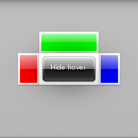
On this example we are going to have a button that when clicked will show our hover widget, this hover will have content set on it's left, top, right and middle positions. In the middle position we are placing a button that when clicked will hide the hover. We are also going to use a non-default theme for our hover. We won't explain the functioning of button for that see Button.
We start our example with a couple of callbacks that show and hide the data they're given(which we'll see later on is the hover widget):
static void
_show_hover(void *data, Evas_Object *obj EINA_UNUSED, void *event_info EINA_UNUSED)
{
   evas_object_show(data);
}

static void
_hide_hover(void *data, Evas_Object *obj EINA_UNUSED, void *event_info EINA_UNUSED)
{
   evas_object_hide(data);
}
In our main function we'll do some initialization and then create 3 rectangles, one red, one green and one blue to use in our hover. We'll also create the 2 buttons that will show and hide the hover:
EAPI_MAIN int
elm_main(int argc EINA_UNUSED, char **argv EINA_UNUSED)
{
   Evas_Object *win, *bt, *bt2, *rect, *rect2, *rect3, *hover;

   elm_policy_set(ELM_POLICY_QUIT, ELM_POLICY_QUIT_LAST_WINDOW_CLOSED);

   win = elm_win_util_standard_add("hover", "Hover");
   elm_win_autodel_set(win, EINA_TRUE);

   rect = evas_object_rectangle_add(evas_object_evas_get(win));
   evas_object_size_hint_min_set(rect, 25, 25);
   evas_object_color_set(rect, 255, 0, 0, 255);
   evas_object_show(rect);

   rect2 = evas_object_rectangle_add(evas_object_evas_get(win));
   evas_object_size_hint_min_set(rect2, 25, 25);
   evas_object_color_set(rect2, 0, 255, 0, 255);
   evas_object_show(rect2);

   rect3 = evas_object_rectangle_add(evas_object_evas_get(win));
   evas_object_size_hint_min_set(rect3, 25, 25);
   evas_object_color_set(rect3, 0, 0, 255, 255);
   evas_object_show(rect3);

   bt = elm_button_add(win);
   elm_object_text_set(bt, "Show hover");
   evas_object_move(bt, 60, 90);
   evas_object_resize(bt, 80, 20);
   evas_object_show(bt);

   bt2 = elm_button_add(win);
   elm_object_text_set(bt2, "Hide hover");
   evas_object_show(bt2);
With all of that squared away we can now get to the heart of the matter, creating our hover widget, which is easy as pie:
hover = elm_hover_add(win);
Having created our hover we now need to set the parent and target. Which if you recall from the function documentations are going to tell the hover which area it should cover and where it should be centered:
   elm_hover_parent_set(hover, win);
   elm_hover_target_set(hover, bt);
Now we set the theme for our hover. We're using the popout theme which gives our contents a white background and causes their appearance to be animated:
elm_object_style_set(hover, "popout");
And finally we set the content for our positions:
   elm_object_part_content_set(hover, "left", rect);
   elm_object_part_content_set(hover, "top", rect2);
   elm_object_part_content_set(hover, "right", rect3);
   elm_object_part_content_set(hover, "middle", bt2);
So far so good? Great 'cause that's all there is too it, what is left now is just connecting our buttons to the callbacks we defined at the beginning of the example and run the main loop:
   evas_object_smart_callback_add(bt, "clicked", _show_hover, hover);
   evas_object_smart_callback_add(bt2, "clicked", _hide_hover, hover);

   evas_object_resize(win, 200, 200);
   evas_object_show(win);

   elm_run();

   return 0;
}
ELM_MAIN()
Our example will initially look like this:

And after you click the "Show hover" button it will look like this:
