|
Tizen Native API
3.0
|
Panes


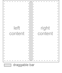
The panes widget adds a draggable bar between two contents. When dragged this bar will resize contents' size.
Panes can be split vertically or horizontally, and contents size proportion can be customized (homogeneous by default).
This widget inherits from the Layout one, so that all the functions acting on it also work for panes objects.
This widget emits the following signals, besides the ones sent from Elm_Layout:
"press"- The panes has been pressed (button wasn't released yet)."unpress"- The panes was released after being pressed."clicked"- The panes has been clicked>"clicked,double"- The panes has been double clicked
Available styles for it:
"default"
Default content parts of the panes widget that you can use are:
- "left" - A leftside content of the panes
- "right" - A rightside content of the panes
- "top" - A top content of the vertical panes
- "bottom" - A bottom content of the vertical panes
If panes are displayed vertically, left content will be displayed on top.
Supported elm_object common APIs.