Colored List View
Colored list view provides the list has gradient background color.
You should check if your brower support WebGL since colored list view uses the WebGL technology.
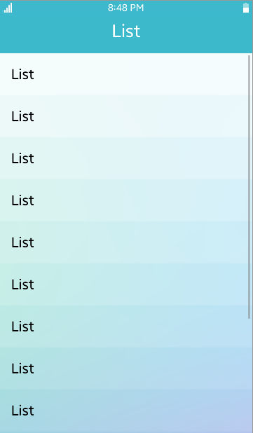
Table of Contents
Default selector
By default, all <ul> and <ol> elements with the class="ui-colored-list" or data-role="coloredlistview" attribute are displayed as colored list view components.
Manual Constructor
To manually create a colored list view component, use the component constructor from the tau namespace:
The constructor requires an HTMLElement parameter to create the component, and you can get it with the document.getElementById() method. The constructor can also take a second parameter, which is an object defining the configuration options for the component.
HTML code:
<ul class="ui-colored-list" id="coloredlist">
   <li class="ui-li-static">Item</li>
   <li class="ui-li-static">Item</li>
   <li class="ui-li-static">Item</li>
</ul>
JS code:
var elColoredList = document.getElementById("coloredlist"),
    coloredList = tau.widget.ColoredListview(elColoredList);
Options
| Option | Input type | Default value | Description |
|---|---|---|---|
| data-colored-listview-number | number | 15 | the number of list items to be applied colored list view |