Popup
The popup component handles creating and managing pop-up windows.
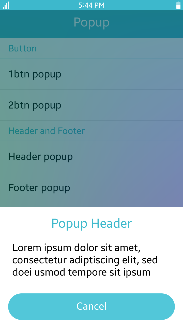
Table of Contents
- Default Selectors
- Manual Constructor
- HTML Examples
- Popup / ContextPopup
- Options
- Events
- Managing a Popup
Default Selectors
By default, all elements with the class="ui-popup" and data-role="popup" attribute are displayed as Tizen Web UI popups.
Manual Constructor
To manually create a button component, use the component constructor from the tau namespace:
HTML code:
<div id="popup">
   <p>This is not a popup yet. But when TAU namespace calls me as widget, I will be popup.</p>
</div>
JS code:
var popupElement = document.getElementById("popup"),
    popup = tau.widget.Popup(popupElement);
HTML Examples
Basic structure of Popup
As basically, popup has class="ui-popup-header" as Header, class="ui-popup-content" as body and class="ui-popup-footer" as button area. Here is simple example:
<div id="1btn_popup" class="ui-popup">
   <div class="ui-popup-header">Popup Header</div>
   <div class="ui-popup-content popup-content-padding">
      Lorem ipsum dolor sit amet,
      consectetur adiptiscing elit, sed
      doei usmod tempore sit ipsum
   </div>
   <div class="ui-popup-footer">
      <a class="ui-btn" data-rel="back" data-inline="true">Cancel</a>
   </div>
</div>
Context Popup
Context popup(ctxpopup) has very simple structure. It does not need header or footer. So, just put content in <div> area. Please refer this example:
<div id="ctxpopup_vertical_basic" class="ui-popup" data-overlay="false">
   <ul class="ui-listview">
      <li class="ui-li-anchor"><a href="#" data-rel="back">Copy</a></li>
      <li class="ui-li-anchor"><a href="#" data-rel="back">Cut</a></li>
      <li class="ui-li-anchor"><a href="#" data-rel="back">Paste</a></li>
      <li class="ui-li-anchor"><a href="#" data-rel="back">Clipboard</a></li>
   </ul>
</div>
Toast Popup
If you want to show popup as toast, please add "ui-popup-toast" class with "ui-popup"
<div id="popup_toast" data-role="popup" class="ui-popup ui-popup-toast">
   <div class="ui-popup-content">
      Toast popup text Toast popup text
   </div>
</div>
Popup / ContextPopup
There's one different factor between popup and context popup. It is data-position-to options of popup opener element.
Open Popup as window popup
When element has data-position-to="window", it opens window popup(as known as normal popup window).
<div data-role="page" class="ui-page" id="demo-page">
   <div class="ui-content">
      <ul class="ui-listview">
         <li class="ui-li-anchor"><a  href="#1btn_popup" data-inline="true" data-rel="popup" data-position-to="window">1btn popup</a></li>
      </ul>

      <div id="1btn_popup" class="ui-popup">
         <div class="ui-popup-header">Popup Header</div>
         <div class="ui-popup-content popup-content-padding">
            Lorem ipsum dolor sit amet,
            consectetur adiptiscing elit, sed
            doei usmod tempore sit ipsum
         </div>
         <div class="ui-popup-footer">
             <a class="ui-btn" data-rel="back" data-inline="true">Cancel</a>
         </div>
     </div>
   </div>
</div>
Open Popup as context popup
When element has data-position-to="origin", it opens context popup.
In mobile profile, default value is "origin" and if popup has no option about data-position-to, it opened as context popup.
<div data-role="page" class="ui-page" id="demo-page">
   <div class="ui-content">
      <ul class="ui-listview">
         <li class="ui-li-anchor"><a href="#ctxpopup_vertical_basic" data-inline="true" data-rel="popup">Vertical Basic</a></li>
      </ul>

      <div id="ctxpopup_vertical_basic" class="ui-popup" data-overlay="false">
         <ul class="ui-listview">
            <li class="ui-li-anchor"><a href="#" data-rel="back">Copy</a></li>
            <li class="ui-li-anchor"><a href="#" data-rel="back">Cut</a></li>
            <li class="ui-li-anchor"><a href="#" data-rel="back">Paste</a></li>
            <li class="ui-li-anchor"><a href="#" data-rel="back">Clipboard</a></li>
         </ul>
      </div>
   </div>
</div>
Options
| Option | Input type | Default value | Description |
|---|---|---|---|
| data-position-to | string | "origin" | Element relative to which the popup is centered. |
| data-close-link-selector | string | 'a[data-rel="back"]' | Selector for the close buttons in the popup. |
| data-transition | string | "pop" | Default transition for the popup. |
| data-arrow | string | "b, t, r, l" | Sets directions of popup's arrow by priority ("l" for left, "t" for top, "r" for right, and "b" for bottom). The first one has the highest priority. |
| data-direction-priority | Array | ["bottom","top", "right", "left"] | DEPRECATED since 2.4 |
Events
To handle popup events, use the following code:
HTML code:
<!--Popup HTML code-->
<div id="popup" data-role="popup">
   <p>This is a completely basic popup, no options set.</p>
</div>
JS code:
/* Use popup events */
var popup = document.getElementById("popup");
popup.addEventListener("popupafteropen", function()
{
   /* Implement code for popupafteropen event */
});
Summary
Mobile Popup has three more events including Base Popup Events. Here is mobile-specific popup events.
| Name | Description |
|---|---|
| popupafteropen | Triggered when process of opening a popup is completed. |
| beforeposition | Triggered before a popup computes the coordinates where it appears. |
| popupafterclose | Triggered when the process of closing a popup is completed. |
Managing a Popup
Open Popup
There are 2 ways to open a popup:
- Open by clicking on a link:
If the link has the
idof the popup set as the value of thehrefproperty, the popup is opened after clicking on the link.<!--Definition of link, which opens popup with popup id--> <a href="#popup">Click to open popup</a> <div id="popup" data-role="popup"> <p>This is a completely basic popup, no options set.</p> </div>
- Open manually:
To open a popup with the "popup"
idproperty, thetaunamespace can be used.:HTML code:
<div id="popup">
   <p>This is a completely basic popup, no options set.</p>
</div>
JS code:
var popupElement = document.getElementById("popup"),
    popup = tau.widget.Popup(popupElement);
popup.open();
With the TAU API, you can open a popup anywhere:
HTML code:
<div id="popup">
   <p>This is a completely basic popup, no options set.</p>
</div>
JS code:
tau.openPopup("#popup");
Close Popup
There are 2 ways to close a popup:
- Close by clicking on a button inside:
If the link inside the popup has the
data-rel="back"property, the popup is closed after clicking on it.
The selector, which causes closing on click, can be changed by setting thecloseLinkSelectoroption in the popup:<div id="1btn_popup" class="ui-popup"> <div class="ui-popup-header">Popup Header</div> <div class="ui-popup-content popup-content-padding"> Lorem ipsum dolor sit amet, consectetur adiptiscing elit, sed doei usmod tempore sit ipsum </div> <div class="ui-popup-footer"> <a class="ui-btn" data-rel="back" data-inline="true">Cancel</a> </div> </div> - Close manually:
To close a popup with the "popup"
idproperty, thetaunamespace can be used:HTML code:
<a href="#popup" data-position-to="window">Click to open popup</a>
<div id="popup" data-role="popup">
   <p>This is a completely basic popup, no options set.</p>
</div>
JS code:
var popupElement = document.getElementById("popup"),
    popup = tau.widget.Popup(popupElement);
/* Close popup after opening */
popupElement.addEventListener("popupafteropen", function()
{
   popup.close();
});
With the TAU API, you can close a popup anywhere:
HTML code:
<div id="popup">
   <p>This is a completely basic popup, no options set.</p>
</div>
JS code:
tau.closePopup();