CircleProgressBar
Shows a control that indicates the progress percentage of an on-going operation by circular shape.
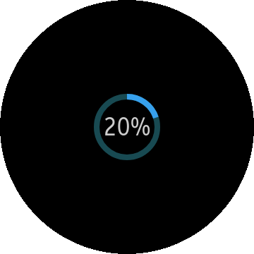
The circle progress component shows a control that indicates the progress percentage of an on-going operation.
This component can be scaled to be fit inside a parent container.
| Note |
|---|
| This component is supported since 2.3. |
| This component is optimized for circular UI. The component may not be shown properly in rectangular UI. |
Table of Contents
How to Create CircleProgressBar
Default CircleProgressBar
If you don't make any "circleprogress" with <progress> element, you can show default progress style.
To add a CircleProgressBar component to the application, use the following code:
HTML code:
<div class="ui-page" id="pageCircleProgressBar">
   <header class="ui-header"></header>
   <div class="ui-content">
      <progress class="ui-circle-progress" id="circleprogress" max="20" value="2"></progress>
   </div>
</div>
JS code:
(function()
{
   var page = document.getElementById("pageCircleProgressBar"),
       progressBar = document.getElementById("circleprogress"),
       progressBarWidget;

   page.addEventListener("pageshow", function()
   {
      /* Make Circle Progressbar object */
      progressBarWidget = new tau.widget.CircleProgressBar(progressBar);
   });

   page.addEventListener("pagehide", function()
   {
      /* Release object */
      progressBarWidget.destroy();
   });
}());
Full(screen) size CircleProgressBar
To add a circular shape(page size) progressbar in your application, you have to declare <progress> tag in "ui-page" element.
And in your javascript code, you have to add option "size: full".
Be sure to place the <progress> element outside of content element.
HTML code:
<div class="ui-page" id="pageCircleProgressBar">
   <header class="ui-header"></header>
   <div class="ui-content"></div>
   <progress class="ui-circle-progress" id="circleprogress" max="20" value="2"></progress>
</div>
JS code:
(function()
{
   var page = document.getElementById("pageCircleProgressBar"),
       progressBar = document.getElementById("circleprogress"),
       progressBarWidget;

   page.addEventListener("pageshow", function()
   {
      /* Make Circle Progressbar object */
      progressBarWidget = new tau.widget.CircleProgressBar(progressBar, {size: "full"});
   });

   page.addEventListener("pagehide", function()
   {
      /* Release object */
      progressBarWidget.destroy();
   });
}());
Using event
Circle progress bar triggers "progresschange" event. The description is here.
The following shows how to use "progresschange" event.
progressBar.addEventListener("progresschange", function()
{
   /* Do something when the value of progress changes */
   console.log(progressBarWidget.value());
});
Options
| Option | Input type | Default value | Description |
|---|---|---|---|
| containerClassName | string | null | Sets the class name of CircleProgressBar container. |
| size | number | "full" | "large" | "medium" | "small" | "medium" | Sets the size of CircleProgressBar. |
| thickness | number | null | Sets the border width of CircleProgressBar. |
Events
| Name | Description |
|---|---|
| progresschange | Triggered when the section is changed. |
Methods
Summary
| Method | Description |
|---|---|
string value() |
Get or Set value of the widget |
value-
Get or Set value of the widget
string value()
Since: 2.3
Return element value or set the value
Return value:
Type Description string In get mode return element value Code example:
HTML code:<div class="ui-page" id="pageCircleProgressBar"> <header class="ui-header"> <h2 class="ui-title">Circle Progress Bar</h2> </header> <div class="ui-content content-padding">Circle Progress Bar <progress class="ui-circle-progress" id="circleprogress" max="20" value="2"></progress> </div> </div>JS code:
var page = document.getElementById("pageCircleProgressBar");

page.addEventListener("pageshow", function()
{
   var progressbar = document.getElementById("circleprogress"),
       progressbarWidget = tau.widget.CircleProgressBar(progressbar),
       /* Return value in progress tag */
       value = progressbarWidget.value();
   /* Set the value for the progress */
   progressbarWidget.value("15");
});