TextInput
TextInput component is decorator for input elements.
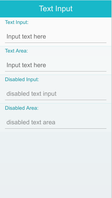
Table of Contents
Default selectors
In default elements matches to :
- INPUT with type "text" or "number" or "password" or "email" or "url" or "tel"
- TEXTAREA
- INPUT elements with class ui-text-input
HTML Examples
Create simple text input on INPUT element with clear button
<label for="texttype">Text Input:</label>
<input type="text" name="texttype" id="texttype" placeholder="Input text here" data-clear-btn="true"/>
Create simple text input on TEXTAREA element
<label for="textarea">Text Area:</label>
<textarea type="text" name="textarea" id="textarea" placeholder="Input text here"></textarea>
Options
| Option | Input type | Default value | Description |
|---|---|---|---|
| data-clear-btn | boolean | false | option indicates that the clear button will be shown |
| data-text-line | boolean | true | option indicates that the text underline will be shown |
Methods
Summary
| Method | Description |
|---|---|
TextInput enable() |
Enables the TextInput |
TextInput disable() |
Disables the TextInput |
enable-
Enables the TextInput
TextInput enable()
Method removes disabled attribute on input and changes look of input to enabled state.
Return value:
Type Description TextInput return this Code example:
HTML code:
<input type="text" name="texttype" id="texttype"/>
JS code:
var inputElement = document.getElementById("texttype"), textInputWidget = tau.widget.TextInput(); textInputWidget.enable(); disable-
Disables the TextInput
TextInput disable()
Method adds disabled attribute on input and changes look of input to disable state.
Return value:
Type Description TextInput return this Code example:
HTML code:
<input type="text" name="texttype" id="texttype"/>
JS code:
var inputElement = document.getElementById("texttype"),
    textInputWidget = tau.widget.TextInput();

textInputWidget.disable();