Support for Circular UI
Tizen Wearable Web UI Framework supports different types of devices(rectangle and circle) with the same application.
To support Circular UI along with Rectangular UI, media query is required.
Table of Contents
- How to apply Circular UI
- How to override css style for Circular UI using media query
- How to write code selectively for Circular UI in JS
- Support guide for UI components
How to apply Circular UI
In order to support the Circular UI, you need to do the following.
1. Include the link tag for the latest "tau.css" file into <head> part in HTML.
( Note : For the compatibility with Rectangular UI, you must use the latest version of TAU library. )
2. Include the link tag for the latest "tau.circle.css" file with media query feature "-tizen-geometric-shape: circle" next to the link tag for the "tau.css".
( Note : Adding the "tau.circle.css" file following the general "tau.css" file will cover the additional Circular UI. )
3. Include the link tag for the latest "tau.js" script file at the end of <body> part of HTML.
4. For writing separate code for Circular UI in JS, you can use "tau.support.shape.circle" property.
<head name="viewport" content="width=device-width, user-scalable=no">
    <title>Support for Circular UI</title>
    <link rel="stylesheet" href="tau.css">
    <!-- CSS media query on a link element -->
    <link rel="stylesheet" media="all and (-tizen-geometric-shape: circle)" href="tau.circle.css">
    <link rel="stylesheet" href="css/stlye.css">
</head>
<body>
    ...
    <script type="text/javascript" src="tau.js"></script>
    <script>
        if (tau.support.shape.circle) {
            /* implement your codes for Circular UI here */
        } else {
            /* implement your codes for Rectangular UI here */
        }
    </script>
</body>
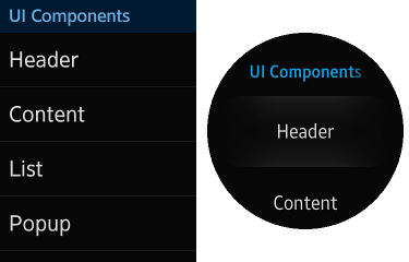
The following figure shows an example of how media query("-tizen-geometric-shape: circle") would work in different devices.
Figure: apply to rectangular device and circular device with media query
How to override css style for Circular UI using media query
In order for some styles to be applied selectively, you can use media query feature "-tizen-geometric-shape" with "rectangle" or "circle" value.
Media query feature for Tizen devices
Media query in Tizen Wearable Web UI Framework utilizes "-tizen-geometric-shape" feature with "rectangle" or "circle" value to distinguish type difference.
( Note : "-tizen-geometric-shape" feature is only available in Tizen devices. )| -tizen-geometric-shape | |
|---|---|
| Value | rectangle | circle |
| Applied to | Visual media types |
| Accept min/max prefixes | No |
.className {
	/* implement basic css style for Rectangular UI here */
}

@media screen and (-tizen-geometric-shape: circle) {
	.className	{
		/* implement css style to be overridden for Circular UI here */
	}
}
How to write code selectively for Circular UI in JS
Tizen Wearable Web UI FW provides the property "tau.support.shape.circle" that checks whether the type is circle or not. If you want implement code selectively for Circular UI and Rectangular UI, you can use the property with boolean value.
( Note : For developing in a browser environment, this property is always set true when "tau.circle.css" is loaded. )
if (tau.support.shape.circle) {
	/* implement your codes for Circular UI here */
} else {
	/* implement your codes for Rectangular UI here */
}
Support guide for UI components
The following is how to use both Rectangular UI components and Circular UI components.
Index of UI Components
- Circular Scroll Bar
- Rotary Event Handling
- List
- Circle Progress Bar
- Index Scroll Bar
- Processing
- More Options
- Footer Button
- Thumbnail
- Popup
How to support circle-shaped scroll bar
How to handle rotary event in application
How to support list
How to support circle progress bar
How to support index scroll bar
How to support processing
How to support more options button
How to support footer buttons
How to support thumbnail
How to support popup