How to support Popup
The following explains how to make the popup buttons for Circular UI.
Table of Contents
Layout (bottom button)
 |
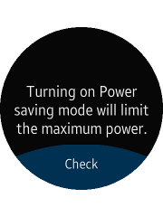 |
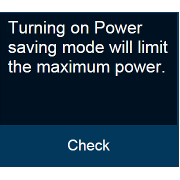
| in Rectangular UI | in Circular UI |
Bottom button of Circular UI has "ui-bottom-button" class on the popup footer. Popup can have only 1 bottom button.
HTML code
<div id="bottomBtnPopup" class="ui-popup">
   <div class="ui-popup-content">
      Turning on Power
      saving mode will
      limit the maximum
      power
   </div>
   <div class="ui-popup-footer ui-bottom-button">
      <button id="bottomBtn" class="ui-btn">Check</button>
   </div>
</div>
Layout (side buttons)
 |
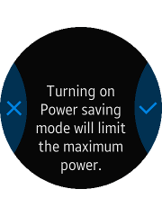 |
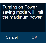
| in Rectangular UI | in Circular UI |
Side button of Circular UI has "ui-side-button" class on the popup footer. It supports just icon-only style button.
Popup can have only 2 side buttons.
HTML code (side buttons)
<style>
   .btn-icon-cancel::before {-webkit-mask-image: url(./cancel.png)}
   .btn-icon-ok::before {-webkit-mask-image: url(./ok.png)}
</style>
<div id="sideBtnPopup" class="ui-popup">
   <div class="ui-popup-content">
      Turning on Power
      saving mode will
      limit the maximum
      power
   </div>
   <div class="ui-popup-footer ui-grid-col-2 ui-side-button">
      <button id="sideBtn-1" class="ui-btn btn-icon-cancel">Cancel</button>
      <button id="sideBtn-2" class="ui-btn btn-icon-ok">OK</button>
   </div>
</div>