This widget is an enhancement of Notify. In addition to content area, there are two optional sections, namely title area and action area.
The popup widget displays its content with a particular orientation in the parent area. This orientation can be one among top, center, bottom, left, top-left, top-right, bottom-left and bottom-right. Content part of Popup can be an Evas Object set by application or it can be Text set by application or set of items containing an icon and/or text. The content/item-list can be removed using elm_object_content_set with second parameter passed as NULL.
The following figures show the textual layouts of popup in which Title Area and Action area are optional ones. Action area can have up to 3 buttons handled using elm_object common APIs mentioned below. If user wants to have more than 3 buttons then these buttons can be put inside the items of a list as content. User needs to handle the clicked signal of these action buttons if required. No event is processed by the widget automatically when clicked on these action buttons.
|---------------------|    |---------------------|    |---------------------|
|     Title Area      |    |     Title Area      |    |     Title Area      |
|Icon|    Text        |    |Icon|    Text        |    |Icon|    Text        |
|---------------------|    |---------------------|    |---------------------|
|       Item 1        |    |                     |    |                     |
|---------------------|    |                     |    |                     |
|       Item 2        |    |                     |    |    Description      |
|---------------------|    |       Content       |    |                     |
|       Item 3        |    |                     |    |                     |
|---------------------|    |                     |    |                     |
|         .           |    |---------------------|    |---------------------|
|         .           |    |     Action Area     |    |     Action Area     |
|         .           |    | Btn1  |Btn2|. |Btn3 |    | Btn1  |Btn2|  |Btn3 |
|---------------------|    |---------------------|    |---------------------|
|       Item N        |     Content Based Layout     Description based Layout
|---------------------|
|     Action Area     |
| Btn1  |Btn2|. |Btn3 |
|---------------------|
   Item Based Layout
Timeout can be set on expiry of which popup instance hides and sends a smart signal "timeout" to the user. The visible region of popup is surrounded by a translucent region called Blocked Event area. By clicking on Blocked Event area, the signal "block,clicked" is sent to the application. This block event area can be avoided by using API elm_popup_allow_events_set. When gets hidden, popup does not get destroyed automatically, application should destroy the popup instance after use. To control the maximum height of the internal scroller for item, we use the height of the action area which is passed by theme based on the number of buttons currently set to popup.
Popup sets the focus to itself when evas_object_show is called on popup. To set the focus into popup's contents and buttons automatically, evas_object_show on popup should be called after setting all the contents and buttons of popup.
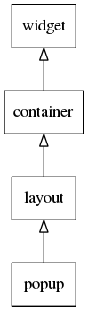
This widget inherits from the Layout one, so that all the functions acting on it also work for popup objects (since 1.8).
This widget emits the following signals, besides the ones sent from Layout:
"timeout"- whenever popup is closed as a result of timeout."block,clicked"- whenever user taps on Blocked Event area."dismissed"- The popup is dismissed with a hide effect."focused"- When the popup has received focus. (since 1.8)"unfocused"- When the popup has lost focus. (since 1.8)- "language,changed" - the program's language changed (since 1.8)
- "item,focused" - When the popup item has received focus. (since 1.10)
- "item,unfocused" - When the popup item has lost focus. (since 1.10)
Styles available for Popup
- "default"
Default contents parts of the popup widget that you can use are:
- "default" - The content of the popup
- "title,icon" - Title area's icon
- "button1" - 1st button of the action area
- "button2" - 2nd button of the action area
- "button3" - 3rd button of the action area
Default text parts of the popup widget that you can use are:
- "title,text" - A title area's label
- "default" - A content-text set in the content area of the widget
Default contents parts of the popup items that you can use are:
- "default" - An item's icon
Default text parts of the popup items that you can use are:
- "default" - An item's label
Supported elm_object_item common APIs.
- elm_object_item_part_text_set
- elm_object_item_part_text_get
- elm_object_item_part_content_set
- elm_object_item_part_content_get
- elm_object_item_disabled_set
- elm_object_item_disabled_get
- elm_object_item_del
- elm_object_item_signal_emit
supported elm_object common APIs.
- elm_object_part_text_set
- elm_object_part_text_get
- elm_object_part_content_set
- elm_object_part_content_get
- elm_object_part_content_unset
- elm_object_signal_emit
Here are some sample code to illustrate Popup usage:
Functions | |
| Evas_Object * | elm_popup_add (Evas_Object *parent) |
| Adds a new Popup to the parent. | |
Enumeration Type Documentation
| enum Elm_Popup_Orient |
Possible orient values for popup.
These values should be used in conjunction to elm_popup_orient_set() to set the position in which the popup should appear(relative to its parent) and in conjunction with elm_popup_orient_get() to know where the popup is appearing.
- Enumerator:
Function Documentation
| Evas_Object* elm_popup_add | ( | Evas_Object * | parent | ) |
Adds a new Popup to the parent.
- Parameters:
-
parent The parent object
- Returns:
- The new object or NULL if it cannot be created
- Since :
- 2.3
- Examples:
- popup_example_01.c, popup_example_02.c, and popup_example_03.c.