|
Tizen Native API
5.0
|
A diskselector is a kind of list widget. It scrolls horizontally, and can contain label and icon objects. Three items are displayed with the selected one in the middle.
It can act like a circular list with round mode and labels can be reduced for a defined length for side items.
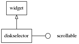
This widget implements the elm-scrollable-interface interface, so that all (non-deprecated) functions for the base Scroller widget also work for diskselectors.
Some calls on the diskselector's API are marked as deprecated, as they just wrap the scrollable widgets counterpart functions. Use the ones we point you to, for each case of deprecation here, instead -- eventually the deprecated ones will be discarded (next major release).
This widget emits the following signals, besides the ones sent from Layout:
"selected"- when item is selected, i.e. scroller stops."clicked"- This is called when a user clicks an item (since 1.8)"scroll,anim,start"- scrolling animation has started"scroll,anim,stop"- scrolling animation has stopped"scroll,drag,start"- dragging the diskselector has started"scroll,drag,stop"- dragging the diskselector has stopped"focused"- When the diskselector has received focus. (since 1.8)"unfocused"- When the diskselector has lost focus. (since 1.8)"language,changed"- the program's language changed (since 1.9)
- Note:
- The "scroll,anim,*" and "scroll,drag,*" signals are only emitted by user intervention.
Available styles for it:
"default"
Default content parts of the diskselector items that you can use for are:
- "icon" - An icon in the diskselector item
Default text parts of the diskselector items that you can use for are:
- "default" - A label of the diskselector item
Supported elm_object_item common APIs.
- elm_object_item_del
- elm_object_item_part_text_set
- elm_object_item_part_text_get
- elm_object_item_part_content_set
- elm_object_item_part_content_get
List of examples: