|
Tizen Native API
6.5
|
This widget is an enhancement of Notify. In addition to content area, there are two optional sections, namely title area and action area.
The popup widget displays its content with a particular orientation in the parent area. This orientation can be one among top, center, bottom, left, top-left, top-right, bottom-left and bottom-right. Content part of Popup can be an Evas Object set by application or it can be Text set by application or set of items containing an icon and/or text. The content/item-list can be removed using elm_object_content_set with second parameter passed as NULL.
The following figures show the textual layouts of popup in which Title Area and Action area are optional ones. Action area can have up to 3 buttons handled using elm_object common APIs mentioned below. If user wants to have more than 3 buttons then these buttons can be put inside the items of a list as content. User needs to handle the clicked signal of these action buttons if required. No event is processed by the widget automatically when clicked on these action buttons.
|---------------------|    |---------------------|    |---------------------|
|     Title Area      |    |     Title Area      |    |     Title Area      |
|Icon|    Text        |    |Icon|    Text        |    |Icon|    Text        |
|---------------------|    |---------------------|    |---------------------|
|       Item 1        |    |                     |    |                     |
|---------------------|    |                     |    |                     |
|       Item 2        |    |                     |    |    Description      |
|---------------------|    |       Content       |    |                     |
|       Item 3        |    |                     |    |                     |
|---------------------|    |                     |    |                     |
|         .           |    |---------------------|    |---------------------|
|         .           |    |     Action Area     |    |     Action Area     |
|         .           |    | Btn1  |Btn2|. |Btn3 |    | Btn1  |Btn2|  |Btn3 |
|---------------------|    |---------------------|    |---------------------|
|       Item N        |     Content Based Layout     Description based Layout
|---------------------|
|     Action Area     |
| Btn1  |Btn2|. |Btn3 |
|---------------------|
   Item Based Layout
Timeout can be set on expiry of which popup instance hides and sends a smart signal "timeout" to the user. The visible region of popup is surrounded by a translucent region called Blocked Event area. By clicking on Blocked Event area, the signal "block,clicked" is sent to the application. This block event area can be avoided by using API elm_popup_allow_events_set. When gets hidden, popup does not get destroyed automatically, application should destroy the popup instance after use. To control the maximum height of the internal scroller for item, we use the height of the action area which is passed by theme based on the number of buttons currently set to popup.
Popup sets the focus to itself when evas_object_show is called on popup. To set the focus into popup's contents and buttons automatically, evas_object_show on popup should be called after setting all the contents and buttons of popup.
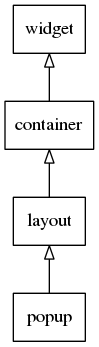
This widget inherits from the Layout one, so that all the functions acting on it also work for popup objects (since 1.8).
This widget emits the following signals, besides the ones sent from Layout :
"timeout"- whenever popup is closed as a result of timeout."block,clicked"- whenever user taps on Blocked Event area."dismissed"- The popup is dismissed with a hide effect."focused"- When the popup has received focus. (since 1.8)"unfocused"- When the popup has lost focus. (since 1.8)- "language,changed" - the program's language changed (since 1.8)
- "item,focused" - When the popup item has received focus. (since 1.10)
- "item,unfocused" - When the popup item has lost focus. (since 1.10)
Styles available for Popup
- "default"
Default contents parts of the popup widget that you can use are:
- "default" - The content of the popup
- "title,icon" - Title area's icon
- "button1" - 1st button of the action area
- "button2" - 2nd button of the action area
- "button3" - 3rd button of the action area
Default text parts of the popup widget that you can use are:
- "title,text" - A title area's label
- "default" - A content-text set in the content area of the widget
Default contents parts of the popup items that you can use are:
- "default" - An item's icon
Default text parts of the popup items that you can use are:
- "default" - An item's label
Supported elm_object_item common APIs.
- elm_object_item_part_text_set
- elm_object_item_part_text_get
- elm_object_item_part_content_set
- elm_object_item_part_content_get
- elm_object_item_disabled_set
- elm_object_item_disabled_get
- elm_object_item_del
- elm_object_item_signal_emit
supported elm_object common APIs.
- elm_object_part_text_set
- elm_object_part_text_get
- elm_object_part_content_set
- elm_object_part_content_get
- elm_object_part_content_unset
- elm_object_signal_emit
Here are some sample code to illustrate Popup usage:
Functions | |
| Evas_Object * | elm_popup_add (Evas_Object *parent) |
| Adds a new Popup to the parent. | |
| void | elm_popup_align_set (Elm_Popup *obj, double horizontal, double vertical) |
| Set the alignment of the popup object. | |
| void | elm_popup_align_get (const Elm_Popup *obj, double *horizontal, double *vertical) |
| Get the alignment of the popup object. | |
| void | elm_popup_allow_events_set (Elm_Popup *obj, Eina_Bool allow) |
| Sets whether events should be passed to by a click outside. | |
| Eina_Bool | elm_popup_allow_events_get (const Elm_Popup *obj) |
| Returns value indicating whether allow event is enabled or not. | |
| void | elm_popup_content_text_wrap_type_set (Elm_Popup *obj, Elm_Wrap_Type wrap) |
| Control the wrapping type of content text packed in content area of popup object. | |
| Elm_Wrap_Type | elm_popup_content_text_wrap_type_get (const Elm_Popup *obj) |
| Control the wrapping type of content text packed in content area of popup object. | |
| void | elm_popup_orient_set (Elm_Popup *obj, Elm_Popup_Orient orient) |
| Sets the orientation of the popup in the parent region. | |
| Elm_Popup_Orient | elm_popup_orient_get (const Elm_Popup *obj) |
| Returns the orientation of the popup. | |
| void | elm_popup_timeout_set (Elm_Popup *obj, double timeout) |
| Sets a timeout to hide popup automatically. | |
| double | elm_popup_timeout_get (const Elm_Popup *obj) |
| Returns the timeout value set to the popup (in seconds). | |
| void | elm_popup_scrollable_set (Elm_Popup *obj, Eina_Bool scroll) |
| Enable or disable scroller in popup content area. | |
| Eina_Bool | elm_popup_scrollable_get (const Elm_Popup *obj) |
| Get the scrollable state of popup content area. | |
| Elm_Widget_Item * | elm_popup_item_append (Elm_Popup *obj, const char *label, Efl_Canvas_Object *icon, Evas_Smart_Cb func, const void *data) |
| Add a new item to a Popup object. | |
| void | elm_popup_dismiss (Elm_Popup *obj) |
Function Documentation
| Evas_Object* elm_popup_add | ( | Evas_Object * | parent | ) |
Adds a new Popup to the parent.
- Parameters:
-
parent The parent object
- Returns:
- The new object or NULL if it cannot be created
- Since :
- 2.3
- Examples:
- popup_example_01.c, popup_example_02.c, and popup_example_03.c.
| void elm_popup_align_get | ( | const Elm_Popup * | obj, |
| double * | horizontal, | ||
| double * | vertical | ||
| ) |
Get the alignment of the popup object.
- Parameters:
-
[in] obj The object. [out] horizontal The horizontal alignment of the popup. [out] vertical The vertical alignment of the popup.
- Since (EFL) :
- 1.9
- Since :
- 2.3
| void elm_popup_align_set | ( | Elm_Popup * | obj, |
| double | horizontal, | ||
| double | vertical | ||
| ) |
Set the alignment of the popup object.
Sets the alignment in which the popup will appear in its parent.
- Parameters:
-
[in] obj The object. [in] horizontal The horizontal alignment of the popup. [in] vertical The vertical alignment of the popup.
- Since (EFL) :
- 1.9
- Since :
- 2.3
| Eina_Bool elm_popup_allow_events_get | ( | const Elm_Popup * | obj | ) |
Returns value indicating whether allow event is enabled or not.
- Parameters:
-
[in] obj The object.
- Returns:
- If
true, events are passed to lower objects.
- Since :
- 2.3
| void elm_popup_allow_events_set | ( | Elm_Popup * | obj, |
| Eina_Bool | allow | ||
| ) |
Sets whether events should be passed to by a click outside.
Enabling allow event will remove the Blocked event area and events will pass to the lower layer objects otherwise they are blocked.
- Note:
- The default value is
false.
- Parameters:
-
[in] obj The object. [in] allow If true, events are passed to lower objects.
- Since :
- 2.3
| Elm_Wrap_Type elm_popup_content_text_wrap_type_get | ( | const Elm_Popup * | obj | ) |
Control the wrapping type of content text packed in content area of popup object.
- Parameters:
-
[in] obj The object.
- Returns:
- Wrapping type of type Elm_Wrap_Type.
- Since :
- 2.3
| void elm_popup_content_text_wrap_type_set | ( | Elm_Popup * | obj, |
| Elm_Wrap_Type | wrap | ||
| ) |
Control the wrapping type of content text packed in content area of popup object.
- Parameters:
-
[in] obj The object. [in] wrap Wrapping type of type Elm_Wrap_Type.
- Since :
- 2.3
- Examples:
- popup_example_02.c.
| void elm_popup_dismiss | ( | Elm_Popup * | obj | ) |
Dismiss a Popup object.
- Since (EFL) :
- 1.17
- Since :
- 2.3.1
| Elm_Widget_Item* elm_popup_item_append | ( | Elm_Popup * | obj, |
| const char * | label, | ||
| Efl_Canvas_Object * | icon, | ||
| Evas_Smart_Cb | func, | ||
| const void * | data | ||
| ) |
Add a new item to a Popup object.
Both an item list and a content could not be set at the same time! once you add an item, the previous content will be removed.
- Warning:
- When the first item is appended to popup object, any previous content of the content area is deleted. At a time, only one of content, content-text and item(s) can be there in a popup content area.
- Parameters:
-
[in] obj The object. [in] label The Label of the new item. [in] icon Icon to be set on new item. [in] func Convenience function called when item selected. [in] data Data passed to funcabove.
- Returns:
- A handle to the item added or
nullon errors.
- Since :
- 2.3
- Examples:
- popup_example_03.c.
| Elm_Popup_Orient elm_popup_orient_get | ( | const Elm_Popup * | obj | ) |
Returns the orientation of the popup.
- Parameters:
-
[in] obj The object.
- Returns:
- The orientation of the popup.
- Since :
- 2.3
| void elm_popup_orient_set | ( | Elm_Popup * | obj, |
| Elm_Popup_Orient | orient | ||
| ) |
Sets the orientation of the popup in the parent region.
Sets the position in which popup will appear in its parent. By default, #ELM_POPUP_ORIENT_CENTER is set.
- Parameters:
-
[in] obj The object. [in] orient The orientation of the popup.
- Since :
- 2.3
- Examples:
- popup_example_02.c.
| Eina_Bool elm_popup_scrollable_get | ( | const Elm_Popup * | obj | ) |
Get the scrollable state of popup content area.
Normally content area does not contain scroller.
- Parameters:
-
[in] obj The object.
- Returns:
trueif it is to be scrollable,falseotherwise.
- Since (EFL) :
- 1.15.1
- Since :
- 4.0
| void elm_popup_scrollable_set | ( | Elm_Popup * | obj, |
| Eina_Bool | scroll | ||
| ) |
Enable or disable scroller in popup content area.
Normally content area does not contain scroller.
- Parameters:
-
[in] obj The object. [in] scroll trueif it is to be scrollable,falseotherwise.
- Since (EFL) :
- 1.15.1
- Since :
- 4.0
| double elm_popup_timeout_get | ( | const Elm_Popup * | obj | ) |
Returns the timeout value set to the popup (in seconds).
- Parameters:
-
[in] obj The object.
- Returns:
- The timeout in seconds.
- Since :
- 2.3
| void elm_popup_timeout_set | ( | Elm_Popup * | obj, |
| double | timeout | ||
| ) |
Sets a timeout to hide popup automatically.
This function sets a timeout and starts the timer controlling when the popup is hidden. Since calling evas_object_show on a popup restarts the timer controlling when it is hidden, setting this before the popup is shown will in effect mean starting the timer when the popup is shown. Smart signal "timeout" is called afterwards which can be handled if needed.
- Note:
- Set a value <= 0.0 to disable a running timer.
- If the value > 0.0 and the popup is previously visible, the timer will be started with this value, canceling any running timer.
- Parameters:
-
[in] obj The object. [in] timeout The timeout in seconds.
- Since :
- 2.3
- Examples:
- popup_example_01.c.