|
Tizen Native API
|
This widget aims to position objects in a grid layout while actually creating and rendering only the visible ones.
Gengrid using the same idea as the genlist: the user defines a class for each item, specifying functions that are called at object creation, deletion, etc. When those items are selected by the user, a callback function is issued. Users may interact with the gengrid via a mouse (by clicking on items to select them and clicking on the grid's viewport and swiping to pan the whole view) or via the keyboard, navigating through items using the arrow keys.
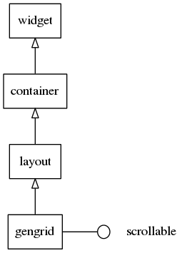
This widget inherits from the Layout one, so that all the functions acting on it also work for gengrid objects.
This widget implements the elm-scrollable-interface interface, so that all (non-deprecated) functions for the base Scroller widget also work for gengrids.
Some calls on the gengrid's API are marked as deprecated, as they just wrap the scrollable widgets counterpart functions. Use the ones mentioned for each case of deprecation here, Eventually the deprecated ones are discarded (next major release).
Gengrid layouts
Gengrid may layout its items in one of the following two possible layouts:
- horizontal
- vertical
When in the "horizontal mode", items are placed in columns from top to bottom and when the space for a column is filled, another one is started on the right, thus expanding the grid horizontally and allowing horizontal scrolling. When in the "vertical mode", though items are placed in rows from left to right, and when the space for a row is filled, another one is started below, thus expanding the grid vertically (and allowing vertical scrolling).
Gengrid items
An item in a gengrid can have 0 or more texts (they can be regular text or textblock Evas objects - that's up to the style to determine), 0 or more contents (which are simply objects swallowed into the gengrid item's theming Edje object) and 0 or more boolean states, which have their behavior left to the user to define. The Edje part names for each of these properties are looked up in the theme file for the gengrid, under the Edje (string) data items named "texts", "contents", and "states", respectively. For each of these properties, if more than one part is provided, they must have names listed and separated by spaces in the data fields. By default, in a gengrid item theme, we have one text part ("elm.text"), two content parts ("elm.swalllow.icon" and "elm.swallow.end"), and no state parts.
A gengrid item may have one of the several styles. Elementary provides one by default - "default", but this can be extended by the system or application custom themes/overlays/extensions (see themes for more details).
Gengrid item classes
In order to have the ability to add and delete items on the fly, gengrid implements a class (callback) system where the application provides a structure with information about that type of item (gengrid may contain multiple items of different types with different classes, states, and styles). Gengrid calls the functions in this struct (methods) when an item is "realized" (i.e., created dynamically, while the user is scrolling the grid). All objects are simply deleted when no longer needed with evas_object_del(). The Elm_Gengrid_Item_Class structure contains the following members:
item_style- This is a constant string and simply defines the name of the item style. It must be specified and the default should be"default".func.text_get- This function is called when an item object is actually created. The data parameter points to the same data passed to elm_gengrid_item_append() and other related item creation functions. The obj parameter is the gengrid object itself, while thepartone is the name string of one of the existing text parts in the Edje group implementing the item's theme. This function must return a strdup'()ed string, as the caller uses free() to free it when done. See Elm_Gengrid_Item_Text_Get_Cb.func.content_get- This function is called when an item object is actually created. The data parameter points to the same data passed to elm_gengrid_item_append() and other related item creation functions. The obj parameter is the gengrid object itself, while thepartone is the name string of one of the existing (content) swallow parts in the Edje group implementing the item's theme. It must returnNULLwhen no content is desired, otherwise, a valid object handle. The object is deleted by the gengrid on its deletion or when the item is "unrealized". See Elm_Gengrid_Item_Content_Get_Cb.func.state_get- This function is called when an item object is actually created. The data parameter points to the same data passed to elm_gengrid_item_append() and other related item creation functions. The obj parameter is the gengrid object itself, while thepartone is the name string of one of the state parts in the Edje group implementing the item's theme. ReturnEINA_FALSEfor false/off orEINA_TRUEfor true/on. Gengrids emit a signal to its theming Edje object with"elm,state,xxx,active"and"elm"as "emission" and "source" arguments respectively, when the state istrue(the default is false), wherexxxis the name of the (state) part. See Elm_Gengrid_Item_State_Get_Cb.func.del- This is called when elm_object_item_del() is called on an item or elm_gengrid_clear() is called on the gengrid. This is intended for use when gengrid items are deleted, so any data attached to the item (e.g. its data parameter on creation) can be deleted. See Elm_Gengrid_Item_Del_Cb.
Usage hints
If the user wants to have multiple items selected at the same time, elm_gengrid_multi_select_set() permits it. If the gengrid is single-selection only (the default), then elm_gengrid_select_item_get() returns the selected item, otherwise it returns NULL, if no item is selected. If the gengrid is under multi-selection, then elm_gengrid_selected_items_get() returns a list (that is only valid as long as no items are modified (added, deleted, selected, or unselected) from the child items on a gengrid.
If an item changes (internal (boolean) state, text, or content changes), then use elm_gengrid_item_update() to have gengrid update the item with the new state. A gengrid re-realizes the item, thus calling the functions in the Elm_Gengrid_Item_Class set for that item.
To programmatically (un)select an item, use elm_gengrid_item_selected_set(). To get its selected state use elm_gengrid_item_selected_get(). To disable an item (unable to be selected and appear differently) use elm_object_item_disabled_set() to set this and elm_object_item_disabled_get() to get the disabled state.
Grid cells only have their selection smart callbacks called when getting selected for the first time. Any further clicks do nothing, unless you enable the "always select mode", with elm_gengrid_select_mode_set() as ELM_OBJECT_SELECT_MODE_ALWAYS, thus making every click to issue selection callbacks. elm_gengrid_select_mode_set() as ELM_OBJECT_SELECT_MODE_NONE turns off the ability to select items entirely in the widget and they neither appear selected nor call the selection smart callbacks.
Remember that you can create new styles and add your own theme augmentation for each application using elm_theme_extension_add(). If you absolutely must have a specific style that overrides any theme the user or system sets up, you can use elm_theme_overlay_add() to add such a file.
Gengrid smart events
This widget emits the following signals, besides the ones sent from Layout :
"activated"- The user has double-clicked or pressed (enter|return|spacebar) on an item. The event_info parameter is the gengrid item that is activated."pressed"- The user pressed an item. The event_info parameter is the item that is pressed."released"- The user released an item. The event_info parameter is the item that is released."clicked,double"- The user has double-clicked an item. The event_info parameter is the gengrid item that is double-clicked."longpressed"- This is called when the item is pressed for a certain amount of time. By default it's1second."selected"- The user has selected an item. The event_info parameter is the gengrid item that is selected."unselected"- The user has unselected an item. The event_info parameter is the gengrid item that is unselected."realized"- This is called when the item in the gengrid has its implementing Evas object instantiated, de facto. event_info is the gengrid item that is created. The object may be deleted at any time, so it is highly advised to the caller not to use the object pointer returned from elm_gengrid_item_object_get(), because it may point to freed objects."unrealized"- This is called when the implementing Evas object for this item is deleted. event_info is the gengrid item that is deleted."changed"- Called when an item is added, removed, resized, or moved and when the gengrid is resized or gets "horizontal" property changes."scroll,anim,start"- This is called when scrolling animation has started."scroll,anim,stop"- This is called when scrolling animation has stopped."drag,start,up"- Called when the item in the gengrid has been dragged (not scrolled) up."drag,start,down"- Called when the item in the gengrid has been dragged (not scrolled) down."drag,start,left"- Called when the item in the gengrid has been dragged (not scrolled) left."drag,start,right"- Called when the item in the gengrid has been dragged (not scrolled) right."drag,stop"- Called when the item in the gengrid has stopped being dragged."drag"- Called when the item in the gengrid is being dragged."scroll"- Called when the content has been scrolled (moved)."scroll,drag,start"- Called when dragging the content has started."scroll,drag,stop"- Called when dragging the content has stopped."edge,top"- Called when the gengrid is scrolled till the top edge."edge,bottom"- Called when the gengrid is scrolled until the bottom edge."edge,left"- Called when the gengrid is scrolled till the left edge."edge,right"- Called when the gengrid is scrolled till the right edge."highlighted"- Called when an item in the list is pressed and highlighted. The event_info parameter is the item that is highlighted."unhighlighted"- an item in the list is unpressed and unhighlighted. The event_info parameter is the item that is unhighlighted."language,changed"- Called when the program's language is changed. Call elm_gengrid_realized_items_update() if items text needs to be translated.
Supported common elm_object APIs.
Supported common elm_object_item APIs.
- elm_object_item_part_content_get()
- elm_object_item_part_content_set()
- elm_object_item_part_content_unset()
- elm_object_item_part_text_set()
- elm_object_item_part_text_get()
- elm_object_item_disabled_set()
- elm_object_item_disabled_get()
Typedef Documentation
- See also:
- Elm_Gen_Item_Class
- See also:
- Elm_Gen_Item_Content_Get_Cb
- See also:
- Elm_Gen_Item_Del_Cb
- See also:
- Elm_Gen_Item_Text_Get_Cb
Enumeration Type Documentation
Enumeration that defines the type of item part.
- Remarks:
- It is used while updating item parts
- It can be used at updating multi fields.
Enumeration that defines where to position the item in the gengrid.