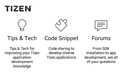
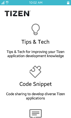
Media Query sample application demonstrates how to define different style rules for different devices using the CSS3 Media Query.
The application displays the content with different layout for different devices/screens.
- For landscape view on mobile device, the list items are displayed in columns.
- For portrait view on mobile device, the list items are displayed in rows.
- For wearable device, the font size gets bigger and the logo is aligned in the center.
The following figure illustrates the main screens of the Media Query.
Figure: Media Query screens


Source Files
You can create and view the sample application project including the source files in the IDE.
| File name | Description |
|---|---|
| config.xml | This file contains the application information for the platform to install and launch the application. |
| css/style.css | This file contains the CSS styling for the application UI. |
| index.html | This is a starting file from which the application starts loading. It contains the layout of the application screens. |
| js/app.js | This file contains the code for handling the main functionality of the application. |
Implementation
The width media feature describes the width of the rendering surface of the output device.
The following media query specifies a style sheet for screen devices with a width less than 480px.
/* css/style.css */

@media screen and (max-width: 480px) {
    #menu li {
        width: 100%;
        float: none;
        margin-bottom: 25px;
    }
}
The following media query specifies a style sheet for screen devices with a width less than 360px and device pixels per CSS pixel less than 1.
The media query feature -webkit-max-device-pixel-ratio is used to specify between the mobile and wearable devices.
/* css/style.css */

@media screen and (max-width: 360px) and (-webkit-max-device-pixel-ratio: 1) {
    #header {
        height: 100px;
        line-height: 100px;
        text-align: center;
    }

    #header #logo {
        width: 150px;
        padding-left: 0;
    }

    #page {
        font-size: 1.5em;
    }

    #menu li .menu-icon {
        width: 75px;
    }

    #menu li .menu-title {
        font-size: 2em;
    }
}
The following media query specifies a style sheet for screen devices with circular UI.
The media query feature -tizen-geometric-shape is used to specify the shape of Tizen devices.
/* css/style.css */

@media screen and (-tizen-geometric-shape: circle) {
    #main {
        margin-bottom: 85px;
    }
}
