
The Gallery sample application demonstrates how you can create a gallery Tizen Web application dedicated for the circular screen. It presents image gallery views and animations for the circular screen. The application is not fully functional, since sending and deleting image methods are not implemented.
The following figure illustrates the main screens of the Gallery.
Figure: Gallery screens
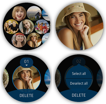
When the application opens, the main view displays the available images in a grid view. When the view is clicked, it changes to a full screen image view displaying one image at a time. In the full screen image view:
- The user can long-press the view to open a list view, where they can select the images they want to delete or send to the phone.
- The user can double-click the view to zoom in the image.
Source Files
You can create and view the sample application project including the source files in the IDE.
The application uses a simple MV (Model View) architecture, which contains the core part determining the architecture and the application part determining the application behavior. The core.js file implements a simple AMD (Asynchronous Module Definition) and specifies module defining.
| File name | Description |
|---|---|
| config.xml | Contains the application information for the platform to install and launch the application, including the view mode and the icon to be used in the device menu. |
| css/ | This directory contains the CSS (Cascading Style Sheets) files used for the application UI. |
| images/ | This directory contains all the images used in the application. |
| index.html | This is a starting file from which the application starts loading. It also contains layout of application pages. |
| js/ | This directory contains the application code. |
| js/app.js | This file contains the code for the main application module used for initialization. |
| js/circle-helper.js | This file contains the TAU helper module for displaying a circular scrollbar. |
| js/core/ | This directory contains the application framework. |
| js/helpers/ | This directory contains the helper functions for the lists and DOM manipulation. |
| js/tau-config.js | This file contains the TAU configuration parameters. |
| js/views/ | This directory contains the files implementing UI event handling for all applications pages. |
| lib/tau | This file contains the TAU library files. |
Implementation
Application Start
At the start, the application sets event handlers for the tizenhwkey event and the low battery state:
/* app.js */
function init()
{
   document.addEventListener('tizenhwkey', onTizenHWKey);

   sysInfo.checkBatteryLowState();
   sysInfo.listenBatteryLowState();
}

/* app.js */
function onTizenHWKey(event)
{
   var activePopup = tau.activePage.querySelector('.ui-popup-active');
   if (event.keyName === 'back')
   {
      if (activePopup)
      {
         tau.widget.Popup(activePopup).close();
      }
      else if (tau.activePage.id === 'main')
      {
         if (main.getCurrentMode() === CONST.MODE.GRID)
         {
            app.exit();
         }
         else
         {
            main.onBack();
         }
      }
      else if (tau.activePage.id === 'empty-page')
      {
         app.exit();
      }
      else
      {
         tau.back();
      }
   }
}
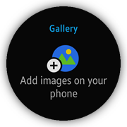
Afterwards, the main view module is invoked and the application checks whether the picture destination list is empty. If images list is empty, the no image page is shown. Otherwise, the gallery is created.
Figure: No image page
/* js/views/main.js */
function init()
{
   if (IMAGES.length)
   {
      buildGallery(IMAGES);
   }
   else
   {
      tau.changePage(ID.EMPTY_PAGE);
   }
}
Main View
The main view shows the gallery (the available images in the picture destination list):
- The gallery is created within the main page container:
<!--index.html-->
<div class="ui-page" id="main">
   <div class="ui-content ui-scroller" id="main-content">
      <div id="main-container"></div>
   </div>
</div>
- The buildGallery() method creates new images inside wrappers with appropriate classes, and appends them to the main container:
/* js/views/main.js */ function buildGallery(imageList) { var i = 0, len = imageList.length, imgElement = null, imgWrapper = null; for (; i < len; i += 1) { imgElement = document.createElement('img'); imgElement.classList.add(CLASSES.PICTURE); imgElement.src = imageList[i]; imgWrapper = document.createElement('div'); imgWrapper.classList.add(CLASSES.PICTURE_WRAPPER); imgWrapper.id = i; imgWrapper.appendChild(imgElement); container.appendChild(imgWrapper); } setDisplayMode(CONST.MODE.GRID, 0); } - The main view has 3 different display modes:
- The grid mode is the default mode that shows the available images in a 3-row grid view.
- The full screen mode is activated by clicking the grid view, and it shows only one image at a time, enlarged to the size of the display.
The full screen image view adds a long-press listener to change to the line mode, and a double-click listener to zoom in the picture.
- The line mode displays the images one at a time in a horizontal line, allowing the user to select the images.


The setDisplayMode() method overrides the current mode and sets the new view mode (layout):
/* js/views/main.js */ function setDisplayMode(mode, id) { select.hideOverlay(); switch (mode) { case CONST.MODE.GRID: case CONST.MODE.LINE: case CONST.MODE.FULL: currentMode = mode; setViewMode(mode); break; } } - To set the view mode, the setViewMode() method first removes all classes related to the current mode and then adds the picture and wrapper classes related to the new mode.
Each picture is positioned absolutely. Their position is computed by the layout helper method using the proper module of grid, line or full.
/* js/views/main.js */
function setViewMode(mode)
{
   var wrappers = container.querySelectorAll('.' + CLASSES.PICTURE_WRAPPER),
       pictures = container.querySelectorAll('.' + CLASSES.PICTURE),
       len = wrappers.length,
       i = 0,
       position = {},
       picture = null,
       wrapper = null;

   setContainerWidth(len);

   for (; i < len; i += 1)
   {
      wrapper = wrappers[i];
      picture = pictures[i];

      content.classList.remove(CLASSES.SCROLL_GRID);
      content.classList.remove(CLASSES.SCROLL_LINE);
      content.classList.remove(CLASSES.SCROLL_FULL);

      picture.classList.remove(CLASSES.PICTURE_LINE);
      wrapper.classList.remove(CLASSES.PICTURE_WRAPPER_LINE);
      picture.classList.remove(CLASSES.PICTURE_FULL);
      wrapper.classList.remove(CLASSES.PICTURE_WRAPPER_FULL);
      picture.classList.remove(CLASSES.PICTURE_GRID);
      wrapper.classList.remove(CLASSES.PICTURE_WRAPPER_GRID);

      switch (mode)
      {
         case CONST.MODE.GRID:
            content.classList.add(CLASSES.SCROLL_GRID);
            picture.classList.add(CLASSES.PICTURE_GRID);
            wrapper.classList.add(CLASSES.PICTURE_WRAPPER_GRID);
            break;
         case CONST.MODE.LINE:
            content.classList.add(CLASSES.SCROLL_LINE);
            picture.classList.add(CLASSES.PICTURE_LINE);
            wrapper.classList.add(CLASSES.PICTURE_WRAPPER_LINE);
            break;
         case CONST.MODE.FULL:
            content.classList.add(CLASSES.SCROLL_FULL);
            picture.classList.add(CLASSES.PICTURE_FULL);
            wrapper.classList.add(CLASSES.PICTURE_WRAPPER_FULL);
            break;
      }

      position = helpers[mode].getElementPosition(i);

      wrapper.style.top = position.top + CONST.PIXEL;
      wrapper.style.left = position.left + CONST.PIXEL;
   }
}
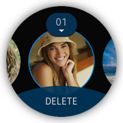
Image Selection
After a long-press on an image in the full screen mode, the main view changes into a 1–line horizontal list of round images with a select overlay. The select overlay allows the user to select and manipulate the images: they can select pictures by clicking them, or select or deselect all by clicking the selected item counter button above the image.
Figure: Selecting images
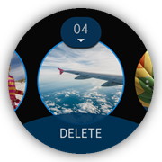
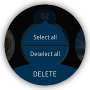
To access more options for manipulating the images, the user can click the 3 dots button at the right edge.
Figure: Manipulating images
- When the list mode is initialized, the elements are cached, the selector component is initialized, and events are bound. The selector component must be initialized with a radius in which the items must be placed.
The view uses a helper module line for image positioning.
/* select.js */ function initSelector() { var radius = window.innerHeight / 2 * 0.8; selectorWidget = tau.widget.Selector(selector, {itemRadius: radius}); } - The events needed to cover the selection overlay functionality are element clicks, a popup hide event, and page show and hide events. The following example shows how the element click events are handled.
After the user clicks the button with the selected item counter, a popup is opened. The popup content depends on the selected item count:
- If no images are selected, the popup with the Select all button is shown.
- If all images are selected, the popup with the Deselect all button is shown.
- In other cases, both buttons are shown.
function openSelectPopup(event)
{
   var popup = null;

   selectOverlay.classList.add(CLASSES.POPUP);
   if (selectedCount === 14)
   {
      popup = selectPopupNone;
   }
   else if (selectedCount)
   {
      popup = selectPopupBoth;
   }
   else
   {
      popup = selectPopupAll;
   }

   popup.classList.add(CLASSES.OPEN);
   event.stopPropagation();
   event.preventDefault();
}
The 3 DOM elements sharing the main-select-popup class are popups used to select and deselect all elements. Selecting all elements is done by adding the selected class to the image elements, while deselecting removes this class.
/* select.js */
function selectAll()
{
   var pictures = page.querySelectorAll('.' + CLASSES.PICTURE),
       len = pictures.length,
       i = 0,
       picture = null;

   for (; i < len; i += 1)
   {
      picture = pictures[i];
      if (!picture.classList.contains(CLASSES.SELECTED))
      {
         picture.classList.add(CLASSES.SELECTED);
         selectedCount += 1;
         updateSelectCounter();
      }
   }
}
After each element update (select/deselect), the selected item counter is updated. If the counter equals zero, some elements of the overlay are hidden or disabled.
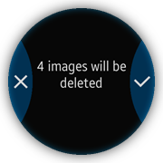
After the user clicks the footer button or selects the delete option from the selector component, the delete popup is opened.
Zoom Image
After the user double-clicks the image in the full screen mode, a zoom page is opened, showing the image with a size twice bigger than originally. A second double-click returns the image to the full screen mode.
Figure: Full screen image and zoomed image
- The zoom page view consists of content with a <div> element for the image:
<!--index.html-->
<div id="zoom-page" class="ui-page" data-enable-page-scroll="false">
   <div id="zoom-content" class="ui-content ui-scroller">
      <div id="zoom-image"></div>
   </div>
</div>
- The zoom-image element has a size twice the size of the screen, specified in the css/style.css file:
<!--css/style.css--> #zoom-image { width: 720px; height: 720px; background-size: cover; background-repeat: no-repeat; } - When the page is initialized, the HTML elements are defined and events are bound:
/* js/views/zoom.js */ define( { name: 'views/zoom', requires: [ 'helpers/doubleClick' ], def: function viewsZoom(doubleClick) { 'use strict'; var ID = Object.freeze( { PAGE: 'zoom-page', CONTENT: 'zoom-content', IMAGE: 'zoom-image' }), page = null, content = null, image = null, SCROLL_CENTER = 180; function bindEvents() { page.addEventListener('pagebeforeshow', centerContentScroll); doubleClick.addHandler(image, onDoubleClick); } function init() { page = document.getElementById(ID.PAGE); content = document.getElementById(ID.CONTENT); image = document.getElementById(ID.IMAGE); bindEvents(); } } }); - The handling of the page is implemented in the js/views/zoom.js file. The module returns the setImage() method to set the proper image in the view.
/* js/views/zoom.js */ /* @param {string} url Image url */ function setImage(url) { image.style.backgroundImage = 'url(' + url + ')'; } - Before the page show event, the scroll top and scroll left properties of the content element are set to the image center:
/* js/views/zoom.js */
function centerContentScroll()
{
   content.scrollTop = SCROLL_CENTER;
   content.scrollLeft = SCROLL_CENTER;
}
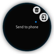
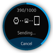
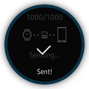
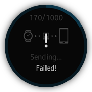
Image Sending
To send an image, the user selects the Send to phone option in the more options menu. The progress bar starts to run and the counter starts to count in the page show event.
A success popup is displayed after the sending is completed. If the user clicks Cancel, the failure popup appears.
Figure: Sending images
Before the sending page is displayed, the beforeshow event is used to create the page content:
- The progress bar component is created and the progress is started.
- The progress value is updated when the currently sent images counter is incremented.
- The success popup is shown when all selected images have been sent.
/* js/views/send.js */
function updateProgress(val, total)
{
   value.innerText = val + '/' + total;
   tau.widget.CircleProgressBar(progress).value(val * 100 / total);
}

function startProgress()
{
   progressInterval = window.setInterval(function onInterval()
   {
      if (currentValue < 1000)
      {
         currentValue += 10;
         updateProgress(currentValue, 1000);
      }
      else
      {
         window.clearInterval(progressInterval);
         progressInterval = 0;
         currentValue = 0;
         tau.widget.Popup(popup).open();
      }
   }, 50);
}

function pageBeforeShow()
{
   tau.widget.CircleProgressBar(progress, {size: 'full'});
   currentValue = 0;
   startProgress();
}