
The Settings sample application demonstrates how to create a complicated and multilevel user interface for a Tizen Web application.
The application is not fully functional: its code covers only the presentation layer, and the actual setting management is not implemented. The TAU (Tizen Advanced UI) library components are used to speed up the development process.
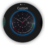
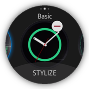
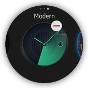
The following figure illustrates some of the screens of the Settings application.
Figure: Settings screens
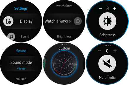
The application's features are grouped thematically into several multilevel views. The main view shows the top level groups.
To move in the UI:
- To go to the deeper level, tap the applicable list row.
If the feature supports additional settings, the new view opens.
- To go back to an upper level, use the flick down gesture or the device Back key.
- Some of the views use the swipe left and right gestures to navigate between their subviews.
In such cases, the page indicator component is shown at the top of the screen (for example, see the volume view at bottom right in the above figure).
Source Files
You can create and view the sample application project including the source files in the IDE.
The application uses a simple MV (Model View) architecture, which contains the core part determining the architecture and the application part determining the application behavior. The core.js file implements a simple AMD (Asynchronous Module Definition) and specifies module defining.
| File name | Description |
|---|---|
| config.xml | This file contains the application information for the platform to install and launch the application, including the view mode and the icon to be used in the device menu. |
| css/style.css | This file contains the CSS styling for the application UI. |
| css/tau-custom.css | This file contains the custom CSS styling for the TAU components. |
| images/ | This directory contains all the images used in the application. |
| index.html | This is a starting file from which the application starts loading. It contains the layout of the application screens. |
| js/app.js | This file contains the code for the main application module used for initialization. |
| js/core/ | This directory contains the core modules used in other parts of the application code. |
| js/helpers/ | This directory contains the helper functions for lists and DOM manipulation. |
| js/views/ | This directory contains code handling UI events for all pages. |
| lib/tau | This directory contains TAU library files. |
Implementation
The Settings sample consists of many views (pages), and this topic describes an example of each view type and how various components are used to build the application pages. Other views are created similarly.
The most commonly used components and solutions are:
- List with thumbnail images and scroll animation
The main page uses this solution.
- List with subtext elements and toggle switches without a confirmation popup
The vibration, sound, gesture, date and time, Bluetooth, Wi-Fi, NFC, accessibility, vision, and hearing pages use this solution.
- List with text elements and toggle switches with a confirmation popup displayed when the toggle state is being changed from off to on
The display, call, call forwarding, mobile networks, and Gear info pages use this solution.
- List with text elements and toggle switches with a confirmation popup displayed when the toggle state is being changed
The mobile networks page uses this solution.
- Section changer and page indicator TAU components
The watch faces page uses this solution.
- Number selector
The call forwarding page uses this solution.
- Rotary event handling
The set date and set time pages use this solution.
- Slider TAU component
The brightness and volume pages use this solution.
- Marquee TAU component
The display, device, gesture, network operators, hearing, and Gear info pages use this solution.
- Radio buttons with auto return on select
The sound mode, font style, font size, double press home key, and network mode pages use this solution.
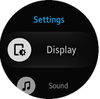
List with Thumbnail Images and Scroll Animation
The main page shows how to use a list with thumbnails and scroll animation. The main page displays a list of settings groups.
Figure: Main screen
Layout
The layout consists of a header and a list:
<!--index.html-->
<div class="ui-page ui-page-active" id="main">
   <header class="ui-header">
      <h2 class="ui-title">Settings</h2>
   </header>
   <div class="ui-content">
      <ul class="ui-listview">
         <li class="li-has-thumb-left">
            <a href="#display">
               Display
               <div class="img-icon display-icon ui-li-thumb-left"></div>
            </a>
         </li>
         <li class="li-has-thumb-left">
            <a href="#sound">
               Sound
               <div class="img-icon sound-icon ui-li-thumb-left"></div>
            </a>
         </li>
         <li class="li-has-thumb-left">
            <a href="#device">
               Device
               <div class="img-icon device-icon ui-li-thumb-left"></div>
            </a>
         </li>
         <!--Other list items-->
      </ul>
   </div>
</div>
Some extra CSS code is required for thumbnail images. Mask images are used for this purpose. All images are located in the images folder in the root of the application.
<!--css/style.css-->
<!--List element thumbnail-->
.ui-li-thumb-left
{
   border-radius: 50%;
}

.ui-listview li.li-has-thumb-left .img-icon
{
   left: 30px;
}

.ui-listview li .img-icon
{
   position: absolute;
   top: 50%;
   width: 86px;
   height: 86px;
   margin: 0;
   padding: 0;
   -webkit-transform: translate3d(0, -50%, 0);
   background-color: rgba(245, 245, 245, 1);
}

.ui-listview li .img-icon:before
{
   position: absolute;
   content: "";
   top: 0;
   left: 0;
   width: 100%;
   height: 100%;
   -webkit-mask-size: 100% 100%;
   background-color: rgb(0, 0, 0);
   -webkit-mask-repeat: no-repeat;
}

.display-icon:before
{
   -webkit-mask-image: url(../images/b_settings_list_display.png);
}

.sound-icon:before
{
   -webkit-mask-image: url(../images/b_settings_list_sound.png);
}

.device-icon:before
{
   -webkit-mask-image: url(../images/b_settings_list_device.png);
}

.connections-icon:before
{
   -webkit-mask-image: url(../images/b_settings_list_connections.png);
}

.screen-lock-icon:before
{
   -webkit-mask-image: url(../images/b_settings_list_security.png);
}

.accessibility-icon:before
{
   -webkit-mask-image: url(../images/b_settings_list_accessibility.png);
}

.input-icon:before
{
   -webkit-mask-image: url(../images/b_settings_list_input.png);
}

.power-saving-icon:before
{
   -webkit-mask-image: url(../images/b_settings_list_power_saving.png);
}

.gear-info-icon:before
{
   -webkit-mask-image: url(../images/b_settings_list_gear_info.png);
}
Module
The views/main module loads all of its subview modules.
The module also uses a list helper to add a scale animation effect while the page is being scrolled (listHelper.animate()). The list helper is used in all views containing lists.
/* js/views/main.js */
/* Main view module */
define(
{
   name: 'views/main',
   requires:
   [
      'views/display',
      'views/sound',
      'views/screenLock',
      'views/input',
      'views/gearInfo',
      'views/device',
      'views/connections',
      'views/accessibility',
      'helpers/list'
   ],
   def: function main(req)
   {
      'use strict';

      /*
         List helper module instance.
         @type {Module}
      */
      var listHelper = req.helpers.list,

          /*
             Page element
             @type {HTMLElement}
          */
          page = null;

      /* Initialize the module */
      function init()
      {
         page = document.getElementById('main');
         listHelper.animate(page);
      }

      return
      {
         init: init
      };
   }
});
Scroll Animation Effect
The list helper provides the animate() method, which adds a scroll animation effect (scale) to a specified page (as a parameter).
The module adds listeners for the pagebeforeshow and pagebeforehide events. Before the page opens, it creates a tau.helper.SnapListStyle instance with the scale animation. The instance is destroyed when the page is hidden. The animation is used by all of the list-based pages and is added immediately if a specified page is already active.
/* js/helpers/list.js */
/* List helper module */
define(
{
   name: 'helpers/list',
   requires:
   [
      'helpers/dom'
   ],
   def: function list(domHelper)
   {
      'use strict';

      /*
         Snap list style helper instance
         @type {SnapListStyle}
      */
      var listHelper = null,

          /*
             Scrolled element
             @type {HTMLElement}
          */
          scrolledElement = null;

      /*
         Add animation effects to the list in a scrolled element
         @param {HTMLElement} page
      */
      function addAnimation(page)
      {
         var list = null;

         scrolledElement = page.querySelector('.ui-scroller');

         if (scrolledElement)
         {
            list = scrolledElement.querySelector('.ui-listview');
         }

         if (scrolledElement && list)
         {
            listHelper = tau.helper.SnapListStyle.create(list, {animate: 'scale'});
            scrolledElement.setAttribute('tizen-circular-scrollbar', '');
         }
      }

      /* Remove animation effects from the list in a scrolled element */
      function removeAnimation()
      {
         if (listHelper)
         {
            listHelper.destroy();
            listHelper = null;

            if (scrolledElement)
            {
               scrolledElement.removeAttribute('tizen-circular-scrollbar');
            }
         }
      }

      /* Handle pagebeforeshow event on an active page element */
      function onPageBeforeShow()
      {
         /* jshint validthis:true */
         addAnimation(this);
      }

      /* Handle pagebeforehide event on an active page element */
      function onPageBeforeHide()
      {
         removeAnimation();
      }

      /*
         Provide adding and removing animation effects
         to the list in a scrolled element
         @param {HTMLElement} page
      */
      function animate(page)
      {
         if (page.classList.contains('ui-page-active'))
         {
            addAnimation(page);
         }

         page.addEventListener('pagebeforeshow', onPageBeforeShow);
         page.addEventListener('pagebeforehide', onPageBeforeHide);
      }

      return
      {
         animate: animate,
      };
   }
});
List with Subtext Elements and Toggle Switches without a Confirmation Popup
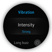
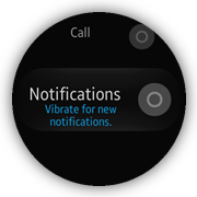
The vibration page is one of the views that shows a list with animated subtext elements and toggle switches without a confirmation popup. It displays a list of settings for the device vibration. The user can change the state of the toggle switch without any additional popup confirmation.
Figure: Vibration screen
Layout
The layout consists of a header displaying the page name and a list displaying the settings. TAU subtext elements and toggle switches are used.
<!--index.html-->
<div class="ui-page" id="vibration">
   <header class="ui-header">
      <h2 class="ui-title">Vibration</h2>
   </header>
   <div class="ui-content">
      <ul class="ui-listview">
         <li class="li-has-2line">
            <a href="#vibration-intensity">
               Intensity
               <span id="vibration-intensity-value" class="li-text-sub ui-li-sub-text">Strong</span>
            </a>
         </li>
         <li class="li-has-toggle">
            <label class="ui-custom-toggleswitch-label">
               Long buzz
               <div class="ui-toggleswitch ui-custom-toggleswitch">
                  <input type="checkbox" class="ui-switch-input">
                  <div class="ui-switch-button"></div>
               </div>
            </label>
         </li>
         <li class="li-has-toggle li-has-2line">
            <label class="ui-custom-toggleswitch-label">
               Call
               <span class="li-text-sub ui-li-sub-text li-text-sub-2-lines">Vibrate for incoming calls.</span>
               <div class="ui-toggleswitch ui-custom-toggleswitch">
                  <input type="checkbox" class="ui-switch-input">
                  <div class="ui-switch-button"></div>
               </div>
            </label>
         </li>
         <li class="li-has-toggle li-has-2line">
            <label class="ui-custom-toggleswitch-label">
               Notifications
               <span class="li-text-sub ui-li-sub-text li-text-sub-2-lines">Vibrate for new notifications.</span>
               <div class="ui-toggleswitch ui-custom-toggleswitch">
                  <input type="checkbox" class="ui-switch-input">
                  <div class="ui-switch-button"></div>
               </div>
            </label>
         </li>
      </ul>
   </div>
</div>
Some extra CSS code is required for subtext element animation. The opacity transition is used to create a smooth fade in and fade out effect.
<!--css/style.css-->
.ui-listview li.li-has-2line .ui-li-sub-text
{
   -webkit-transform: translate3d(0, 0, 0);
   opacity: 0;
   -webkit-transition: all ease 1s;
}

.ui-listview li.li-has-2line.ui-snap-listview-selected .ui-li-sub-text
{
   -webkit-transform: translate3d(0, 0, 0);
   opacity: 1;
   -webkit-transition: all ease 1s;
}
Module
The views/vibration module loads a sub-view module, a list helper module responsible for the scroll animation effect, and a page helper module responsible for resetting the page scroll position. It also updates the UI with the current setting values (vibration intensity), when the page is being shown (in the pagebeforeshow event).
/* views/vibration.js */
/* Vibration view module */
define(
{
   name: 'views/vibration',
   requires:
   [
      'views/vibrationIntensity',
      'helpers/list',
      'helpers/page'
   ],
   def: function vibrationDefine(req)
   {
      'use strict';

      /*
         List helper module instance
         @type {Module}
      */
      var listHelper = req.helpers.list,

          /*
             Page helper module instance
             @type {Module}
          */
          pageHelper = req.helpers.page,

          /*
             Vibration intensity view module
             @type {Module}
          */
          vibrationIntensityView = req.views.vibrationIntensity,

          /*
             Page element
             @type {HTMLElement}
          */
          page = null;

      /* Handle pagebeforeshow event */
      function onPageBeforeShow()
      {
         pageHelper.resetScroll(page);
         page.querySelector('#vibration-intensity-value').innerText = vibrationIntensityView.getCurrentValue();
      }

      /* Register the module's event listeners */
      function bindEvents()
      {
         page.addEventListener('pagebeforeshow', onPageBeforeShow);
      }

      /* Initialize the module */
      function init()
      {
         page = document.getElementById('vibration');

         listHelper.animate(page);
         bindEvents();
      }

      return
      {
         init: init
      };
   }
});
Page Scroll Reset
The page helper provides the resetScroll() method, which allows the application to make a decision on whether the page scroll must be reset.
The best moment for the resetScroll() method call is the pagebeforeshow event listened for by the page element. According to the logic of this module, the page scroll is reset always, except the situation when the page is displayed after a history back action. This core functionality is based on the popstate event listened for by the window element, the pageshow event listened for by the document element, and the historyBack variable, whose value decides whether the page scroll is reset.
This module is used in a similar way by many of the application page modules.
/* js/helpers/page.js */
/* Page helper module */
define(
{
   name: 'helpers/page',
   requires: [],
   def: function pageHelper()
   {
      'use strict';

      /*
         Indicate whether a history back event occurs
         @type {boolean}
      */
      var historyBack = false;

      /* Handle a popstate event on a window element */
      function onWindowPopstate()
      {
         historyBack = true;
      }

      /* Handle a pageshow event on a document element */
      function onPageShow()
      {
         historyBack = false;
      }

      /*
         Reset the scroll position of the given page
         @param {HTMLElement} page
      */
      function resetScroll(page)
      {
         if (!historyBack)
         {
            page.querySelector('.ui-scroller').scrollTop = 0;
         }
      }

      /* Register event listeners */
      function bindEvents()
      {
         window.addEventListener('popstate', onWindowPopstate, true);
         document.addEventListener('pageshow', onPageShow);
      }

      /* Initialize the module */
      function init()
      {
         bindEvents();
      }

      return
      {
         init: init,
         resetScroll: resetScroll
      };
   }
});
List with Text elements and Toggle Switches with a Confirmation Popup for Toggle State On Events
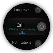
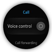
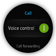
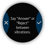
The call page shows how to use a list with text elements and toggle switches, and a confirmation popup that is displayed when the toggle state is to be changed from off to on. This page displays a list of device call settings.
The Voice control list element uses a text element, toggle switch, and an additional popup. The user must confirm the switch on action by tapping the OK button in the displayed popup. The switch off action requires no confirmation.
Figure: Call screen and confirmation popup
Layout
The layout consists of a header displaying the page name and a list displaying the settings:
<!--index.html-->
<div class="ui-page" id="call">
   <header class="ui-header">
      <h2 class="ui-title">Call</h2>
   </header>
   <div class="ui-content">
      <ul class="ui-listview">
         <li id="voice-control" class="li-has-toggle">
            <label class="ui-custom-toggleswitch-label">
               <div class="ui-marquee ui-marquee-gradient">Voice control</div>
               <div class="ui-toggleswitch ui-custom-toggleswitch">
                  <input id="voice-control-input" type="checkbox"
                         class="ui-switch-input"/>
                  <div class="ui-switch-button"></div>
               </div>
            </label>
            <div class="ui-li-cover"></div>
         </li>
         <li>
            <a href="#call-forwarding">Call forwarding</a>
         </li>
      </ul>
   </div>

   <div id="voice-control-popup" class="ui-popup">
      <div class="ui-popup-content">
         Say "Answer" or "Reject" between vibrations.
      </div>
      <div class="ui-popup-footer ui-side-button ui-grid-col-2">
         <a href="#" class="ui-btn btn-erase" data-rel="back">Cancel</a>
         <a id="voice-control-popup-ok-btn" href="#" class="ui-btn btn-apply"
            data-rel="back">OK</a>
      </div>
   </div>
</div>
Some extra CSS code is required for the toggle switch element and popup layout:
<!--css/style.css-->
.ui-custom-toggleswitch
{
   width: 70px;
   height: 70px;
}

.ui-listview.ui-snap-listview li.li-has-toggle > .ui-custom-toggleswitch-label
{
   padding-left: 14px;
   padding-right: 114px;
}

.ui-li-cover
{
   position: absolute;
   left: 0;
   top: 0;
   width: 100%;
   height: 100%;
}

.btn-apply:before
{
   -webkit-mask-image: url(../images/tw_ic_popup_btn_check.png);
   background-color: #fff;
}

.btn-erase:before
{
   -webkit-mask-image: url(../images/tw_ic_popup_btn_delete.png);
   background-color: #fff;
}

.btn-apply, .btn-erase, .btn-cancel
{
   color: transparent;
}
Module
The views/call module loads a subview module and all the necessary helper modules, including popup, which is responsible for resetting the popup scroll position.
To prevent the user from changing the voice control switch state from off to on without confirmation action, the application supports the <div class="ui-li-cover"></div> element (layer) that covers the clickable label of the Voice control list element. To make decision on whether the confirmation popup must be displayed, the application listens for the click event on the Voice control list element. When the event occurs, the application checks the toggle switch state. If the state is off, the confirmation popup is opened, otherwise the click() method of the toggle switch component is called in order to change its state without confirmation.
/* views/call.js */
/* Call view module */
define(
{
   name: 'views/call',
   requires:
   [
      'views/callForwarding',
      'helpers/list',
      'helpers/popup',
      'helpers/page'
   ],
   def: function call(req)
   {
      'use strict';

      /*
         List helper module instance
         @type {Module}
      */
      var listHelper = req.helpers.list,

          /*
             Popup helper module instance
             @type {Module}
          */
          popupHelper = req.helpers.popup,

          /*
             Page helper module instance
             @type {Module}
          */
          pageHelper = req.helpers.page,

          /*
             Page element
             @type {HTMLElement}
          */
          page = null,

          /*
             Voice control element
             @type {HTMLElement}
          */
          voiceControl = null,

          /*
             Voice control popup element
             @type {HTMLElement}
          */
          voiceControlPopup = null,

          /*
             Voice control popup OK button
             @type {HTMLElement}
          */
          voiceControlPopupOkBtn = null,

          /*
             Voice control toggle switch element
             @type {HTMLElement}
          */
          voiceControlToggleSwitch = null,

          /*
             Voice control input element
             @type {HTMLElement}
          */
          voiceControlInput = null;

      /* Handle a click event on a watch always on element */
      function onVoiceControlClick()
      {
         if (voiceControlInput.checked)
         {
            voiceControlToggleSwitch.click();
         }
         else
         {
            tau.openPopup(voiceControlPopup);
         }
      }

      /* Handle a click event on a voice control popup ok button */
      function onVoiceControlPopupOkBtnClick()
      {
         voiceControlToggleSwitch.click();
      }

      /* Handle a click event on a toggle switch element */
      function onVoiceControlToggleSwitchClick(e)
      {
         e.stopPropagation();
      }

      /* Handle a pagebeforeshow event on a page element */
      function onPageBeforeShow()
      {
         pageHelper.resetScroll(page);
      }

      /* Register event listeners */
      function bindEvents()
      {
         page.addEventListener('pagebeforeshow', onPageBeforeShow);
         voiceControl.addEventListener('click', onVoiceControlClick);
         voiceControlToggleSwitch.addEventListener('click', onVoiceControlToggleSwitchClick);
         voiceControlPopupOkBtn.addEventListener('click', onVoiceControlPopupOkBtnClick);
      }

      /* Initialize the module */
      function init()
      {
         page = document.getElementById('call');
         voiceControl = document.getElementById('voice-control');
         voiceControlPopup = document.getElementById('voice-control-popup');
         voiceControlPopupOkBtn = document.getElementById('voice-control-popup-ok-btn');
         voiceControlToggleSwitch = document.querySelector('#voice-control .ui-toggleswitch');
         voiceControlInput = document.getElementById('voice-control-input');

         bindEvents();

         listHelper.animate(page);
         popupHelper.resetScrollBeforeOpen(voiceControlPopup);
      }

      return
      {
         init: init
      };
   }
});
Popup Scroll Reset
The popup helper provides the resetScrollBeforeOpen() method, which allows the application to reset the popup scroll every time it is opened.
The best moment for the resetScrollBeforeOpen() method call is the init() method of the page that uses the popup. This method takes 2 parameters, the reference to the popup element and an optional scroll position value, to which the popup scroll must be reset. The popup helper defines a handler that is called when the popupbeforeshow event of a given popup element occurs. In such a situation, the popup scroll is reset.
This module is used in a similar way by many of the application page modules.
/* js/helpers/popup.js */
/* Popup helper module */
define(
{
   name: 'helpers/popup',
   requires: [],
   def: function popupHelper()
   {
      'use strict';

      /*
         Reset the popup scroll
         @param {number} [position=0]
      */
      function resetScroll(position)
      {
         /* jshint validthis:true */
         var self = this;

         setTimeout(function onTimeout()
         {
            self.querySelector('.ui-popup-wrapper').scrollTop = position || 0;
         }, 0);
      }

      /*
         Handle a popupbeforeshow event on a given popup element
         @param {HTMLElement} popup
         @param {number} [position=0]
      */
      function resetScrollBeforeOpen(popup, position)
      {
         popup.addEventListener('popupbeforeshow', resetScroll.bind(popup, position));
      }

      return
      {
         resetScrollBeforeOpen: resetScrollBeforeOpen
      };
   }
});
List with Text Elements and Toggle Switches with a Confirmation Popup for Toggle State Changes
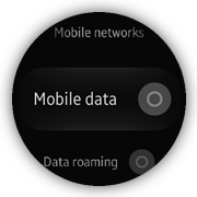
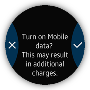
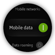
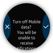
The mobile networks page shows how to use a list with text elements and toggle switches, with a confirmation popup that is displayed when the toggle state is changed. This page displays a list of device mobile network settings.
The Mobile data list element uses a text element, toggle switch, and an additional popup. The user must confirm both switch on and switch off actions by tapping the OK button in the displayed popup.
Figure: Mobile networks screen and confirmation popup
Layout
The layout consists of a header displaying the page name and a list displaying the settings:
<!--index.html-->
<div class="ui-page" id="mobile-networks">
   <header class="ui-header">
      <h2 class="ui-title">Mobile networks</h2>
   </header>
   <div class="ui-content">
      <ul class="ui-listview">
         <!--Other list elements-->
         <li id="mobile-data-switch" class="li-has-toggle">
            <label class="ui-custom-toggleswitch-label">
               Mobile data
               <div class="ui-toggleswitch ui-custom-toggleswitch">
                  <input id="mobile-data-switch-input" type="checkbox"
                         class="ui-switch-input"/>
                  <div class="ui-switch-button"></div>
               </div>
            </label>
            <div class="ui-li-cover"></div>
         </li>
         <!--Other list elements-->
      </ul>
   </div>
   <div id="mobile-data-switch-on-popup" class="ui-popup">
      <div class="ui-popup-content">
         Turn on Mobile data?
         <br>
         This may result in additional charges.
      </div>
      <div class="ui-popup-footer ui-side-button ui-grid-col-2">
         <a href="#" class="ui-btn btn-erase" data-rel="back">Cancel</a>
         <a id="mobile-data-switch-on-popup-ok-btn" href="#"
            class="ui-btn btn-apply" data-rel="back">OK</a>
      </div>
   </div>
   <div id="mobile-data-switch-off-popup" class="ui-popup">
      <div class="ui-popup-content">
         Turn off Mobile data?
         <br>
         You will be unable to receive notifications or use apps that require
         internet access.
      </div>
      <div class="ui-popup-footer ui-side-button ui-grid-col-2">
         <a href="#" class="ui-btn btn-erase" data-rel="back">Cancel</a>
         <a id="mobile-data-switch-off-popup-ok-btn" href="#"
            class="ui-btn btn-apply" data-rel="back">OK</a>
      </div>
   </div>
</div>
Some extra CSS code is required for the toggle switch element and popup layout. The example snippet is shown in the previous section.
Module
The views/mobileNetworks module loads all necessary subviews and helper modules.
To prevent the user from changing the mobile data switch without confirmation action, the application supports the <div class="ui-li-cover"></div> element (layer) that covers the clickable label of the Mobile data list element. To make a decision on which popup must be displayed, the application listens for the click event on the Mobile data list element. When the event occurs, the application checks the toggle switch state. Depending on the value of the state, the application opens the proper confirmation popup (mobileDataSwitchOnPopup or mobileDataSwitchOffPopup). When the user clicks the OK button in the displayed popup, the click() method of the toggle switch component is called in order to change the toggle switch state after confirmation.
/* views/mobileNetworks.js */
/* Mobile networks view module */
define(
{
   name: 'views/mobileNetworks',
   requires:
   [
      'views/mobileNetworksSwitch',
      'views/networkMode',
      'views/networkOperators',
      'helpers/list',
      'helpers/popup',
      'helpers/page'
   ],
   def: function mobileNetworks(req)
   {
      'use strict';

      /*
         List helper module instance
         @type {Module}
      */
      var listHelper = req.helpers.list,

          /*
             Popup helper module instance
             @type {Module}
          */
          popupHelper = req.helpers.popup,

          /*
             Page helper module instance
             @type {Module}
          */
          pageHelper = req.helpers.page,

          /*
             Mobile networks switch view module
             @type {Module}
          */
          mobileNetworksSwitchView = req.views.mobileNetworksSwitch,

          /*
             Network mode view module
             @type {Module}
          */
          networkModeView = req.views.networkMode,

          /*
             Page element
             @type {HTMLElement}
          */
          page = null,

          /*
             Mobile data switch element
             @type {HTMLElement}
          */
          mobileDataSwitch = null,

          /*
             Mobile data switch on popup element
             @type {HTMLElement}
          */
          mobileDataSwitchOnPopup = null,

          /*
             Mobile data switch off popup element
             @type {HTMLElement}
          */
          mobileDataSwitchOffPopup = null,

          /*
             Mobile data switch on popup OK button
             @type {HTMLElement}
          */
          mobileDataSwitchOnPopupOkBtn = null,

          /*
             Mobile data switch off popup OK button
             @type {HTMLElement}
          */
          mobileDataSwitchOffPopupOkBtn = null,

          /*
             Mobile data toggle switch element
             @type {HTMLElement}
          */
          mobileDataToggleSwitch = null,

          /*
             Mobile data switch input element
             @type {HTMLElement}
          */
          mobileDataSwitchInput = null,

      /* Handle a pagebeforeshow event */
      function onPageBeforeShow()
      {
         pageHelper.resetScroll(page);
         page.querySelector('#mobile-networks-value').innerText = mobileNetworksSwitchView.getCurrentValue();
         page.querySelector('#network-mode-value').innerText = networkModeView.getCurrentValue();
      }

      /* Handle a click event on a mobile data switch element */
      function onMobileDataSwitchClick()
      {
         if (mobileDataSwitchInput.checked)
         {
            tau.openPopup(mobileDataSwitchOffPopup);
         }
         else
         {
            tau.openPopup(mobileDataSwitchOnPopup);
         }
      }

      /* Handle a click event on a mobile data toggle switch element */
      function onMobileDataToggleSwitchClick(e)
      {
         e.stopPropagation();
      }

      /* Handle a click event on a mobile data switch on popup OK button */
      function onMobileDataSwitchPopupOkBtnClick()
      {
         mobileDataToggleSwitch.click();
      }

      /* Register module event listeners */
      function bindEvents()
      {
         page.addEventListener('pagebeforeshow', onPageBeforeShow);
         mobileDataSwitch.addEventListener('click', onMobileDataSwitchClick);
         mobileDataToggleSwitch.addEventListener('click', onMobileDataToggleSwitchClick);
         mobileDataSwitchOnPopupOkBtn.addEventListener('click', onMobileDataSwitchPopupOkBtnClick);
         mobileDataSwitchOffPopupOkBtn.addEventListener('click', onMobileDataSwitchPopupOkBtnClick);
      }

      /* Initialize the module */
      function init()
      {
         page = document.getElementById('mobile-networks');
         mobileDataSwitch = document.getElementById('mobile-data-switch');
         mobileDataSwitchOnPopup = document.getElementById('mobile-data-switch-on-popup');
         mobileDataSwitchOffPopup = document.getElementById('mobile-data-switch-off-popup');
         mobileDataSwitchOnPopupOkBtn = document.getElementById('mobile-data-switch-on-popup-ok-btn');
         mobileDataSwitchOffPopupOkBtn = document.getElementById('mobile-data-switch-off-popup-ok-btn');
         mobileDataToggleSwitch = document.querySelector('#mobile-data-switch .ui-toggleswitch');
         mobileDataSwitchInput = document.getElementById('mobile-data-switch-input');

         bindEvents();

         listHelper.animate(page);
         popupHelper.resetScrollBeforeOpen(mobileDataSwitchOnPopup);
         popupHelper.resetScrollBeforeOpen(mobileDataSwitchOffPopup);
      }

      return
      {
         init: init
      };
   }
});
Section Changer and Page Indicator TAU Components
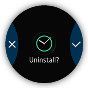
The watch faces page shows how to use the section changer TAU component together with the page indicator TAU component on the same page. This page provides a UI that allows the user to manage the appearance of the watch faces. The user can set up the active face, or uninstall a selected face. Additionally, the application allows the user to stylize the selected faces.
To show the list of available faces, the application uses the section changer component. It allows the user to navigate between different sections of the same page using the swipe left and right gestures. To make the navigation more intuitive, the application uses the page indicator component, which indicates the position of the currently displayed face on the section face list.
Figure: Watch faces screens
Layout
The layout consists of 6 main elements, page indicator, content with a section changer, section name element, footer with the STYLIZE button, remove popup, and change face processing element:
<!--index.html-->
<div id="faces" class="ui-page ui-indicator-circle-page"
   data-enable-page-scroll="false">
   <div id="page-indicator" class="ui-page-indicator" data-layout="circular"></div>

   <div id="h-section-changer" class="ui-content">
      <div>
         <section class="ui-section-active ui-section-current"
                  data-name="Custom" data-stylize="false">
            <div class="ui-section-thumbnail face-1"></div>
            <div class="ui-section-remove" data-id="1"></div>
         </section>
         <section data-name="Basic" data-stylize="true">
            <div class="ui-section-thumbnail face-2"></div>
            <div class="ui-section-remove" data-id="2"></div>
         </section>
         <section data-name="Modern" data-stylize="false">
            <div class="ui-section-thumbnail face-3"></div>
            <div class="ui-section-remove" data-id="3"></div>
         </section>
      </div>
   </div>

   <div id="h-section-name" class="h-section-name">Basic</div>

   <footer class="ui-footer ui-bottom-button ui-fixed">
      <button class="ui-btn">STYLIZE</button>
   </footer>

   <div id="remove-face-popup" class="ui-popup">
      <div class="ui-popup-content">
         <div class="remove-face-thumbnail"></div>
         Uninstall?
      </div>
      <div class="ui-popup-footer ui-side-button ui-grid-col-2">
         <a href="#" class="ui-btn btn-erase" data-rel="back">Cancel</a>
         <a href="#" class="ui-btn btn-apply" data-rel="back">OK</a>
      </div>
   </div>

   <div id="face-change-processing"
      class="ui-processing ui-processing-full-size invisible"></div>
</div>
Some extra CSS code is required for the watch faces page element layout:
<!--css/style.css-->
#faces .ui-footer.ui-bottom-button .ui-btn
{
   left: 50%;
   width: 100%;
   height: 130%;
   position: relative;
   margin: 0;
   padding: 8% 22% 16%;
   background: -webkit-radial-gradient(center, circle cover,
                                       rgba(100, 100, 100, 0.3) 50%,
                                       transparent 50%);
   background-size: 300% 840%;
   background-position: 50% 17%;
   background-repeat: no-repeat;
   -webkit-transition: transform 150ms ease-out;
}

.h-section-name
{
   position: absolute;
   top: 32px;
   left: 100px;
   right: 100px;
   height: 36px;
   line-height: 36px;
   text-align: center;
   font-size: .9em;
}

.remove-face-thumbnail
{
   width: 110px;
   height: 110px;
   border-radius: 50%;
   margin: auto;
   background-repeat: no-repeat;
   background-position: center;
   background-size: cover;
}

#remove-face-popup .ui-popup-wrapper
{
   overflow-y: hidden !important;
}
Module
The views/faces module loads all necessary subviews and helper modules.
The initializeCirclePageIndicator() method is responsible for the page indicator and section changer component initialization. It is called when the page is being shown and during the views/faces module initialization. When the page is being hidden, the application calls the destroyCirclePageIndicator() method, which destroys the previously used TAU components.
The section changer component listens for 2 events:
- The sectionchange event occurs after a swipe left or right user action performed on the section content. When it happens, the application updates the page indicator using the setActive() method of the page indicator component. At the same time, the section name and footer visibility are updated.
- The click event occurs after a click user action performed on the section content. When it happens, the application checks which part of the section content is clicked. If it is the remove icon, the remove popup is displayed. Otherwise, the application displays the face change processing progress element and, after 2 seconds, the application is closed.
/* views/faces.js */
/* Watch faces view module */
define(
{
   name: 'views/faces',
   requires:
   [
      'core/application',
      'helpers/dom'
   ],
   def: function faces(req)
   {
      'use strict';

      /*
         Application core module
         @type {Module}
      */
      var app = req.core.application,

          /*
             DOM helper module
             @type {Module}
          */
          domHelper = req.helpers.dom,

          /*
             Page element
             @type {HTMLElement}
          */
          page = null,

          /*
             Page indicator instance
             @type {PageIndicator}
          */
          pageIndicator = null,

          /*
             Section changer instance
             @type {SectionChanger}
          */
          sectionChanger = null,

          /*
             Page indicator element
             @type {HTMLElement}
          */
          elPageIndicator = null,

          /*
             Section changer element
             @type {HTMLElement}
          */
          hSectionChanger = null,

          /*
             Section name element
             @type {HTMLElement}
          */
          hSectionName = null,

          /*
             Collections of the element
             @type {HTMLElement}
          */
          sections = null,

          /*
             Remove face popup element
             @type {HTMLElement}
          */
          removeFacePopup = null,

          /*
             Face change processing element
             @type {HTMLElement}
          */
          faceChangeProcessing = null;

      /*
         Set the section name
         @param {string} name
      */
      function setSectionName(name)
      {
         hSectionName.innerText = name;
      }

      /*
         Set the footer visibility
         @param {boolean} isVisible
         @param {HTMLElement} footer
      */
      function setFooterVisibility(isVisible, footer)
      {
         if (isVisible === 'true')
         {
            footer.classList.remove('hidden');
         }
         else
         {
            footer.classList.add('hidden');
         }
      }

      /*
         Show the remove face popup
         @param {string} faceId
      */
      function showRemoveFacePopup(faceId)
      {
         removeFacePopup.querySelector('.remove-face-thumbnail')
            .style.backgroundImage = 'url(images/face_' + faceId + '.png)';
         tau.openPopup(removeFacePopup);
      }

      /* Hide face change processing */
      function hideFaceChangeProcessing()
      {
         faceChangeProcessing.classList.add('invisible');
         app.exit();
      }

      /* Show face change processing */
      function showFaceChangeProcessing()
      {
         faceChangeProcessing.classList.remove('invisible');
         setTimeout(hideFaceChangeProcessing, 2000);
      }

      /*
         Handle a sectionchange event on a section changer element
         @param {HTMLElement} page
         @param {event} e
      */
      function onSectionChange(page, e)
      {
         var sectionActive = page.querySelector('.ui-section-active');

         pageIndicator.setActive(e.detail.active);
         setSectionName(sectionActive.getAttribute('data-name'));
         setFooterVisibility(sectionActive.getAttribute('data-stylize'),
                             page.querySelector('.ui-footer')
         );
      }

      /*
         Handle a click event on a section changer element
         @param {event} e
      */
      function onHSectionChangerClick(e)
      {
         var element = e.target,
             parentSection = domHelper.closest(element, 'section');

         if (element.classList.contains('ui-section-remove'))
         {
            showRemoveFacePopup(element.getAttribute('data-id'));
         }

         if (element.classList.contains('ui-section-thumbnail') &&
             !parentSection.classList.contains('ui-section-current'))
         {
            showFaceChangeProcessing();
         }
      }

      /*
         Initialize the circle page indicator
         @param {HTMLElement} page
      */
      function initializeCirclePageIndicator(page)
      {
         var sectionActive = page.querySelector('.ui-section-active');

         elPageIndicator = page.querySelector('#page-indicator');
         hSectionChanger = page.querySelector('#h-section-changer');
         hSectionName = page.querySelector('#h-section-name');
         sections = hSectionChanger.querySelectorAll('section');

         pageIndicator = tau.widget.PageIndicator(elPageIndicator,
         {
            numberOfPages: sections.length
         });
         pageIndicator.setActive(0);

         sectionChanger = new tau.widget.SectionChanger(hSectionChanger,
         {
            circular: true,
            orientation: 'horizontal',
            fillContent: false,
            useBouncingEffect: true
         });

         setSectionName(sectionActive.getAttribute('data-name'));

         setFooterVisibility(sectionActive.getAttribute('data-stylize'),
                             page.querySelector('.ui-footer')
         );

         hSectionChanger.addEventListener('sectionchange',
                                          onSectionChange.bind(null, page), false
         );

         hSectionChanger.addEventListener('click', onHSectionChangerClick);
      }

      /* Destroy the circle page indicator */
      function destroyCirclePageIndicator()
      {
         if (sectionChanger)
         {
            sectionChanger.destroy();
         }
         if (pageIndicator)
         {
            pageIndicator.destroy();
         }
      }

      /*
       * Handle a pagebeforeshow event on an active page element
       * @param {HTMLElement} page
      */
      function onPageBeforeShow(page)
      {
         initializeCirclePageIndicator(page);
      }

      /* Handle a pagebeforehide event on an active page element */
      function onPageBeforeHide()
      {
         destroyCirclePageIndicator();
      }

      /*
         Provide adding and removing animation effects
         to the list in a scrolled element
      */
      function createCirclePageIndicator()
      {
         if (page.classList.contains('ui-page-active'))
         {
            initializeCirclePageIndicator(page);
         }

         page.addEventListener('pagebeforeshow', onPageBeforeShow.bind(null, page));
         page.addEventListener('pagebeforehide', onPageBeforeHide);
      }

      /* Initialize the module */
      function init()
      {
         page = document.getElementById('faces');
         removeFacePopup = document.getElementById('remove-face-popup');
         faceChangeProcessing = document.getElementById('face-change-processing');
         createCirclePageIndicator();
      }

      return
      {
         init: init
      };
   }
});
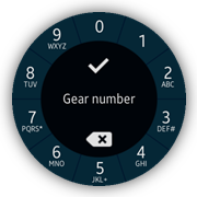
Number Selector
The call forwarding page shows the number selector screen that allows the user to select numbers.
Figure: Number selector screen
Layout
This number selector page contains the following main elements:
- Canvas element arranged as a bottom layer
- Alphanumeric buttons grouped as an ordered list
- Tap indicator
- Clickable layer
- 2 control buttons (confirm and delete)
- Preview of the user input on the top layer
All these elements are positioned absolutely.
- The layout of this page contains a set on buttons placed around the display. The user input preview and control buttons are placed in the middle of the screen.
<!--index.html-->
<div class="ui-page" id="call-forwarding-more-number-settings" data-enable-page-scroll="false">
   <div class="ui-content">
      <div class="circular-dial">
         <canvas></canvas>
         <ul class="dial-buttons">
            <li class="d0">0</li>
            <li class="d1">1</li>
            <li class="d2">2<span>ABC</span></li>
            <li class="d3">3<span>DEF#</span></li>
            <li class="d4">4<span>GHI</span></li>
            <li class="d5">5<span>JKL+</span></li>
            <li class="d6">6<span>MNO</span></li>
            <li class="d7">7<span>PQRS*</span></li>
            <li class="d8">8<span>TUV</span></li>
            <li class="d9">9<span>WXYZ</span></li>
         </ul>
         <div class="dial-indicator"></div>
         <div class="clickable-layer"></div>
         <div class="delete-button"></div>
         <div class="confirm-button "></div>
      </div>
      <div id="call-gear-number">Gear number</div>
   </div>
</div>
- To show dividers between alphanumeric buttons, the canvas element is used.
The dividers are achieved by drawing lines through the center of the canvas with the drawSegmentsDividers() method:
/* views/callForwardingNumber.js */ /* Draw segments dividers */ function drawSegmentsDividers() { /* Angular width of segment @type {number} */ var segmentAngularWidth = 2 * Math.PI / SEGMENTS_COUNT, /* First divider angle (radians) @type {number} */ startAngle = -segmentAngularWidth / 2, /* Full circle angle from first divider (radians) @type {number} */ endAngle = startAngle + 2 * Math.PI, /* Start angle (radians) @type {number} */ angle = startAngle; for (angle; angle < endAngle; angle += segmentAngularWidth) { context.beginPath(); context.moveTo((1 + Math.sin(angle)) * DEVICE_RADIUS, (1 + Math.cos(angle)) * DEVICE_RADIUS); context.lineTo((1 + Math.sin(angle + Math.PI)) * DEVICE_RADIUS, (1 + Math.cos(angle + Math.PI)) * DEVICE_RADIUS); context.stroke(); } } -
Alphanumeric buttons are positioned around and numbered with CSS rules:
<!--css/style.css--> .circular-dial ol { counter-reset: numbers -1; } .circular-dial li { position: absolute; color: #fff; font-size: 36px; line-height: 36px; counter-increment: numbers 1; } .circular-dial li:before { content: counter(numbers); } .circular-dial .d0 { top: 13px; left: 171px; } .circular-dial .d1 { top: 43px; left: 260px; } <!--Other numbers--> .circular-dial .d9 { left: 74px; top: 30px; } -
The tap indicator is a <div> element with CSS rules set by default:
<!--css/style.css--> .dial-indicator { background: rgba(255, 255, 255, .2); width: 64px; height: 64px; margin-left: -32px; margin-top: -32px; transform: scale(0); position: absolute; border-radius: 50%; opacity: .3; } - The active class is added for the element when a tap event is detected. This class applies an additional rule.
<!--css/style.css--> .dial-indicator.active { -webkit-animation: tap-indicator .3s linear; } - The class change causes an animation start. This is a simple animation of opacity and scale values.
<!--css/style.css-->
@-webkit-keyframes tap-indicator
{
   0%, 100%
   {
      opacity: .3;
      -webkit-transform: scale(0);
   }
   30%, 60%
   {
      opacity: 1;
   }
   95%
   {
      -webkit-transform: scale(1.3);
   }
}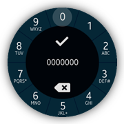
Module
The views/callForwardingNumber module loads all necessary subviews and helper modules:
- The clickable-layer element is used to capture the user interaction with alphanumeric buttons:
<!--index.html-->
<div class="clickable-layer"></div>
- The following method is used to handle the user taps:
/* views/callForwardingNumber.js */ /* Handle a click on a layer */ function onLayerClick(event) { var x = event.clientX - DEVICE_RADIUS, y = event.clientY - DEVICE_RADIUS, button = getSegment(x, y); if (vectorLength(x, y) > CLICKABLE_ZONE_DISTANCE) { addToInput(button); triggerIndicator(button); } } - When a tap event is detected, the method checks its distance to the center of the display. If the distance is bigger than a set value, the pressed segment index is calculated by the getSegment() method and the user input string is updated with the computed value. In addition, the tap indicator is shown.
/* views/callForwardingNumber.js */ /* Compute segment number by coordinates @param {number} x position horizontal component @param {number} y position vertical component @return {number} segment number */ function getSegment(x, y) { /* Segment's angular width (radians) @type {number} */ var angle = -2 * Math.PI / SEGMENTS_COUNT; return (Math.floor((Math.atan2(x, y) - 0.5 * angle) / angle) + SEGMENTS_COUNT / 2 + 1) % SEGMENTS_COUNT; } - The position of the indicator is computed, based on a preset button index:
/* views/callForwardingNumber.js */
/*
   Computes position and shows indicator
   @param {number} button Pressed button number
*/
function triggerIndicator(button)
{
   /*
      Angle between vertical axis and of line from center
      to center of pressed button (radians)
      @type {number}
   */
   var angle = button * 2 * Math.PI / SEGMENTS_COUNT - Math.PI / 2;
   dialIndicator.classList.add('active');

   /* Compute the position */
   dialIndicator.style.left = ~~(Math.cos(angle) * INDICATOR_DISTANCE + DEVICE_RADIUS) + 'px';
   dialIndicator.style.top = ~~(Math.sin(angle) * INDICATOR_DISTANCE + DEVICE_RADIUS) + 'px';

   setTimeout(function removeClass()
   {
      dialIndicator.classList.remove('active');
   }, INDICATOR_RESTORE_TIMEOUT);
}
There are 2 methods provided to manipulate the user input value:
- The addToInput() method adds one char to a string. This method is invoked when the user taps an alphanumeric button.
- The onDeleteInput() method removes the last char from a string. This method is invoked when the user taps the delete button.
Rotary Event Handling
The Set date popup is shows how to use rotary events, which improve user interaction on a wearable rotary device. The view allows the user to select and change the current system date.
Figure: Set date popup screen
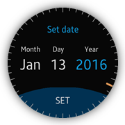
Layout
The popup is composed of a title header (Set date), current date value divided into 3 labeled parts (month, day and year), confirm button (SET) and a clock face with one hand (additional presentation of the current value). Each part of the date can be selected by making it active. The active part value can be changed by rotating the bezel of a device. The value change is also reflected by the change of the clock hand position (with smooth animation). The final date change confirmation is done by clicking SET in the footer.
<!--index.html-->
<div id="date-popup" class="ui-popup">
   <div class="ui-popup-header">Set date</div>
   <div class="ui-popup-content">
      <div class="date-container date-month-container" data-date-part="month">
         <div class="date-label month-label">Month</div>
         <div class="date-value month-value"></div>
      </div>
      <div class="date-container date-day-container" data-date-part="day">
         <div class="date-label day-label">Day</div>
         <div class="date-value day-value"></div>
      </div>
      <div class="date-container date-year-container" data-date-part="year">
         <div class="date-label year-label">Year</div>
         <div class="date-value year-value"></div>
      </div>
   </div>
   <div class="ui-popup-footer ui-bottom-button">
      <a id="date-confirm-btn" href="#" class="ui-btn">SET</a>
   </div>
   <div class="picker-layer face-layer">
      <canvas width="360" height="360"></canvas>
   </div>
   <div class="picker-layer hand-layer">
      <canvas width="360" height="360"></canvas>
   </div>
</div>
Some extra CSS code is required to position and stylize the popup elements:
<!--css/style.css-->
#date-popup .picker-layer, #time-popup .picker-layer
{
   width: 100%;
   height: 360px;
   position: absolute;
   top: 0;
   left: 0;
   pointer-events: none;
}

#date-popup .hand-layer, #time-popup .hand-layer
{
   -webkit-transition: all 0.3s ease-out;
}

#date-popup canvas, #time-popup canvas
{
   width: 100%;
   height: 100%;
}

#date-popup .ui-popup-content, #time-popup .ui-popup-content
{
   position: relative;
   padding-top: 0;
}

#date-popup .date-container, #time-popup .time-container
{
   position: absolute;
   text-align: center;
}

#date-popup .ui-popup-wrapper, #time-popup .ui-popup-wrapper
{
   overflow: hidden !important;
}

#date-popup .date-month-container
{
   width: 25%;
}

#date-popup .date-day-container
{
   left: 34%;
   width: 24%;
}

#date-popup .date-year-container
{
   left: 59%;
   width: 34%;
}

#date-popup .date-label, #time-popup .time-label
{
   font-size: 1.5rem;
}

#date-popup .date-value
{
   font-size: 3rem;
   padding-top: 6px;
}

@-webkit-keyframes date-part-blink
{
   0%
   {
      color: rgba(18, 180, 255, 1);
   }

   50%
   {
      color: #fff;
   }

   100%
   {
      color: rgba(18, 180, 255, 1);
   }
}

#date-popup .date-container.active .date-value,
#time-popup .time-container.active .time-value
{
   color: rgba(18, 180, 255, 1);
   -webkit-animation: date-part-blink 1s steps(1, end) infinite;
}
Module
The views/setDate module is responsible for managing the popup state and handling user actions. Some of the module logic is done with the help of other modules which are loaded as dependencies (helper modules):
- The module sets a listener for the rotarydetent event. When the bezel rotation is captured, the onRotaryDetent() method is called.
/* js/views/setDate.js */ /* Handle a popupbeforeshow event for a date popup */ function onPopupBeforeShow() { document.addEventListener('rotarydetent', onRotaryDetent); } - The direction of the movement is determined by the direction property of the event data. It can be one of 2 values:
- CW: for clockwise direction
- CCW: for counter-clockwise direction
The value is used to decide whether a selected part of the date (month, day, or year) must be incremented or decremented. Further processing is done by the setCurrectDatePartRelative() method.
/* js/views/setDate.js */ /* Handle a rotarydetent event @param {Event} ev */ function onRotaryDetent(ev) { var direction = ev.detail.direction, activePartElement = datePopup.querySelector('.active'), activePart = ''; ev.stopPropagation(); if (!activePartElement) { return; } activePart = activePartElement.getAttribute('data-date-part'); if (direction === 'CW') { setCurrentDatePartRelative(activePart, 1); } else if (direction === 'CCW') { setCurrentDatePartRelative(activePart, -1); } } - The setCurrentDatePartRelative() method updates a specified part of the date by a specified value. It also does some calculations to make sure the final date is valid (dateHelper is used). Finally, it changes the currentDate variable and fires an event to allow other parts of the module to update their state.
/* js/views/setDate.js */ /* Update a specified part of the date by a specified value @param {string} datePart @param {number} valueChange */ function setCurrentDatePartRelative(datePart, valueChange) { var day = currentDate.getDate(), month = currentDate.getMonth(), year = currentDate.getFullYear(), daysInMonth = 0, newDate = null; if (datePart === DATE_PART_MONTH) { month = mathHelper.mod(month + valueChange, 12); } else if (datePart === DATE_PART_YEAR) { year += valueChange; } else if (datePart === DATE_PART_DAY) { daysInMonth = dateHelper.daysInMonth(month, year); day -= 1; day = mathHelper.mod(day + valueChange, daysInMonth); day += 1; } else { return; } if (historyDate && datePart !== DATE_PART_DAY) { daysInMonth = dateHelper.daysInMonth(month, year); if (historyDate.getDate() > daysInMonth) { day = daysInMonth; } else { day = historyDate.getDate(); } } newDate = new Date(year, month, day); currentDate.setTime(newDate.getTime()); e.fire('date.changed'); } - The event is captured and the onCurrentDateChanged() method is used as a callback. It calls 2 methods, which update the user interface. The first one (updateDate()) updates the date elements, and the second one (updateHand()) calculates and updates the clock hand angle.
/* js/views/setDate.js */ /* Handle a current date change event */ function onCurrentDateChanged() { updateDate(); updateHand(); } /* js/views/setDate.js */ /* Update the whole date in the UI */ function updateDate() { updateDay(); updateMonth(); updateYear(); } /* Update the day value in the UI */ function updateDay() { datePopup.querySelector('.day-value').innerText = dateHelper.format(currentDate, 'dd'); } /* Update the month value in the UI */ function updateMonth() { datePopup.querySelector('.month-value').innerText = dateHelper.format(currentDate, 'mmm'); } /* Update the year value in the UI */ function updateYear() { datePopup.querySelector('.year-value').innerText = dateHelper.format(currentDate, 'yyyy'); } /* js/views/setDate.js */ /* Update the clock hand position basing on the current date */ function updateHand() { var activePartElement = datePopup.querySelector('.active'), activePart = '', angle = 0; if (!activePartElement) { return; } activePart = activePartElement.getAttribute('data-date-part'); if (activePart === DATE_PART_DAY) { angle = currentDate.getDate() * handAngleStep; } else if (activePart === DATE_PART_MONTH) { angle = (currentDate.getMonth() + 1) * handAngleStep; } else if (activePart === DATE_PART_YEAR) { angle = currentDate.getFullYear() % yearFaceConfig.size * handAngleStep; } else { return; } setHandAngle(angle); } /* Set a value (in degrees) for the hand angle */ function setHandAngle(value) { var normalized = mathHelper.mod(currentHandAngle, 360), distanceCCW = 0, distanceCW = 0; if (normalized === value) { return; } if (value < normalized) { distanceCW = value + 360 - normalized; distanceCCW = normalized - value; } else { distanceCW = value - normalized; distanceCCW = normalized + 360 - value; } if (distanceCW <= distanceCCW) { currentHandAngle += distanceCW; } else { currentHandAngle -= distanceCCW; } e.fire('hand.angle.changed'); } - Finally, the hand.angle.changed event is fired. The onHandAngleChanged() method updates the user interface using the CSS rotate transformation.
/* js/views/setDate.js */
/* Handle the hand angle change event */
function onHandAngleChanged()
{
   handLayerElement.style.webkitTransform = 'rotate(' + currentHandAngle + 'deg)';
}
Slider TAU Component
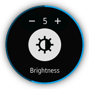
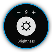
The brightness page shows how to use the slider TAU component. This page provides a UI that allows the user to manage the device brightness value. The user is able to change the brightness value by using the + and - buttons or by rotating the bezel of the device. The current brightness value is indicated by a displayed number (in the range from 0 to 9) as well as by the icon, whose appearance changes along with the change in the brightness value.
Figure: Brightness screen
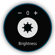
Layout
The layout consists of the header, content, and footer elements. The header contains the + and - control buttons as well as the number indicator that shows the current brightness value. The content element defines the brightness icon indicator and the slider component that allows the user to change the brightness by rotating the bezel of the device. The footer displays static text that indicates what type of value is changed.
<!--index.html--> <div id="brightness" class="ui-page" data-enable-page-scroll="false"> <header class="ui-header"> <div class="brightness-navigation"> <div id="brightness-minus" class="brightness-minus ui-btn brightness-btn"></div> <div id="brightness-value" class="brightness-value"> </div> <div id="brightness-plus" class="brightness-plus ui-btn brightness-btn"></div> </div> </header> <div class="ui-content"> <div id="brightness-icon" class="brightness-icon"></div> <input id="circle" data-type="circle" name="circleSlider" type="range" value="2" min="0" max="9"/> </div> <footer class="ui-footer ui-bottom-button ui-fixed"> <p>Brightness</p> </footer> </div>
Some extra CSS code is required for the brightness page elements:
<!--css/style.css-->
#brightness .ui-footer
{
   display: -webkit-flex;
}

#brightness .ui-footer p
{
   margin: 20px auto;
   font-size: .9em;
}

.brightness-btn
{
   width: 98px;
   height: 98px;
   float: left;
   background-repeat: no-repeat;
   background-position: center;
   background-size: 46%;
   border-radius: 50%;
   background-color: rgba(0, 8, 8, 1);
}

.brightness-btn:active
{
   background-color: #222;
}

.brightness-minus
{
   background-image: url('../images/minus.png');
}

.brightness-plus
{
   background-image: url('../images/plus.png');
}

.brightness-value
{
   width: 20px;
   height: 100px;
   float: left;
   font-size: 1.2em;
   color: #fff;
   line-height: 100px;
   text-align: center;
}

.ui-progressbar .ui-progressbar-bg,
.ui-progressbar .ui-progressbar-value .ui-progressbar-value-left,
.ui-progressbar .ui-progressbar-value .ui-progressbar-value-right
{
   border-width: 0.45rem;
}

.brightness-navigation
{
   position: absolute;
   width: 216px;
   height: 100px;
   left: 50%;
   margin-left: -108px;
   bottom: -7px;
}

.brightness-icon
{
   width: 150px;
   height: 150px;
   top: 50%;
   margin-top: -75px;
   background-color: #fff;
   position: absolute;
   left: 50%;
   margin-left: -75px;
   border-radius: 50%;
}

.brightness-icon:before
{
   position: absolute;
   content: "";
   top: 0;
   left: 0;
   width: 100%;
   height: 100%;
   -webkit-mask-size: 100% 100%;
   background-color: rgba(0, 8, 8, 1);
   -webkit-mask-repeat: no-repeat;
}

.brightness-level-icon-0:before
{
   -webkit-mask-image: url(../images/brightness/b_settings_brightness_0.png);
}

.brightness-level-icon-1:before
{
   -webkit-mask-image: url(../images/brightness/b_settings_brightness_1.png);
}

.brightness-level-icon-2:before
{
   -webkit-mask-image: url(../images/brightness/b_settings_brightness_2.png);
}

.brightness-level-icon-3:before
{
   -webkit-mask-image: url(../images/brightness/b_settings_brightness_3.png);
}

.brightness-level-icon-4:before
{
   -webkit-mask-image: url(../images/brightness/b_settings_brightness_4.png);
}

.brightness-level-icon-5:before
{
   -webkit-mask-image: url(../images/brightness/b_settings_brightness_5.png);
}

.brightness-level-icon-6:before
{
   -webkit-mask-image: url(../images/brightness/b_settings_brightness_6.png);
}

.brightness-level-icon-7:before
{
   -webkit-mask-image: url(../images/brightness/b_settings_brightness_7.png);
}

.brightness-level-icon-8:before
{
   -webkit-mask-image: url(../images/brightness/b_settings_brightness_8.png);
}

.brightness-level-icon-9:before
{
   -webkit-mask-image: url(../images/brightness/b_settings_brightness_9.png);
}
Module
The views/brightness module does not load any additional subviews or helper modules.
The slider TAU component is initialized every time the brightness page is shown. Its default value is used by the updateBrightnessValue() and updateBrightnessIcon() methods to set up the initial values of the brightness indicators. At the same time, the application defines the onCircleSliderChange() method, which is called every time the value of the slider component changes.
The application also provides support for the click event handling on the + and - control buttons. For this reason, it defines the onBrightnessMinusClick() and onBrightnessPlusClick() methods. Depending on which of them is invoked, the application calls the decreaseBrightness() or increaseBrightness() methods. Each of them calculates the proper brightness value and finally calls the value() method of the slider component in order to set up its value.
/* views/brightness.js */
/* Brightness view module */
define(
{
   name: 'views/brightness',
   requires: [],
   def: function brightness()
   {
      'use strict';

      /*
         Page element
         @type {HTMLElement}
      */
      var page = null,

          /*
             Slider element
             @type {HTMLElement}
          */
          sliderElement = null,

          /*
             Brightness minus element
             @type {HTMLElement}
          */
          brightnessMinus = null,

          /*
             Brightness value element
             @type {HTMLElement}
          */
          brightnessValue = null,

          /*
             Brightness icon element
             @type {HTMLElement}
          */
          brightnessIcon = null,

          /*
             Brightness plus element
             @type {HTMLElement}
          */
          brightnessPlus = null,

          /*
             Circle slider widget
             @type {HTMLElement}
          */
          circleSlider = null,

          BRIGHTNESS_ICONS =
          [
             'brightness-level-icon-0', 'brightness-level-icon-1',
             'brightness-level-icon-2', 'brightness-level-icon-3',
             'brightness-level-icon-4', 'brightness-level-icon-5',
             'brightness-level-icon-6', 'brightness-level-icon-7',
             'brightness-level-icon-8', 'brightness-level-icon-9'
          ];

      /*
         Update the brightness value
         @param {number|string} value
      */
      function updateBrightnessValue(value)
      {
         brightnessValue.innerText = value;
      }

      /*
         Update the brightness icon
         @param {number|string} value
      */
      function updateBrightnessIcon(value)
      {
         var i = 0,
             length = BRIGHTNESS_ICONS.length;

         for (i = 0; i < length; i += 1)
         {
            brightnessIcon.classList.remove(BRIGHTNESS_ICONS[i]);
         }
         brightnessIcon.classList.add('brightness-level-icon-' + value);
      }

      /* Handle a progresschange event on a circle slide element */
      function onCircleSliderChange()
      {
         updateBrightnessValue(circleSlider.value());
         updateBrightnessIcon(circleSlider.value());
      }

      /* Handle a pagebeforeshow event on a page element */
      function onPageBeforeShow()
      {
         circleSlider = tau.widget.Slider(sliderElement);
         updateBrightnessValue(circleSlider.value());
         updateBrightnessIcon(circleSlider.value());
         circleSlider.on('progresschange', onCircleSliderChange);
      }

      /* Increase the brightness value */
      function increaseBrightness()
      {
         var currentBrightnessValue = parseInt(circleSlider.value(), 10);

         /*
            Temporary workaround, because the slider component cannot be set
            to 0 value from any positive value. -1 value is needed
         */
         if (currentBrightnessValue === -1)
         {
            currentBrightnessValue += 1;
         }

         if (currentBrightnessValue < 9)
         {
            currentBrightnessValue += 1;
         }

         circleSlider.value(currentBrightnessValue);
      }

      /* Decrease the brightness value */
      function decreaseBrightness()
      {
         var currentBrightnessValue = parseInt(circleSlider.value(), 10);

         if (currentBrightnessValue > 0)
         {
            currentBrightnessValue -= 1;
         }

         /*
            Temporary workaround, because the slider component cannot be set
            to 0 value from any positive value. -1 value is needed
         */
         if (currentBrightnessValue === 0)
         {
            currentBrightnessValue -= 1;
         }

         circleSlider.value(currentBrightnessValue);
      }

      /* Handle a click event on a brightness minus element */
      function onBrightnessMinusClick()
      {
         decreaseBrightness();
      }

      /* Handle a click event on a brightness plus element */
      function onBrightnessPlusClick()
      {
         increaseBrightness();
      }

      /* Register events */
      function bindEvents()
      {
         page.addEventListener('pagebeforeshow', onPageBeforeShow);
         brightnessMinus.addEventListener('click', onBrightnessMinusClick);
         brightnessPlus.addEventListener('click', onBrightnessPlusClick);
      }

      /* Initialize the module */
      function init()
      {
         page = document.getElementById('brightness');
         sliderElement = page.querySelector('#circle');
         brightnessMinus = page.querySelector('#brightness-minus');
         brightnessValue = page.querySelector('#brightness-value');
         brightnessIcon = page.querySelector('#brightness-icon');
         brightnessPlus = page.querySelector('#brightness-plus');
         bindEvents();
      }

      return
      {
         init: init
      };
   }
});
Marquee TAU Component
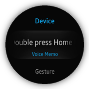
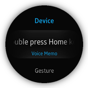
The device page shows how to use the marquee TAU component. It displays a typical list of application options. It also contains a Double press Home key option. Because the length of the title of this option is longer than the width of the device, it is a good opportunity to use the marquee component.
The marquee component provides an animation effect that changes the position of the text, from right to left, to show all of the text characters.
Figure: Device screen
Layout
The layout consists of a header and a list, which displays the settings. The text that uses the marquee animation effect is wrapped by a <div> element with the ui-marquee and ui-marquee-gradient CSS classes.
<!--index.html-->
<div class="ui-page" id="device">
   <header class="ui-header">
      <h2 class="ui-title">Device</h2>
   </header>
   <div class="ui-content">
      <ul class="ui-listview">
         <li class="li-has-2line">
            <a href="#double-press-home-key">
               <div class="ui-marquee ui-marquee-gradient">
                  Double press Home key
               </div>
               <span id="double-press-home-key-value"
                     class="li-text-sub ui-li-sub-text"></span>
            </a>
         </li>
         <li class="li-has-2line">
            <a href="#gesture">
               Gesture
                  <span id="gesture-value"
                        class="li-text-sub ui-li-sub-text"></span>
            </a>
         </li>
         <li>
            <a href="#date-and-time">
               Date and time
            </a>
         </li>
      </ul>
   </div>
</div>
Module
The views/device module loads all necessary subviews and helper modules. From the marquee TAU component point of view, the most important is the helpers/list module. It defines the marquee() method that is responsible for the described animation effect. The best moment for the marquee() method call is the module initialization.
/* views/device.js */
/* Device view module */
define(
{
   name: 'views/device',
   requires:
   [
      'views/doublePressHomeKey',
      'views/gesture',
      'views/dateAndTime',
      'helpers/list',
      'helpers/page'
   ],
   def: function device(req)
   {
      'use strict';

      /*
         List helper module instance
         @type {Module}
      */
      var listHelper = req.helpers.list,

          /*
             Page helper module instance
             @type {Module}
          */
          pageHelper = req.helpers.page,

          /*
             Double press home key view module
             @type {Module}
          */
          doublePressHomeKeyView = req.views.doublePressHomeKey,

          /*
             Gesture view module
             @type {Module}
          */
          gestureView = req.views.gesture,

          /*
             Page element
             @type {HTMLElement}
          */
          page = null;

      /* Handle a pagebeforeshow event */
      function onPageBeforeShow()
      {
         pageHelper.resetScroll(page);
         page.querySelector('#double-press-home-key-value').innerText = doublePressHomeKeyView.getCurrentValue();
         page.querySelector('#gesture-value').innerText = gestureView.getCurrentValue() ? 'On' : 'Off';
      }

      /* Register module event listeners */
      function bindEvents()
      {
         page.addEventListener('pagebeforeshow', onPageBeforeShow);
      }

      /* Initialize the module */
      function init()
      {
         page = document.getElementById('device');
         listHelper.animate(page);
         listHelper.marquee(page.querySelector('.ui-listview'));
         bindEvents();
      }

      return
      {
         init: init
      };
   }
});
Marquee Animation Effect
The list helper provides the marquee() method that is responsible for the marquee TAU component initialization and its behavior management. This method takes the HTMLElement list as a parameter.
The application defines, for this element, 3 event handlers:
- When the selected event occurs, the marquee component is initialized and its start method is called.
- When the scrollstart event occurs, the application stops the marquee animation, if it is active, and the position of the animated text is reset.
- When the scrollend event occurs, the application clears the reference to the marquee component. This reference is also cleared on the pagebeforehide event, which is also provided by the list helper.
/* js/helpers/list.js */
/* List helper module */
define(
{
   name: 'helpers/list',
   requires:
   [
      'helpers/dom'
   ],
   def: function list(domHelper)
   {
      'use strict';

      /*
         Snap list style helper instance
         @type {SnapListStyle}
      */
      var listHelper = null,
          /*
             Scrolled element
             @type {Widget}
          */
          marqueeWidget = null;

      /*
         Handle a selected event on a list element
         @param {Event} ev
      */
      function onListSelected(ev)
      {
         var element = ev.target.querySelector('.ui-marquee');

         if (element)
         {
            marqueeWidget = tau.widget.Marquee(element);
         }

         if (marqueeWidget)
         {
            marqueeWidget.start();
         }
      }

      /* Handle a scrollstart event on a list element */
      function onListScrollStart()
      {
         if (marqueeWidget)
         {
            marqueeWidget.stop();
            marqueeWidget.reset();
         }
      }

      /* Handle a scrollend event on a list element */
      function onListScrollEnd()
      {
         marqueeWidget = null;
      }

      /* Handle a pagebeforehide event on a list page element */
      function onListPageBeforeHide()
      {
         marqueeWidget = null;
      }

      /*
         Provide the marquee functionality for the list items
         @param {HTMLElement} list
      */
      function marquee(list)
      {
         list.addEventListener('selected', onListSelected);
         list.addEventListener('scrollstart', onListScrollStart);
         list.addEventListener('scrollend', onListScrollEnd);
         domHelper.closest(list, '.ui-page').addEventListener('pagebeforehide', onListPageBeforeHide);
      }

      return
      {
         marquee: marquee
      };
   }
});
Radio Buttons with Auto Return
The sound mode page shows how radio buttons are used to obtain the user choice and immediately return to the parent page.
Figure: Vibration intensity screen
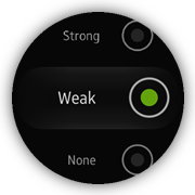
Layout
The radio buttons are styled and handled by the TAU framework:
<!--index.html-->
<ul class="ui-listview">
   <li class="li-has-radio">
      <label>
         Sound
         <input type="radio" name="sound-mode-radio" value="Sound"/>
      </label>
   </li>
   <li class="li-has-radio">
      <label>
         Vibrate
         <input type="radio" name="sound-mode-radio" value="Vibrate"/>
      </label>
   </li>
   <li class="li-has-radio">
      <label>
         Mute
         <input type="radio" name="sound-mode-radio" value="Mute"/>
      </label>
   </li>
</ul>
Module
The views/soundMode module loads all necessary helper modules:
-
Before the page is shown, the previously selected button is marked as checked. This is realized by the pagebeforeshow() method:
/* js/views/soundMode.js */ function onPageBeforeShow() { pageHelper.resetScroll(page); page.querySelector('[value="' + currentValue + '"]').checked = true; } -
To immediately obtain the selected radio button value, the click event listener is added to target list element:
/* js/views/soundMode.js */ function bindEvents() { page.addEventListener('pagebeforeshow', onPageBeforeShow); page.querySelector('ul').addEventListener('click', onListClick); } -
The closest list element is provided with the use of the domHelper.closest() method when the user clicks on the list:
/* js/views/soundMode.js */
/*
   Handles click on the list
   @param {Event} ev
*/
function onListClick(ev)
{
   var item = domHelper.closest(ev.target, 'li');

   if (!item)
   {
      return;
   }

   item = item.querySelector('input');
   currentValue = item.getAttribute('value');
   history.back();
}
The value is stored and the previous page is shown when the closest element is detected.