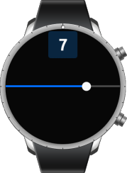
Slider
The slider UI component is a draggable item used to select a value within a certain range. For more information, see the Slider API.
This feature is optional.
Basic Usage
To use a slider component in your application:
-
Create a new slider with the
elm_slider_add()function:Evas_Object *slider = NULL; slider = elm_slider_add(parent); -
Configure the slider. The following configurations are optional. Unless you set other options, the slider uses the default styles.
-
Set the slider indicator:
elm_slider_indicator_show_set(slider, EINA_TRUE); elm_slider_indicator_format_set(slider, "%.0f"); -
Set the range and value of the slider:
elm_slider_min_max_set(slider, 0.0, 10.0); elm_slider_value_set(slider, 5.0); -
The slider for wearable devices does not support additional features, such as horizontal or inverted slider.
-
-
Register the callback functions.
The following example shows how to define and register a callback for the
changedsignal:evas_object_smart_callback_add(slider, "changed", slider_changed_cb, NULL); void slider_changed_cb(void *data, Evas_Object *obj, void *event_info) { double _val = elm_slider_value_get(obj); dlog_print(DLOG_INFO, LOG_TAG, "Slider value changed. %0.1f\n", _val); }
The following example shows a simple use case of the slider component.
Example: Slider use case


Evas_Object *box;
Evas_Object *slider;
Evas_Object *nf;

/* Starting right after the basic EFL UI layout code */
/* (win - conformant - naviframe) */

box = elm_box_add(nf);
elm_naviframe_item_push(nf, "Slider", NULL, NULL, box, NULL);
/* Add a slider */
slider = elm_slider_add(box);
evas_object_size_hint_align_set(slider, EVAS_HINT_FILL, 0.5);

/* Indicator shows the value of the slider */
elm_slider_indicator_show_set(slider, EINA_TRUE);
elm_slider_indicator_format_set(slider, "%.0f");

/* Set the slider range */
elm_slider_min_max_set(slider, 0.0, 10.0);

/* Show the slider */
evas_object_show(slider);
elm_box_pack_end(box, slider);
Styles
The following table lists the available component styles.
Table: Slider styles
| Style | Sample |
|---|---|
default |
 |
Callbacks
You can register callback functions connected to the following signals for a slider object.
Table: Slider callback signals
| Signal | Description | event_info |
|---|---|---|
changed |
The slider value is changed by the user. | NULL |
delay,changed |
A short time after the value is changed by the user. This is called only when the user stops dragging for a very short period or when they release their finger or mouse, so it avoids possibly expensive reactions to the value change. | NULL |
slider,drag,start |
Dragging the slider indicator around has started. | NULL |
slider,drag,stop |
Dragging the slider indicator around has stopped. | NULL |
Note
The signal list in the API reference can be more extensive, but only the above signals are actually supported in Tizen.
Note
Except as noted, this content is licensed under LGPLv2.1+.
Related Information
- Dependencies
- Since Tizen 2.3.1