Custom UI Component
Custom UI components are interface elements you can create for application-specific purposes.
With custom UI components, you can:
- Use the UI Builder to visually edit the properties in the EDJ and XML files that define the custom UI component.
- Support mutual value-binding between event-driven primitive UI components and custom UI components.
- Reuse UI components in other projects by gathering EDJ resources into components.
Custom UI Component Files
A custom component consists of EDJ and XML files that describe its structure, and icon files for displaying it in Tizen Studio.
EDJ and XML Files
A custom component requires an EDJ resource file ([ComponentName].edj) and an XML descriptor ([ComponentName].xml) file.
-
EDJ
Each custom UI component has an EDJ resource file. The custom UI component makes this EDJ file available to the Design editor by placing it on the Palette and enables visual editing in the Properties view.
The EDJ file is created by compiling EDC code with the EDC Editor. For more information about EDC, see Layouting with EDC.
-
XML
The XML descriptor file allows you to register a custom UI component in the UI Builder Palette and create a definition for the property, to be used in the Properties view.
The XML descriptor file consists of the following elements:
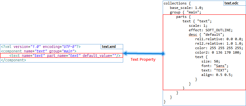
<component>: The root element for the custom UI component. The<component>element describes the EDJ resource content, such as the group, used by the custom UI component.<state>: A state value that must be defined in EDC and changed by the custom UI component during runtime.<value>: A value defined for a state property.<text>: A text value that must be defined in EDC and changed by the custom UI component during runtime. You can define this to change the text value of the text part name.<color>: A color value that must be defined in EDC and changed by the custom UI component during runtime. You can define this to change the color value of the color class name.
The following table shows the XML descriptor file configuration.
Table: XML descriptor file configuration
Parent Element Attribute Description Type Required Default Value - <component> nameComponent identifier, shown on the Palette, Outline view, and Properties view.
This attribute must be identical to the XML file name.String Yes - - <component> descriptionDescription shown when you mouse over the custom UI component on the Palette String No null- <component> groupgroupblock defined in the EDC file for the component.
For more information see Group Block.String Yes - - <component> resize_modeWhich directions the component can be resized in. The possible values are both,horizontal,vertical, andnone.String No both- <component> min_widthMinimum component width in the Design editor Integer No 1 - <component> min_heightMinimum component height in the Design editor Integer No 1 <component> <state> nameState property identifier String Yes - <component> <state> display_nameName shown on the state property label in the Properties view String No nameattribute in the<state>element<component> <state> descriptionState property description String No null<component> <state> default_valueState property default value. The default value must be a nameattribute defined in the <value> element attributes.String Yes - <state> <value> nameValue property identifier String Yes - <state> <value> display_nameName shown on the value property label in the Properties view String No nameattribute in the<value>element<state> <value> signalEDC signal used to change the UI state at runtime.
For information on using signals, see Program Block.String Yes - <state> <value> sourceUser-defined parameter sent when the EDC signal is triggered String No null<component> <text> nameText property identifier String Yes - <component> <text> display_nameName shown on the text property label in the Properties view String No nameattribute in the<text>element<component> <text> descriptionText property description String No null<component> <text> part_namepart blockto change when the text property is modified.
For more information, see Part Block.String Yes - <component> <text> default_valueText property default value String No null<component> <color> nameColor property identifier String Yes - <component> <color> display_nameName shown on the color property label in the Properties view String No nameattribute in the<color>element<component> <color> descriptionColor property description String No null<component> <color> class_nameEDC color class name. For more information, see Color Classes Block. String Yes - <component> <color> default_valueColor property default value String No null<component> <event> nameEvent property identifier String Yes - <component> <event> display_nameName shown on the event property label in the Properties view String No nameattribute in the<event>element<component> <event> descriptionEvent property description String No null<component> <event> signalEDC signal used to change the UI state at runtime String Yes - <component> <event> sourceString or message emitted when the event is triggered String No null
The following figures show corresponding elements between the XML and EDC files.
Figure: Correspondence between XML and EDC (color, state, and event properties)
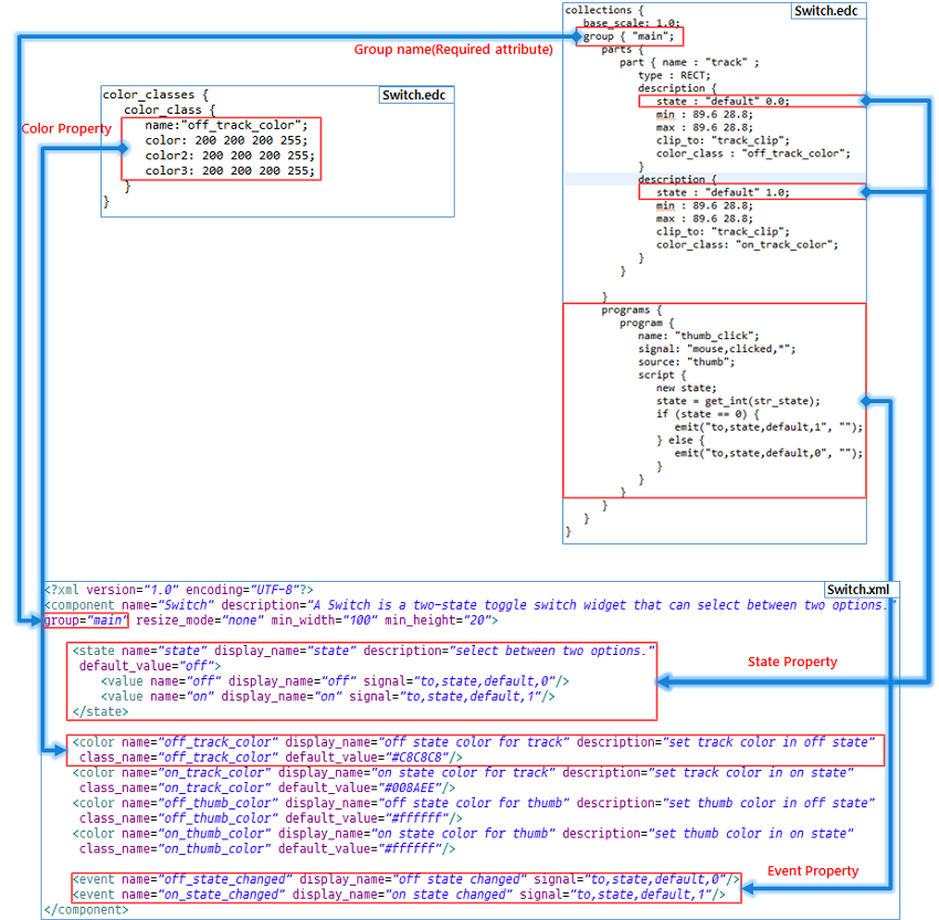
Figure: Correspondence between XML and EDC (text property)
Icon Files
Icons are used on the Palette, the Outline view, and the Properties view.
There are 3 supported icon types:
- The normal icon, which is shown when no action has been taken.
- The mouseover icon, which appears when the mouse cursor is placed over the icon.
- The select icon, which is shown when the icon is selected with the mouse.
If you do not include custom icon files with your custom component, the default icons are used. The following table illustrates the default icons.
Table: Default icon types
| Normal icon | Mouseover icon | Select icon |
|---|---|---|
 |
 |
 |
pal_custom**_nor.png** |
pal_custom**_mv.png** |
pal_custom**_sel.png** |
To use custom icon files, the following conditions must be observed:
- The file names must be in the format
[ComponentName]_[Type].png:[ComponentName]is the UI component name shown on the Palette.[Type]depends on the icon type:nor(for normal),mv(for mouseover), andsel(for selected).
- The icon file must be in PNG format.
- Icon files are recommended to have a maximum size of 32 x 32 pixels.
Using Custom UI Components
The following example shows how you can create a custom UI component in the UI Builder, using the Mobile 4.0 project template. The following sections show how to add or remove a custom component within a project.
To create a custom UI component:
-
In Tizen Studio, create a new UI Builder project using the Mobile v4.0 project template.
-
Add a preset Switch UI component:
-
In the Palette, right-click the Custom UI Components category and select Add preset UI Component > Switch.
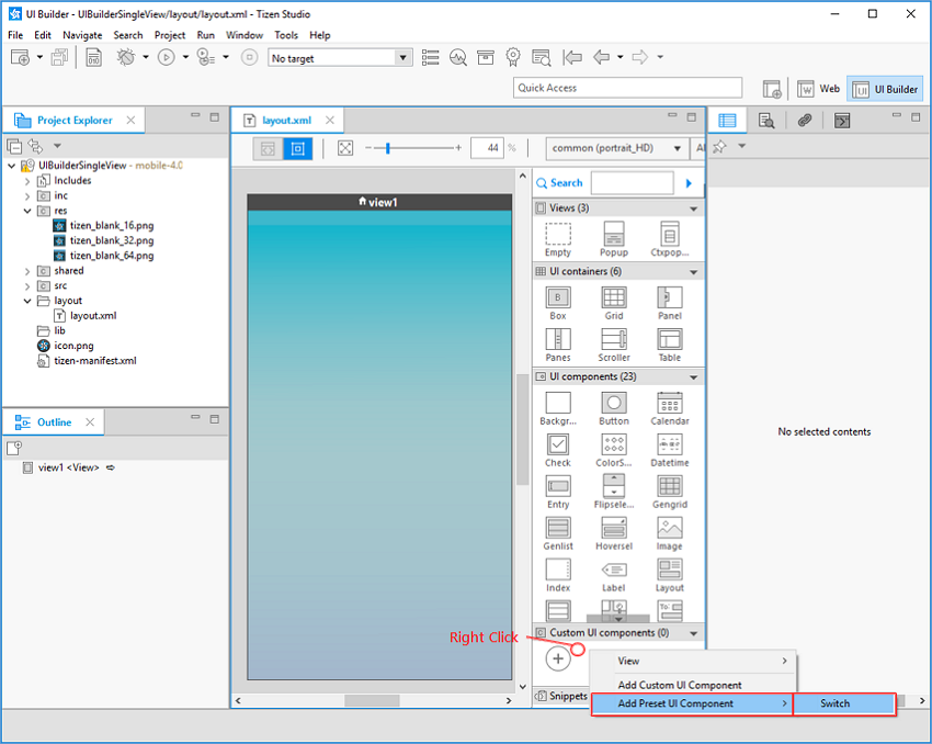
The Switch UI component is added to the Custom UI Components category in the Palette. In the Project Explorer view, the related files can be seen in the
res/custom-componentsfolder.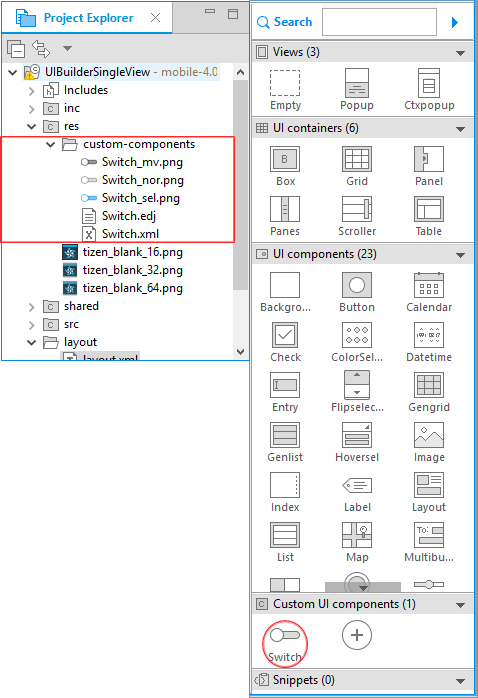
-
-
Create a
text.edjfile for a text custom UI component:-
Right-click the project name in the Project Explorer view, and select New > EDC File.
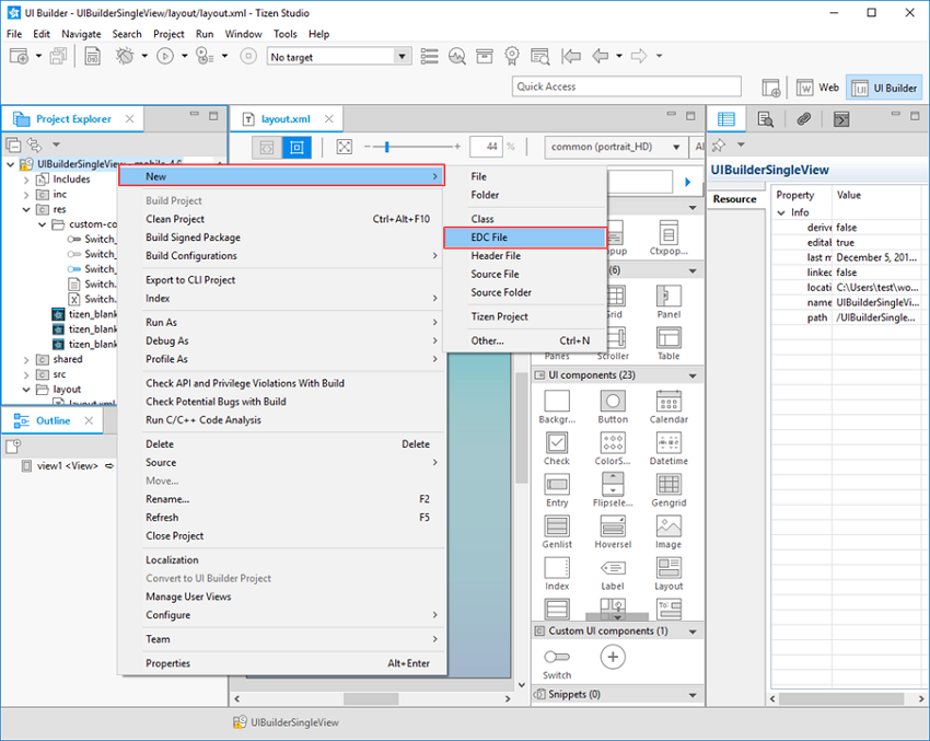
-
In the EDC File dialog, select your project as the parent folder and enter
text.edcin the File name field. Click Finish.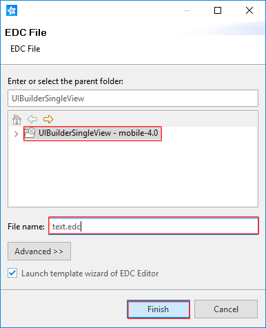
-
In the EDC Editor’s New File: Choose a Template dialog, select the Text template and click Ok.
-
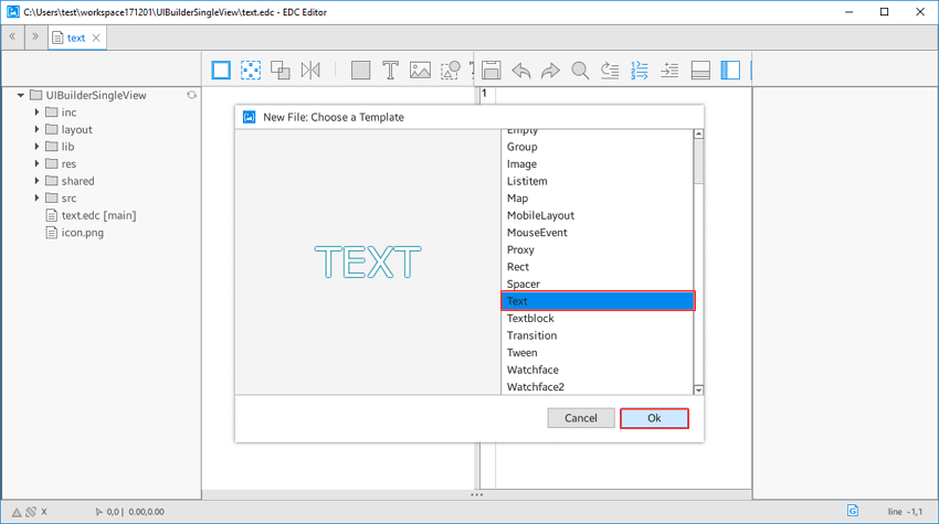
To save the
text.edcfile, click the Save button and close the EDC Editor.
The
text.edcandtext.edjfiles can be seen in the Project Explorer view.
-
-
Create a
text.xmlfile:-
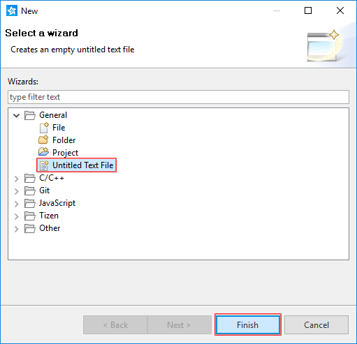
Right-click the project name in the Project Explorer and select New > Other.
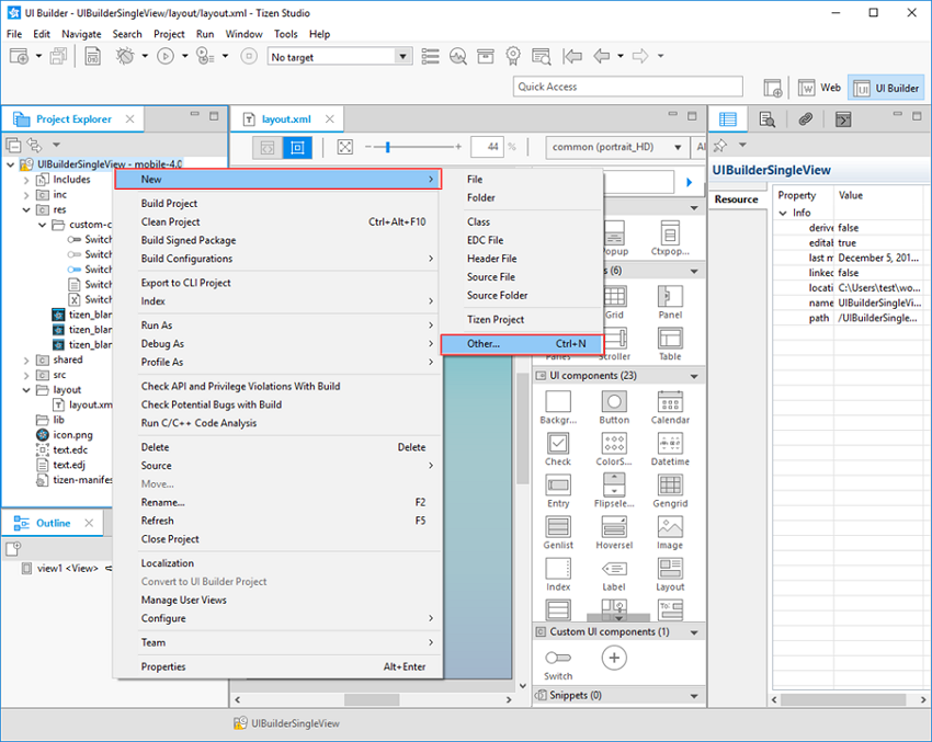
-
In the New dialog, select General > Untitled Text File and click Finish.
-
Enter the following code in the newly-created
Untitled 1file:<?xml version="1.0" encoding="UTF-8"?> <component name="text" group="main"> <text name="text" part_name="text" default_value=""/> </component>This XML code contains only the required attributes for
text.xml. -
Save the file by pressing Ctrl + S.
-
In the Save As dialog, select your project as the parent folder and enter
text.xmlin the File name field. Click OK.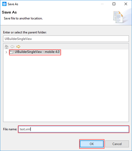
The
text.xmlfile can be seen in the Project Explorer view.
-
-
Add the text UI component to the Palette:
-
Click the Add Custom Component (
 ) button on the Palette, or right-click the Custom UI Components category and select Add Custom UI Component.
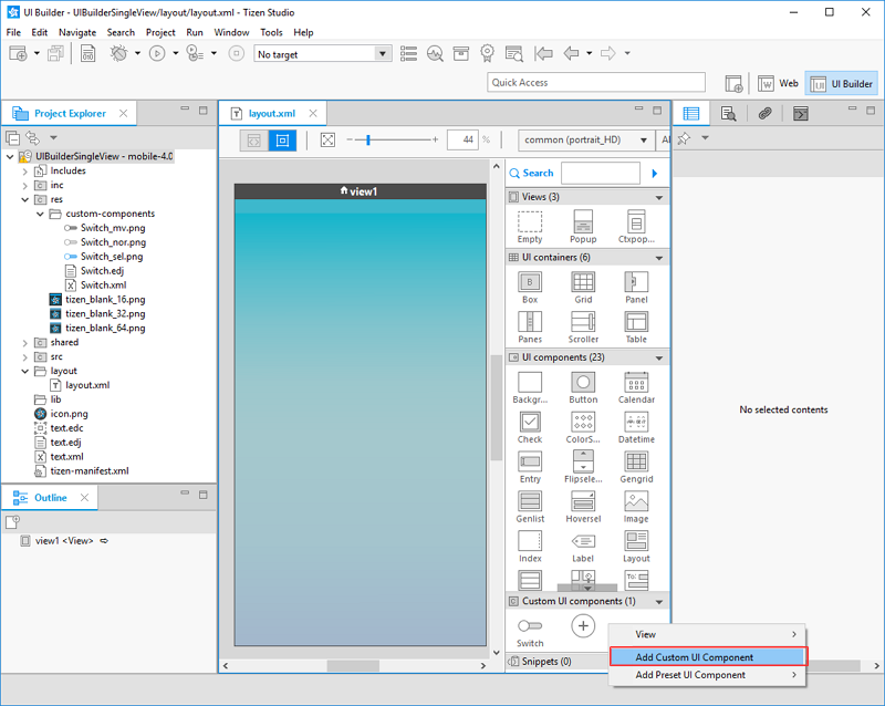
-
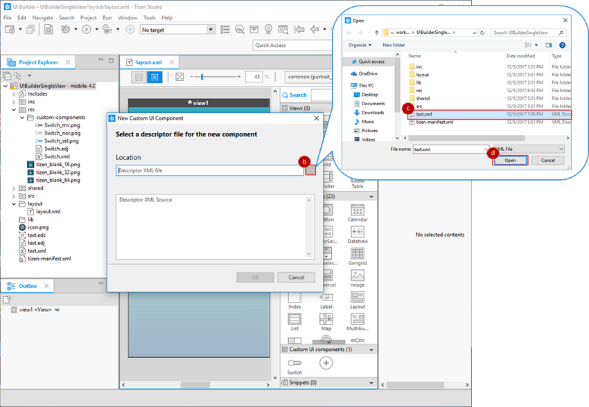
In the New Custom UI Component dialog, to select the XML file, click ….
-
Select the
text.xmlfile from your project folder. -
Click Open.
The following table lists error messages that can occur when adding a custom UI component.
Error message Description A Custom UI Component already exists with the same name. You cannot import a custom UI component if a component with the same name already exists in the Palette. Check the your custom UI component name. An EDJ file required for handling the new component is missing. The EDJ file must be located in the same folder as the XML file. Check the location of your EDJ and XML files. The descriptor file is missing a required attribute (such as name or group). The nameattribute in the<component>element in the descriptor file defines the display name for the component in the Palette, and thegroupattribute specifies whichgroupblock to use in the EDJ file. Check the descriptor file to see whether a required attribute is missing.The descriptor file name does not match the value for the internal name attribute. The descriptor file name must be the same as the nameattribute inside the file. Check that the XML file name and internalnameattribute are identical.XML syntax in the descriptor file is incorrect. If there are syntax errors in the XML file, registration and visual editing in the Palette do not work properly. Check the XML file syntax. Unexpected internal error occurred. If the descriptor XML and EDJ files have unexpected errors, registration and visual editing in the Palette do not work properly. Check that the XML and EDJ files exist. The descriptor file is missing a root element(component). To use a custom UI component, a <component>element must exist as the root element in the XML file. Check the XML file syntax.The name can contain letters, digits, and underscores ("_"), and must not begin with a digit. Check that the component name in the XML file follows the naming rules. The required attribute cannot contain any space characters. Check the XML file syntax. -
Click OK.
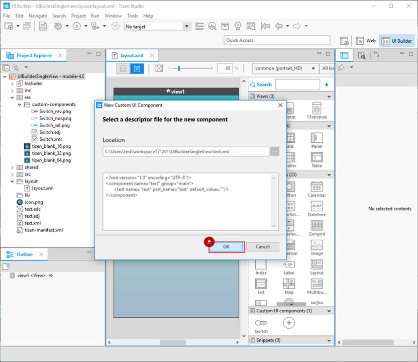
The text UI component is added to the Palette, and the
text.xmlandtext.edjfiles are added to theres/custom-componentsfolder.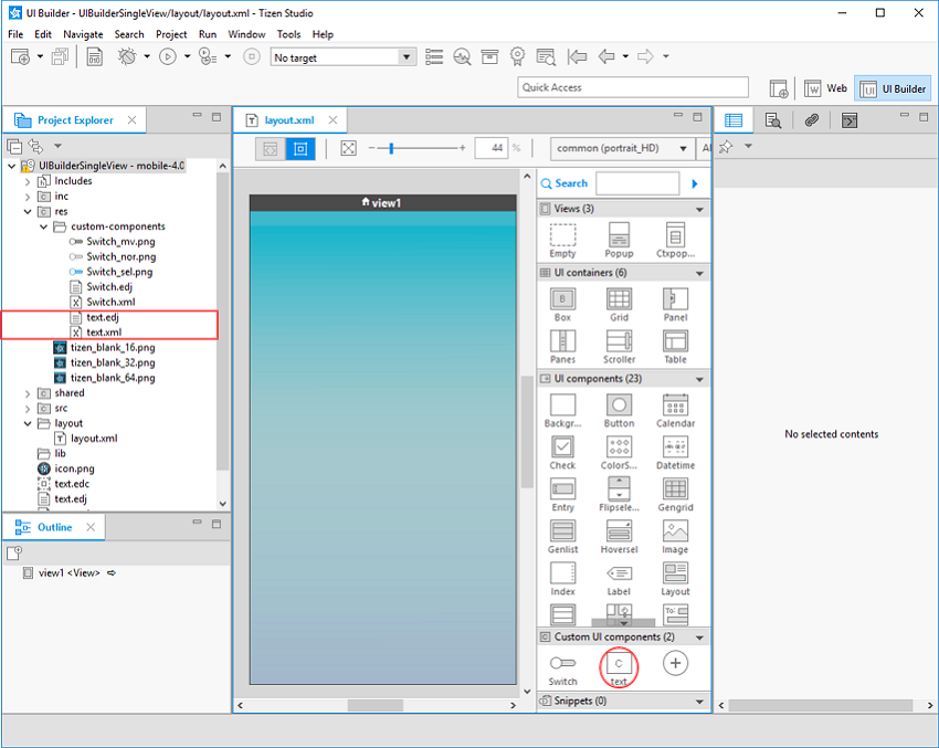
-
Adding Custom UI Components to Projects
To add the new custom elements to your project:
-
Add UI components on the Design editor:
-
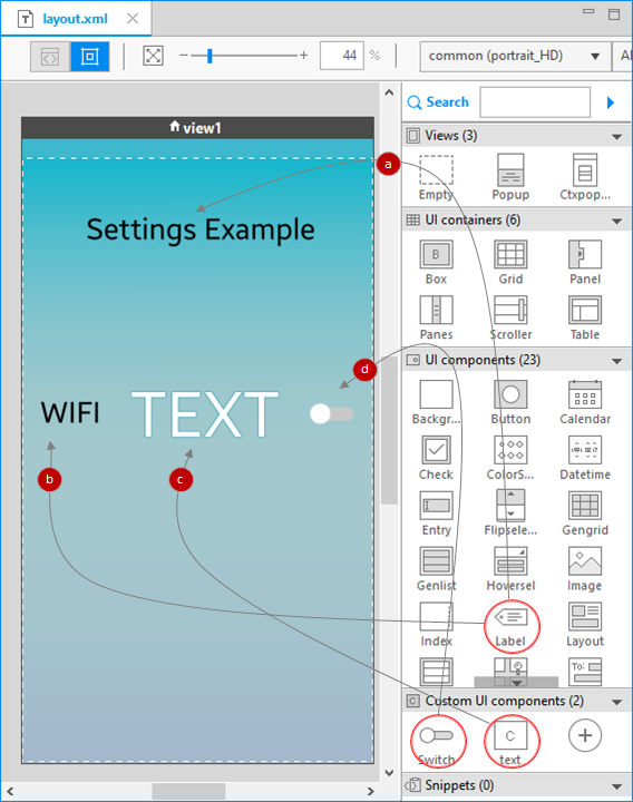
Add a Label component to the Design editor by dragging and dropping it from the Palette.
In the Properties view, modify the Text field for the component:
<align=center><font_size=60>Settings Example</font></align> -
Add a second Label component in the same way, and modify its Text property:
<align=center><font_size=60>WIFI</font></align> -
Add a text custom UI component.
-
Add a Switch custom UI component.
-
-
Modify the custom UI component properties:
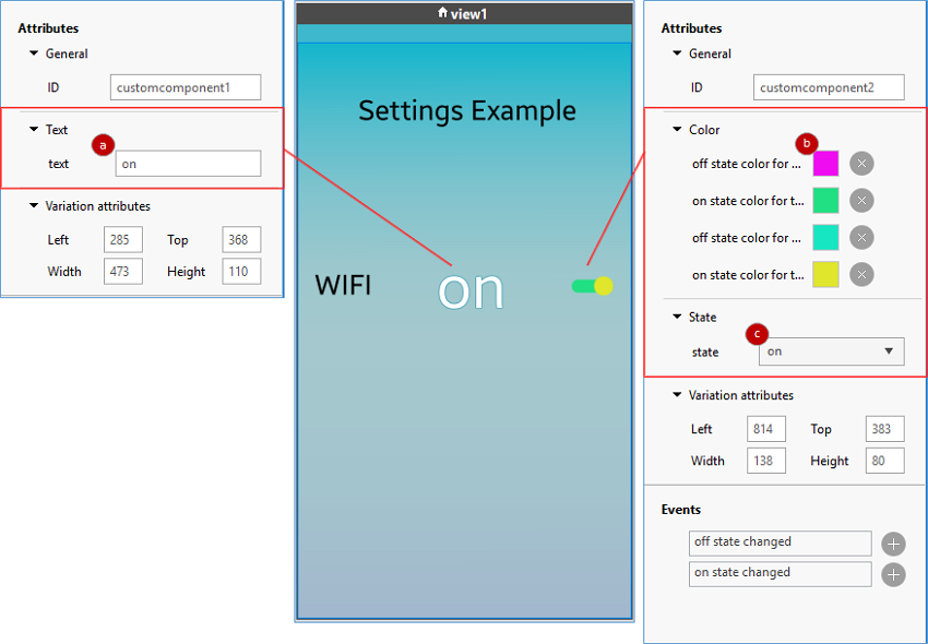
- For the text component, change the Text value to on.
- For the Switch component, change the Color values to colors of your choosing.
- For the Switch component, change the State value to on.
-
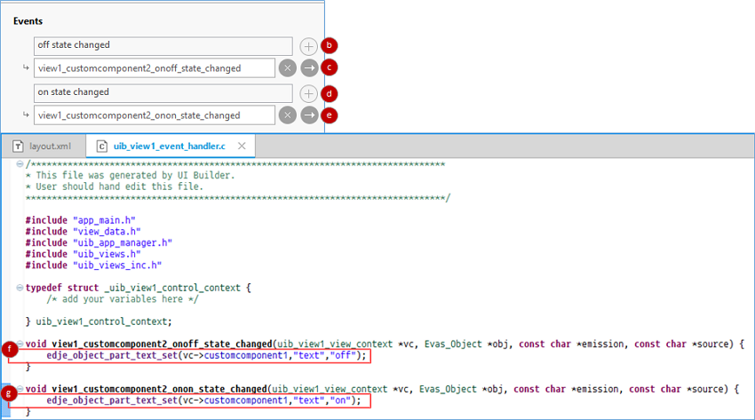
Add an event handler to the Switch component:
- In the Design editor, select the Switch component.
- In the Properties view, add an off state changed event handler by clicking the
 icon next to the event name.
 - Add the event handler to your source code by clicking the
 icon.
icon. - Add an on state changed event handler by clicking the icon next to the event name.
- Add the event handler to your source code by clicking the icon.
- For the off state changed event handler, add code that changes the text UI component Text property value to “off” when the Switch UI component state changes to off.
- For the on state changed event handler, add code that changes the text UI component Text property value to “on” when the Switch UI component state changes to on.
- Save all changes to your project by pressing Ctrl + S.
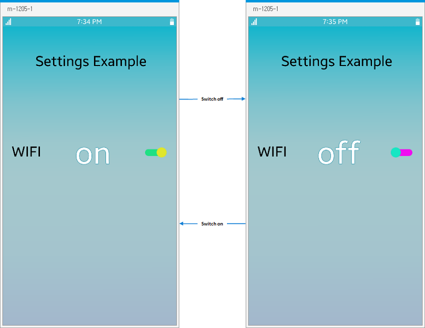
The following figure shows the created custom UI components in operation. The Switch component color and the text component value change depending on the Switch component state.
Figure: Custom UI component example
Deleting Custom UI Components
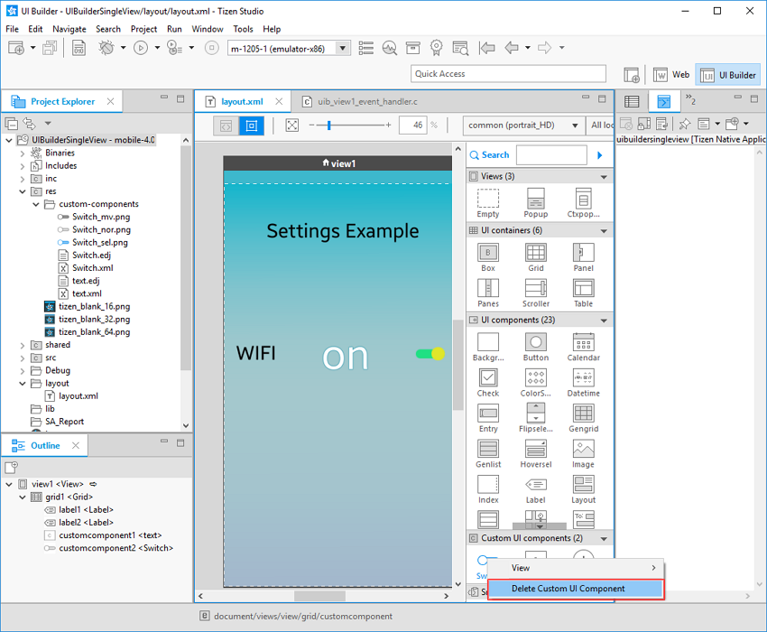
To remove a custom UI component from the Palette:
-
In the Palette, right-click the Switch UI component and select Delete Custom UI Component.
-
Confirm the deletion by clicking Yes.
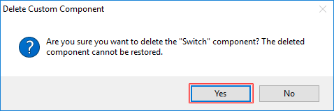
-
The Switch component is removed from the Palette.
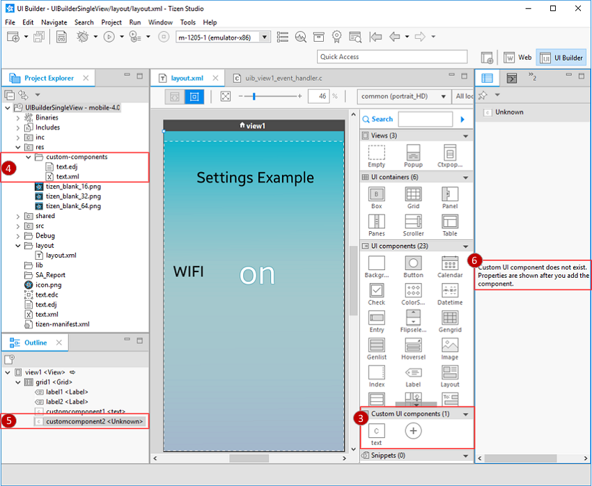
-
In the Project Explorer, all files related to the custom component are deleted. For the Switch component, this includes
Switch.xml,Switch.edj,Switch_mv.png,Switch_nor.png, andSwitch_sel.png. -
In the Outline view, the UI component previously labeled Switch now appears as Unknown.
-
If you select the UI component labeled Unknown in the Outline view, the Properties view shows an error message.
If you add a new custom UI component with the same name as the deleted one, the component name is restored in the Outline view.
Related Information
- Dependencies
- Tizen Studio 2.1 and Higher