Toolbar
The toolbar UI component has a scrollable list of items which can be selected. Only one item can be selected at a time. For more information, see the Toolbar API.
This feature is optional.
Basic Usage
To use a toolbar component in your application:
-
Add a toolbar with the
elm_toolbar_add()function:Evas_Object *toolbar; toolbar = elm_toolbar_add(parent); -
Configure the toolbar options.
-
Append items to the toolbar with
elm_toolbar_item_append()function. The function takes 5 parameters: the pointer of the toolbar, a file path of an icon, a text, a callback function to call when the item is clicked, and the parameter passed to the callback.elm_toolbar_item_append(toolbar, "icon.png", "Tab", _item_selected_cb, NULL);The following example shows how to add 2 items and define callbacks for when they are clicked:
Elm_Object_Item *home_it; Elm_Object_Item *help_it; home_it = elm_toolbar_item_append(toolbar, "home", "Home", _home_item_pressed_cb, NULL); help_it = elm_toolbar_item_append(toolbar, "help", "Help", _help_item_pressed_cb, NULL); static void _home_item_pressed_cb(void *data, Evas_Object *obj, void *event_info) { dlog_print(DLOG_INFO, LOG_TAG, "Home item clicked \n"); } static void _help_item_pressed_cb(void *data, Evas_Object *obj, void *event_info) { dlog_print(DLOG_INFO, LOG_TAG, "Help item clicked \n"); } -
Set the toolbar as the content of a container component. A toolbar is usually used to show a menu inside a naviframe.
-
Register the callback functions.
The following example shows how to define and register a callback for the
clickedsignal:evas_object_smart_callback_add(toolbar, "clicked", clicked_cb, data); /* Callback for the "clicked" signal */ /* Called when a toolbar item is double-clicked and selected */ void clicked_cb(void *data, Evas_Object *obj, void *event_info) { Elm_Toolbar_Item * item = event_info; dlog_print(DLOG_INFO, LOG_TAG, "Item clicked\n"); }
The following example shows a simple use case of the toolbar component.
Example: Toolbar use case
Evas_Object *win;
Evas_Object *conf;
Evas_Object *nf;
Evas_Object *tb;
Elm_Object_Item *nf_it;

/* Starting right after the basic EFL UI layout code */
/* win - conformant - naviframe */

/* Add a toolbar */
tb = elm_toolbar_add(nf);
evas_object_show(tb);

/* Configure the toolbar */
elm_toolbar_shrink_mode_set(tb, ELM_TOOLBAR_SHRINK_EXPAND);
elm_toolbar_transverse_expanded_set(tb, EINA_TRUE);

/* Append items */
elm_toolbar_item_append(tb, NULL, "Tab1", NULL, NULL);
elm_toolbar_item_append(tb, NULL, "Tab2", NULL, NULL);

/* Set the toolbar as a part of the naviframe item */
nf_it = elm_naviframe_item_push(nf, "Test", NULL, NULL, NULL, "tabbar/notitle");
elm_object_item_part_content_set(nf_it, "tabbar", tb);
Options
You can set the shrink and select mode of the toolbar, and set the items to be displayed homogeneously. You can also define a state for the toolbar item.
Shrink Mode
The toolbar offers the following options for shrinking its content:
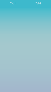
ELM_TOOLBAR_SHRINK_NONE: Set a minimum size to the toolbar so that all of them fit without scrolling.ELM_TOOLBAR_SHRINK_HIDE: Hide excess items that do not fit.ELM_TOOLBAR_SHRINK_SCROLL: Scroll to show the items that do not fit.ELM_TOOLBAR_SHRINK_MENU: Insert a button to pop up a menu with hidden items.ELM_TOOLBAR_SHRINK_EXPAND: Expand all items according to the size of the toolbar.
To set the shrinking mode:
elm_toolbar_shrink_mode_set(toolbar, ELM_TOOLBAR_SHRINK_EXPAND);
The following examples illustrate the shrink modes.
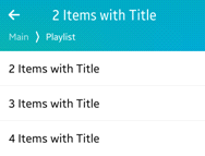
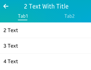
Table: Shrink mode example
| Mode | Example |
|---|---|
ELM_TOOLBAR_SHRINK_EXPAND |
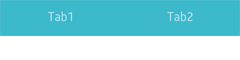 |
ELM_TOOLBAR_SHRINK_SCROLL |
 |
Select Mode
The following select modes are available:
ELM_OBJECT_SELECT_MODE_DEFAULTELM_OBJECT_SELECT_MODE_ALWAYSELM_OBJECT_SELECT_MODE_NONEELM_OBJECT_SELECT_MODE_DISPLAY_ONLY
To set a select mode:
elm_toolbar_select_mode_set(toolbar, ELM_OBJECT_SELECT_MODE_ALWAYS);
Homogeneous
A toolbar displays items homogeneously by default, with long label items occupying a lot of space.
To avoid that, disable the homogeneous mode:
elm_toolbar_homogeneous_set(toolbar, EINA_FALSE);
Item State
You can define 2 or more states for an item. Each state has its own icon, label, and function to call when an item is clicked.
To create 2 states for an item with the same icon but 2 different labels:
Elm_Object_Item *it;
it = elm_toolbar_item_append(toolbar, NULL, "Tab1", NULL, NULL);

elm_toolbar_item_state_add(it, "icon.png", "State 1", _item_pressed_cb, NULL);
elm_toolbar_item_state_add(it, "icon.png", "State 2", _item_pressed_cb, NULL);
You can cycle through the item states to set the state you want:
elm_toolbar_item_state_set(it, elm_toolbar_item_state_next(it));
Styles
To set the style to navigationbar:
elm_object_style_set(toolbar, "navigationbar");
The following table lists the available component styles.
Table: Toolbar styles
| Style | Sample | Text part | Swallow part | Notes |
|---|---|---|---|---|
elm/toolbar/base/default |
 |
N/A | N/A | N/A |
elm/toolbar/base/navigationbar |
 |
N/A | N/A | N/A |
elm/toolbar/base/tabbar_with_title |
 |
N/A | N/A | N/A |
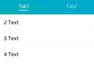
elm/toolbar/item/tabbarelm/toolbar/item/default |
- | elm.text |
elm.swallow.icon |
This style is for the toolbar’s item. Use the elm_toolbar_item_append() function to set the text and the icon. |
elm/toolbar/item/navigationbar |
- | elm.text |
N/A | This style is for the toolbar’s item. Use the elm_toolbar_item_append() function to set the text and the icon. |
Callbacks
You can register callback functions connected to the following signals for a toolbar object.
Table: Toolbar callback signals
| Signal | Description | event_info |
|---|---|---|
clicked |
The toolbar item is double-clicked and selected. | Elm_Toolbar_Item |
clicked,double |
The toolbar item is double-clicked. | Elm_Toolbar_Item |
longpressed |
The toolbar is pressed for a certain amount of time. | Elm_Toolbar_Item |
language,changed |
The program language changes. | - |
item,focused |
The item is highlighted. | Elm_Toolbar_Item |
item,unfocused |
The highlight is removed from the item. | Elm_Toolbar_Item |
scroll |
The toolbar scrolls. | NULL |
scroll,anim,start |
The toolbar scrolling animation starts. | NULL |
scroll,anim,stop |
The toolbar scrolling animation stops | NULL |
scroll,drag,start |
The user starts dragging the toolbar. | NULL |
scroll,drag,stop |
The user stops dragging the toolbar. | NULL |
Note
The signal list in the API reference can be more extensive, but only the above signals are actually supported in Tizen.
Note
Except as noted, this content is licensed under LGPLv2.1+.
Related Information
- Dependencies
- Since Tizen 2.4