Overview of Tizen UI Development
This guide gives a brief description of UI structures and demonstrates how you can develop and design native UI applications with tools.
This documentation has been created based on the mobile profile.
When talking about the development of Tizen native UI applications, you cannot avoid EFL. Tizen platform uses EFL as a UI framework that provides both a visual outlook for user applications and significant performance benefits.
EFL stands for Enlightenment Foundation Libraries. Enlightenment is a project consisting of Enlightenment window manager, EFL libraries, and various utilities and applications. Originally, Enlightenment was a project to build a Window Manager for X11. However, it has grown much since then. At the moment, it still produces the Window Manager, but it has evolved to cover mobile, wearable, and TV UI needs (for example, for Tizen projects) as well as the traditional desktop UI. Although Tizen adopts EFL as the UI framework, the UI framework and EFL are not the same thing. Since EFL is mainly a project for the Window Manager, in the Tizen UI framework, its features are defined for mobile, wearable, and TV characteristics.
Benefits of EFL
EFL provides streamlined graphic core libraries that you need to create powerful applications. EFL has comparatively low memory requirements but provides high performance, and supports a retained mode graphics system and user-centric features, such as themes, 2D/3D effects, and accessibility. In addition, EFL supports various resolutions with the same layout, fast and small file systems, a variety of programming language bindings, and separation of UI and logic. Even though the EFL UI toolkit is used mainly for 2D-based Tizen native applications, it also supports 2.5D and 3D effects and 3D objects.
An important aspect of EFL is efficiency, both in speed and size:
- The core EFL libraries, even with Elementary, are about half the size of the equivalent “small stack” of GTK+ (used, for example, by GNOME), and about one quarter the size of Qt. Of course, with these kinds of numbers, you can always argue over what exactly constitutes an equivalent measurement.
- EFL is low on actual memory usage at runtime, with memory footprints a fraction the size of those in the GTK+ and Qt environments.
- EFL is fast, considering what it does. Some libraries claim to be very fast - but then, it is easy to be fast when you only handle simple and straightforward tasks. EFL is fast, while also tackling the more complex rendering problems involving, for example, alpha blending, interpolated scaling, and transforms with dithering.
Key Characteristics of EFL
The key characteristics of EFL explain why Tizen has adopted EFL as its UI framework:
- Fast performance
- Small memory footprint
- Various back-end engine support
- UI and logic separation
- Themeable and scalable
- Animations
- Language bindings and hardware acceleration
- Flexibility
The following sections describe the most important features (fast performance, and UI and logic separation) in more detail.
Fast Performance with the Retained-mode Rendering
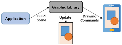
The main reason Tizen uses EFL is its speed. EFL is highly optimized by using a scene graph and retained-mode rendering, resulting in EFL being fast even in software rendering.
A graphics system adopting the retained mode is basically responsible for responding to all repaint requests for rendering the application objects. Clients do not directly cause actual rendering, but objects are redrawn when parts of them are updated. In other words, since EFL (Evas) works with the retained mode, there is no need to command any drawing.
Figure: Retained-mode rendering
Separation of UI and Logic with Edje
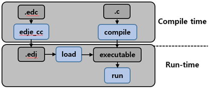
EFL supports EDC files for the UI layout and theme:
- The EDC file can separate the UI layout (EDC) and logic by having the layout description in a plain text file and the logic code in the C or C++ source files.
- The EDC files support themes, which can be changed at runtime without restarting the application.
- UI components are customizable so that each application can create its own customized theme to overlay above the default theme, adding customized versions of UI components to achieve a specific look and feel.
The following figure describes the behavior of the EDC files.
Figure: EDC file behavior
EFL Structure on Tizen
EFL is a collection of libraries that cover a range of functionality from managing the application life-cycle to rendering graphical objects. EFL libraries build on top of each other in layers, steadily becoming higher-level, yet allowing access to lower levels. The higher up you go, the less you have to do yourself. Elementary is at the top, but you still access the layers below it for common tasks, as there is no need for Elementary to wrap things that work perfectly well as-is.
To learn more about each library, go to Introduction. This section only briefly describes the hierarchical structure of your application on Tizen.
Figure: EFL structure
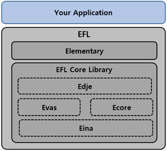
When you create a basic EFL application, you use the following main libraries as a basis:
-
Elementary is the topmost library with which you create your EFL application. It provides all the functions you need to create a window, create simple and complex layouts, manage the life-cycle of a view, and add UI components (a full set with, for example, buttons, boxes, scrollers, and sliders).
-
EFL Core Library consists of several libraries that build on top of each other in layers, steadily becoming higher-level, yet allowing access to lower levels.
EFL Core Library provides the following main libraries:
- Edje library provides a powerful theme. You can use it to create your own UI components and use them in your application. You can also extend the default theme.
- Ecore library manages the main loop of your application. The main loop is one of the most important concepts you need to know to develop an application. The main loop is where events are handled, and where you interact with the user through the callback mechanism.
- Evas library is responsible for managing the drawing of your content. All graphical objects that you create are Evas objects. Evas handles the window state by filling the canvas with objects and manipulating their states. In contrast to other canvas libraries, such as Cairo, OpenGL®, and XRender, Evas is not a drawing library but a scene graph library that retains the state of all objects. Evas objects are created and then manipulated until they are no longer needed, at which point they are deleted. This allows you to work in the same terms that a designer thinks in: it is a direct mapping, as opposed to having to convert the concepts into drawing commands in the right order, and calculate minimum drawing calls needed to get the job done.
- Eina library is the basis of all the EFL libraries. Eina is a toolbox that implements an API for data types in an efficient way. It contains all the functions needed to create lists and hashes, manage shared strings and open shared libraries, and handle errors and memory pools.
UI Hierarchy Structure
To develop a UI application, you must understand the hierarchy structure used in EFL.
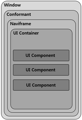
To manage multiple views with EFL on Tizen applications, create a naviframe object. The naviframe can contain multiple views, and is a top-layer object which can help your application to manage and switch views. If your application has only one view, you do not need the naviframe.
The following figure illustrates the most popular view hierarchy for managing multiple views.
Figure: View hierarchy for multiple views
-
Window is the bottommost UI component holding a canvas object for drawing, and represents a block of memory that gets composited to the screen.
-
Conformant shows the virtual keyboard, indicator, softkey, and clipboard areas.
If you do not need those components, you do not need the conformant either.
-
Naviframe is used in applications that show multiple views with back and forth transitions between them.
If you want to manage only 1 view, there is no need to add the naviframe.
-
UI Container (such as grid, table, or box) helps to arrange UI components.
-
UI Component (such as button, background, icon, or image) presents the UI layout.
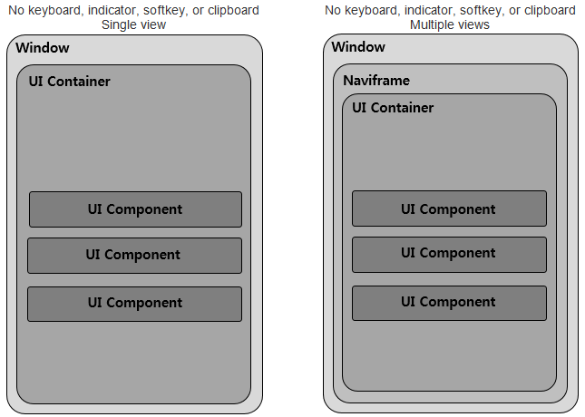
If you want to make a structure for each situation (single and multiple views), the following figure illustrates a possible structure.
Figure: UI hierarchy structure
Elementary UI Component Library
The EFL Elementary is a set of fast, finger-friendly, scalable, and themeable UI component libraries. The number of supported UI components is around 80, including both containers and non-containers. Originally, the Elementary was developed as part of the Window Manager development on Desktop devices. For the mobile profile, Tizen reused the proper UI components and created new ones, and then enhanced and adjusted all of them for Tizen native applications.
The UI components are mobile-friendly: for example, the naviframe component supports view-management for multiple views, the entry component supports many modes (such as password, single/multi-line, and edit/no-edit), the index component supports quick access to another group of UI items, and the toolbar component shows a menu when an item is selected.
The mobile UI components were designed to allow the user to interact with touch screen-equipped mobile devices. Therefore, when developing mobile applications, you can easily use them through the mobile-related infrastructure in company with view management and when reacting to touch events and the user finger size.
UI Components
- Win is the root window component that is often used in an application. It allows you to create some content in it, and it is handled by the window manager.
- Conformant is a container component that accounts for the space taken by the indicator, virtual keyboard, and softkey areas.
- Naviframe consists of a stack of views. New views are pushed on top of previous ones, and only the topmost view is displayed.
- Popup shows a popup area that can contain a title area, a content area, and an action area.
- Ctxpopup is a contextual popup that can show a list of items.
- Scroller holds (and clips) a single object and allows you to scroll across it.
- Grid allows objects to be placed at specific positions along a fixed grid.
- Table is like a box but with 2 dimensions.
- Box is one of the simplest EFL container components. It allows you to arrange the UI components in a specific order, horizontally or vertically.
- Panes adds a draggable bar between 2 content sections. The sections are resized when the bar is dragged.
- Panel is an animated object that can contain child objects. It can be expanded or collapsed by clicking the button on its edge.
- List is a very simple list for managing a small number of items. If you need to manage a lot of items, use the genlist component instead.
- Genlist displays a scrollable list of items. It can hold a lot of items while still being fast and memory-efficient (only the visible items are allocated memory).
- Toolbar is a scrollable list of items. It can also show a menu when an item is selected. Only one item can be selected at a time.
- Multibuttonentry allows the user to enter text so that the text is divided into chunks and managed as a set of buttons.
- Gengrid displays objects on a grid layout and renders only the visible objects.
- Index gives you quick access to a group of other UI items.
- Flipselector is a set of text items and a selector that flips up or down to change the currently-shown text item.
- Background can be used to set a solid background decoration to a window or a container object. It works like an image, but has some background-specific properties, such as setting it to a tiled, centered, scaled, or stretched mode.
- Datetime can display and input date and time values.
- Image can load and display an image from a file or memory.
- Label displays text with simple HTML-like markup.
- Progressbar can be used to display the progress status of a given task.
- Layout is a container component that takes a standard Edje design file and wraps it very thinly in a UI component.
- Map displays a map, using the OpenStreetMap provider.
- Calendar displays month views.
- Colorselector provides a color selector. It has different modes, each of them showing a different color selection configuration.
- Entry is a box in which the user can enter text.
- Spinner enables the user to increase or decrease a numeric value by using arrow buttons.
- Slider is a draggable bar that is used to select a value from a range of values.
- Button is a simple push button. It is composed of a label icon and an icon object, and has an auto-repeat feature.
- Check toggles a Boolean value between true and false.
- Radio can display 1 or more options, but the user can only select one of them. The UI component is composed of an indicator (selected/unselected), an optional icon, and an optional label. Even though it is usually grouped with 2 or more other radio components, it can also be used alone.