CollectionView
Tizen.NUI.Components.CollectionView is a class for presenting collection of data using different layout specifications. It aims to provide a more flexible, and performant scrollable items view with lower memory usage.
CollectionView should be used for presenting collections of data that require scrolling or selection.
While CollectionView manages the appearance of the layout, the appearance of each item is defined by a Tizen.NUI.Binding.DataTemplate class that uses a Tizen.NUI.Components.RecyclerViewItem class to display items. NUI includes item types to display combinations of text and images, and you can also define custom items that display any content you want. CollectionView also includes support for displaying header, footer, and grouped data.
Figure: UI components
CollectionView properties
The CollectionView class derives from the Tizen.NUI.Components.RecyclerView class, from which it inherits the following properties:
Table: RecyclerView properties
| Property | Type | Description |
|---|---|---|
ItemSource |
IEnumerable |
The data source for collection of items. |
ItemTemplate |
DataTemplate |
The template for each item to be displayed. |
CollectionView defines the following properties:
Table: CollectionView properties
| Property | Type | Description |
|---|---|---|
ItemsLayouter |
ItemsLayouter |
To layout items flexibly with scrolling geometry. |
Header |
RecyclerViewItem |
The header of CollectionView. It is present in the scrollable area. |
Footer |
RecyclerViewItem |
The footer of CollectionView. It is present in the scrollable area. |
IsGrouped |
bool |
The boolean flag to set group mode. |
GroupHeaderTemplate |
DataTemplate |
The template to apply each group header items. |
GroupFooterTemplate |
DataTemplate |
The template to apply each group footer items. |
SelectionMode |
ItemSelectionMode |
The selection mode for single and multi-selection. |
SelectedItem |
object |
The last selected item. |
SelectedItems |
IList<object> |
The list of selected items in multi-selection mode. |
Tizen.NUI.Components.ScrollableBase class is the indirect base class of the CollectionView, and you can also use its properties and methods such as ScrollingDirection or ScrollPosition.
Create item source
To use Tizen.NUI.Components.CollectionView class, the item source needs to be created first. Item source is the collection of data on each item, which can notify the changes on demand.
-
Create an model class of item data:
C#Copyclass Animal { private string _name; private string _scientificName; private string _imageResource; private string _imageUrl = Tizen.Applications.Application.Current.DirectoryInfo.Resource + "/animals/"; public Animal(string name, string scientificName, string imageResource) { _name = name; _scientificName = scientificName; _imageResource = imageResource; } public string Name { get => _name; set => _name = value; } public string ScientificName { get => _scientificName; set => _scientificName = value; } public string ImagePath { get => _imageUrl + _imageResource; } }To apply property changes dynamically in the
CollectionView, you need to implement System.ComponentModel.INotifyPropertyChanged interface:C#Copyclass Animal : INotifyPropertyChanged { public event PropertyChangedEventHandler PropertyChanged; public string Name { get => _name; set { _name = value; //Invoke property changed event when property changed. PropertyChanged?.Invoke(this, new PropertyChangedEventArgs("Name")); } } } -
Create System.Collections.Generic.IEnumerable data collection for items. For simple collection, System.Collections.Generic.List<T> can be useful:
C#Copyvar animals = new List<Animal>(); animals.Add(new Animal("Cat", "Felis catus", "cat.png")); animals.Add(new Animal("Dog", "Canis lupus familiaris", "dog.png")); animals.Add(new Animal("Fox", "Vulpes" "fox.png")); animals.Add(new Animal("Horse", "Equus ferus", "horse.png"));To apply data changes dynamically in the
CollectionView, you need to implement System.ComponentModel.INotifyPropertyChanged and System.Collections.Specialized.INotifyCollectionChanged interface. System.Collections.ObjectModel.ObservableCollection<T> can be useful for this purpose:C#Copyvar animals = new ObservableCollection<Animal>();
Create grouped item source
CollectionView supports grouped item source with System.Collections.ObjectModel.ObservableCollection<T>:
-
Create
System.Collections.ObjectModel.ObservableCollection<T>data collection for a group:C#Copyclass Family : ObservableCollection<Animal> { private string _name; public Family(string name) { _name = name; } public Name { get => _name; set { _name = value; OnPropertyChanged(new PropertyChangedEventArgs("Name")); } } } -
To add a group into group collection:
C#Copyvar families = new ObservableCollection<Family>(); var falidae = new Family("Falidae"); falidae.Add(new Animal("Cat", "Felis catus", "cat.png")); falidae.Add(new Animal("Cheetah", "Acinonyx jubatus", "cheetah.png")); falidae.Add(new Animal("Leopard", "Panthera pardus", "leopard.png")); falidae.Add(new Animal("Lion", "Panthera leo", "lion.png")); falidae.Add(new Animal("Tiger", "Panthera tigris", "tiger.png")); families.Add(falidae); var canidae = new Family("Canidae"); canidae.Add(new Animal("Coyote", "Canis latrans" "coyote.png")); canidae.Add(new Animal("Dog", "Canis lupus familiaris", "dog.png")); canidae.Add(new Animal("Fox", "Vulpes" "fox.png")); canidae.Add(new Animal("Raccoon dog", "Nyctereutes procyonoides" "raccoondog.png")); canidae.Add(new Animal("Wolf", "Canis lupus" "wolf.png")); families.Add(canidae);
To use grouped item source in CollectionView, IsGrouped property must be true.
Create items
-
To create items in
CollectionView, useTizen.NUI.Binding.DataTemplateclass asItemTemplateofCollectionView:C#Copyvar collectionView = new CollectionView() { ItemTemplate = new DataTemplate(() => { /// Create item here. This method is CreateContent() of DataTemplate. }); }You can scroll this table.xmlCopy<CollectionView> <ItemTemplate> <DataTemplate> <!-- Create item here --> </DataTemplate> </ItemTemplate> </CollectionView>You can scroll this table. -
Create an item as the content of the
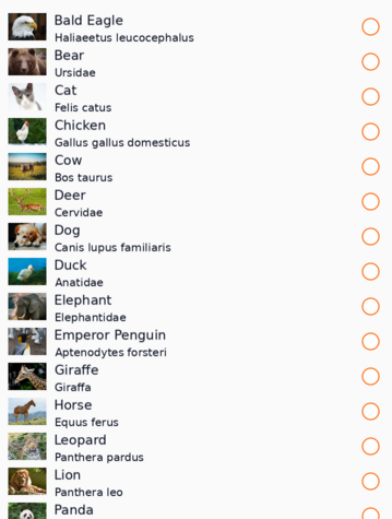
Tizen.NUI.Binding.DataTemplateclass.CollectionViewacceptsTizen.NUI.Components.RecyclerViewItemclass as an item. Developers can create a new class inherited from abstractTizen.NUI.Components.RecyclerViewItemclass, or use pre-defined default item classes. The following are pre-defined default item classes:Figure: Tizen.NUI.Components.DefaultLinearItem

Tizen.NUI.Components.DefaultLinearItemis for LinearLayout items. It provides the following contents:Table: Tizen.NUI.Components.DefaultLinearItem
You can scroll this table.Property Type Description TextstringThe main text. It uses Labelto getTextLabelobject.SubTextstringThe substitute text. It uses SubLabelto getTextLabelobject.IconViewThe left icon content of item. ExtraViewThe right icon content of item. Figure: Tizen.NUI.Components.DefaultGridItem
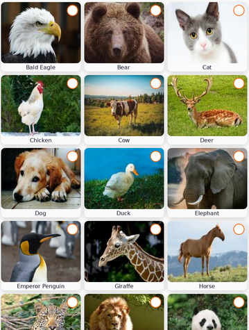
Tizen.NUI.Components.DefaultGridItemis for GridLayout items. It provides the following contents:Table: Tizen.NUI.Components.DefaultGridItem
You can scroll this table.Property Type Description TextstringThe main text. It uses Labelto getTextLabelobject.ImageImageViewThe image content of item. To set resource on an image use ResourceUrl. BadgeViewThe top-right badge icon content of item. LabelOrientationTypeDefaultGridItem.LabelOrientationThe enum type for label orientation. The label can be placed on the outer/inner side of the image and on the top/bottom side of the image. Figure: Tizen.NUI.Components.DefaultTitleItem

Tizen.NUI.Components.DefaultTitleItemis for group header items. It provides the following contents:Table: Tizen.NUI.Components.DefaultTitleItem
You can scroll this table.Property Type Description TextstringThe main text. It uses Labelto getTextLabelobject.IconViewThe left icon content of item. SeperatorViewThe bottom separator of group title for dividing from it’s children. Use data binding for property update.
C#Copyvar collectionView = new CollectionView() { ItemTemplate = new DataTemplate(() => { var item = DefaultLinearItem() { WidthSpecification = LayoutParamPolicies.MatchParent }; item.SetBinding(DefaultLinearItem.TextProperty, "Name"); item.SetBinding(DefaultLinearItem.SubTextProperty, "ScientificName"); item.Icon = new ImageView() { WidthSpecification = 80, HeightSpecification = 80, }; item.Icon.SetBinding(ImageView.ResourceUrlProperty, "ImagePath"); return item; }); }You can scroll this table.dustCopy<CollectionView> <CollectionView.ItemTemplate> <DataTemplate> <DefaultLinearItem WidthSpecification="{Static LayoutParamPolicies.MatchParent}" Text="{Binding Path=Name}" SubText="{Binding Path=ScientificName}"> <DefaultLinearItem.Icon> <ImageView WidthSpecification="80" HeightSpecification="80" ResourceUrl="{Binding Path=ImagePath}" /> </DefaultLinearItem.Icon> </DefaultLinearItem> </DataTemplate> </CollectionView.ItemTemplate> </CollectionView>You can scroll this table.
CreateContent() will be performed internally with CollectionView class and Tizen.NUI.Components.ItemsLayouter class, Here, generated items can be cached, and recycled on different positions.
GroupHeader and GroupFooter also can be created with Tizen.NUI.Binding.DataTemplate class.
Set layout on CollectionView
CollectionView allows changing items layout using Tizen.NUI.Components.ItemsLayouter.
NUI provides the following pre-defined ItemsLayouter:
Table: ItemsLayouter derivded class
| Class | Figure | Description |
|---|---|---|
Tizen.NUI.Components.LinearLayouter |
 |
Layout items on linear position such as list view. |
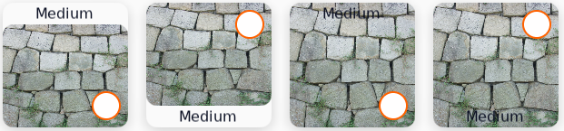
Tizen.NUI.Components.GridLayouter |
 |
Layout items on grid rows and columns. The row and column count will be automatically calculated by item’s size. |
                C#

                    Copy


            var collectionView = new CollectionView()
{
    ItemsLayouter = new LinearLayouter(),
    ScrollingDirection = Tizen.NUI.Components.ScrollableBase.Direction.Vertical
}
                xml

                    Copy


            <CollectionView ScrollingDirection="Vertical">
    <ItemsLayouter>
        <LinearLayouter />
    </ItemsLayouter>
</CollectionView>
Selection in CollectionView
The CollectionView provides item selection feature. Selection can be controlled by SelectionMode, which provides you with single or multi-selection.
Table: ItemSelectionMode
| Mode | Description |
|---|---|
None |
It is the default mode where none of the items can be selected. |
Single |
Allows exclusive single selection. Any previously selected item will be deselected. |
SingleAlways |
Allows only a single selection. It’s not possible to deselect item, so once the user selects an item, there is always exactly one item selected. |
Multiple |
Allows multiple selections without deselecting previous selected items. |
Selection can be handled by user interactions such as key or touch inputs.
Changing selection will initiate SelectionChanged event.
The Tizen.NUI.Components.SelectionChangedEventArgs object that accompanies the SelectionChanged event has two properties, both of type System.Collections.Generic.IReadOnlyList<object>, which are described below:
PreviousSelection: The list of items that were selected, before the selection changed.CurrentSelection: The list of items that are selected, after the selection changed.
-
Single selection
SelectionMode is
SingleorSingleAlways,CollectionViewonly selects single items and previously selected item will be deselected. To get or set currently selected item, use SelectedItem property:C#Copyvar collectionView = new CollectionView() { ItemSource = animalSource; SelectionMode = ItemSelectionMode.Single, // itemSelectionMode.SingleAlways, SelectedItem = animalSource[10]; // 10th item will be selected. } collectionView.SelectionChanged = ((object o, SelectionChangedEventArgs ev) => { Animal animal = null; // Single Selection Only have 1 or nil object in the list. foreach (object item in ev.PreviousSelection) { animal = item as Animal; if (animal == null) break; Console.WriteLine($"Previous selected item {animal.Name}"); } foreach (object item in ev.CurrentSelection) { animal = item as Animal; if (animal == null) break; Console.WriteLine($"Current selected item {animal.Name}"); } }); -
Multiple selection
SelectionModeisMultiple,CollectionViewselects multiple items. To get currently selected items, use SelectedItems property. To set new selection, use UpdateSelectedItems() method:C#Copyvar collectionView = new CollectionView() { ItemSource = animalSource; SelectionMode = ItemSelectionMode.Multiple, } collectionView.SelectionChanged = ((object o, SelectionChangedEventArgs ev) => { Animal animal = null; foreach (object item in ev.PreviousSelection) { animal = item as Animal; if (animal == null) break; Console.WriteLine($"Previous selected item {animal.Name}"); } foreach (object item in ev.CurrentSelection) { animal = item as Animal; if (animal == null) break; Console.WriteLine($"Current selected item {animal.Name}"); } }); var newSelection = new List<Animal>(); for(int i = 3; int i < 10; i++) { newSelection.Add(animalSource[i]); } collectionView.UpdateSelectedItems(newSelection);
Other features
CollectionView can use not only scroll-related features and events as it is a descendant of Tizen.NUI.Components.ScrollableBase, but also provide an extended method of ScrollTo() which requires Tizen.NUI.Component.ItemScrollTo type:
                C#

                    Copy


            var collectionView = new CollectionView();
collectionView.ScrollTo(10, true, ItemScrollTo.Nearest);
Related information
- Dependencies
- Tizen 7.0 and Higher