UI Components
UI components are interactive components for layout and user interface. NUI provides UI components, such as buttons, table view, text controls, image view, flex container, slider, and video view.
Figure: UI components
The following table lists the available UI components:
Table: UI components
You can scroll this table.
| Control | Description | Appearance |
|---|---|---|
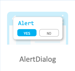
| AlertDialog | AlertDialog class shows a dialog with title, message, and action buttons. Guide / API |
 C# code for this page / XAML page |
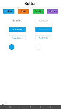
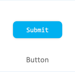
| Button | Button is a common component and describes what action occurs when you select it. A Button can either contain a text or an icon. Guide / API |
 C# code for this page / XAML page |
| CanvasView | A CanvasView is a class for displaying vector primitives. Guide / API |
CanvasViewView |
| CameraView | A camera view that controls and displays camera playback. Guide / API |
CameraView |
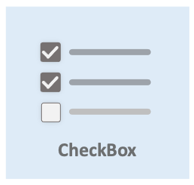
| CheckBox | A CheckBox that can set selected or unselected status when user selects it. Guide / API |
 C# code for this page / XAML page |
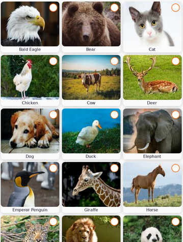
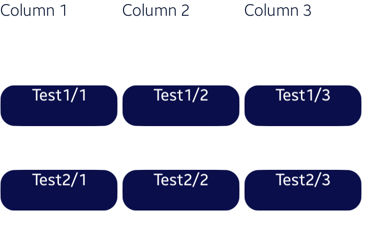
| CollectionView | A scrollable items view for presenting collection of data using different layout specifications. It aims to provide a more flexible, and performant scrollable items view with lower memory usage. Guide / API |
 |
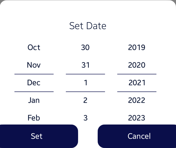
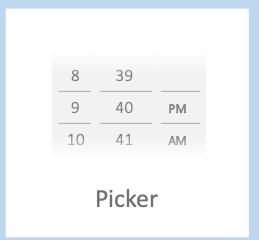
| DatePicker | DatePicker is a class which provides a function that allows the user to select a date through a scrolling motion by expressing the specified value as a list. DatePicker expresses the current date using the locale information of the system. Year range is 1970~2038 (glibc time_t struct min, max value) Guide / API |
 C# code for this page / XAML page |
| GLView | GLView is a class which renders the view with OpenGL® ES. Guide / API |
GLView |
| ImageView | An image view is a class for displaying an image resource. Guide / API |
 C# code for this page / XAML page |
| Loading | A loading is used to give information about the ongoing operations. Guide / API |
 C# code for this page / XAML page |
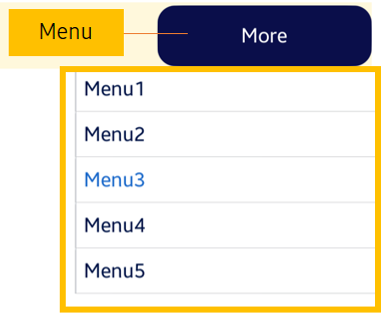
| Menu | Menu is a class which contains a set of MenuItems and has one of them selected. Guide / API |
 C# code for this page / XAML page C# code Menu definition / XAML Menu definition |
| Notification | A notification is used to pop-up a notification window with a content view. Guide / API |
Notification |
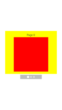
| Pagination | A Pagination is used to show the number of pages available and the currently active page. Guide / API |
 C# code for this page / XAML page |
| Picker | Picker is a class which provides a function that allows the user to select a value through a scrolling motion by expressing the specified value as a list. Guide / API |
 C# code for this page / XAML page |
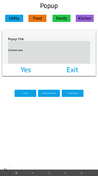
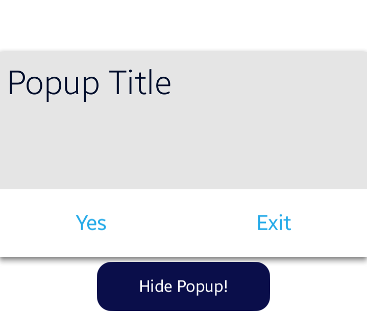
| Popup | A popup is used as a popup window. Guide / API |
 C# code for this page / XAML page |
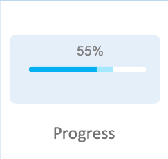
| Progress | A progress is used to show the ongoing status using a long narrow bar. Guide / API |
 C# code for this page / XAML page |
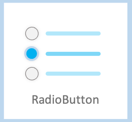
| RadioButton | A RadioButton that can set selected or unselected status when user selects it. Guide / API |
 C# code for this page / XAML page |
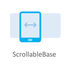
| ScrollableBase | A ScrollableBase supports scrolling. Guide / API |
 C# code for this page / XAML page |
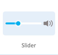
| Slider | A slider that indicates a modifiable value within a specific range. Guide / API |
 C# code for this page / XAML page |
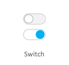
| Switch | A switch that can be used as a selector. Guide / API |
 C# code for this page / XAML page |
| TabBar | TabBar is a class which contains a set of TabButtons and has one of them selected. Guide / API |
 C# code for this page / XAML page |
| TabButton | TabButton is a class which is used for selecting a content in the TabView. Guide / API |
C# code for this page / XAML page |
| TabContent | TabContent is a class which contains a set of Views and has one of them selected. Guide / API |
 C# code for this page / XAML page |
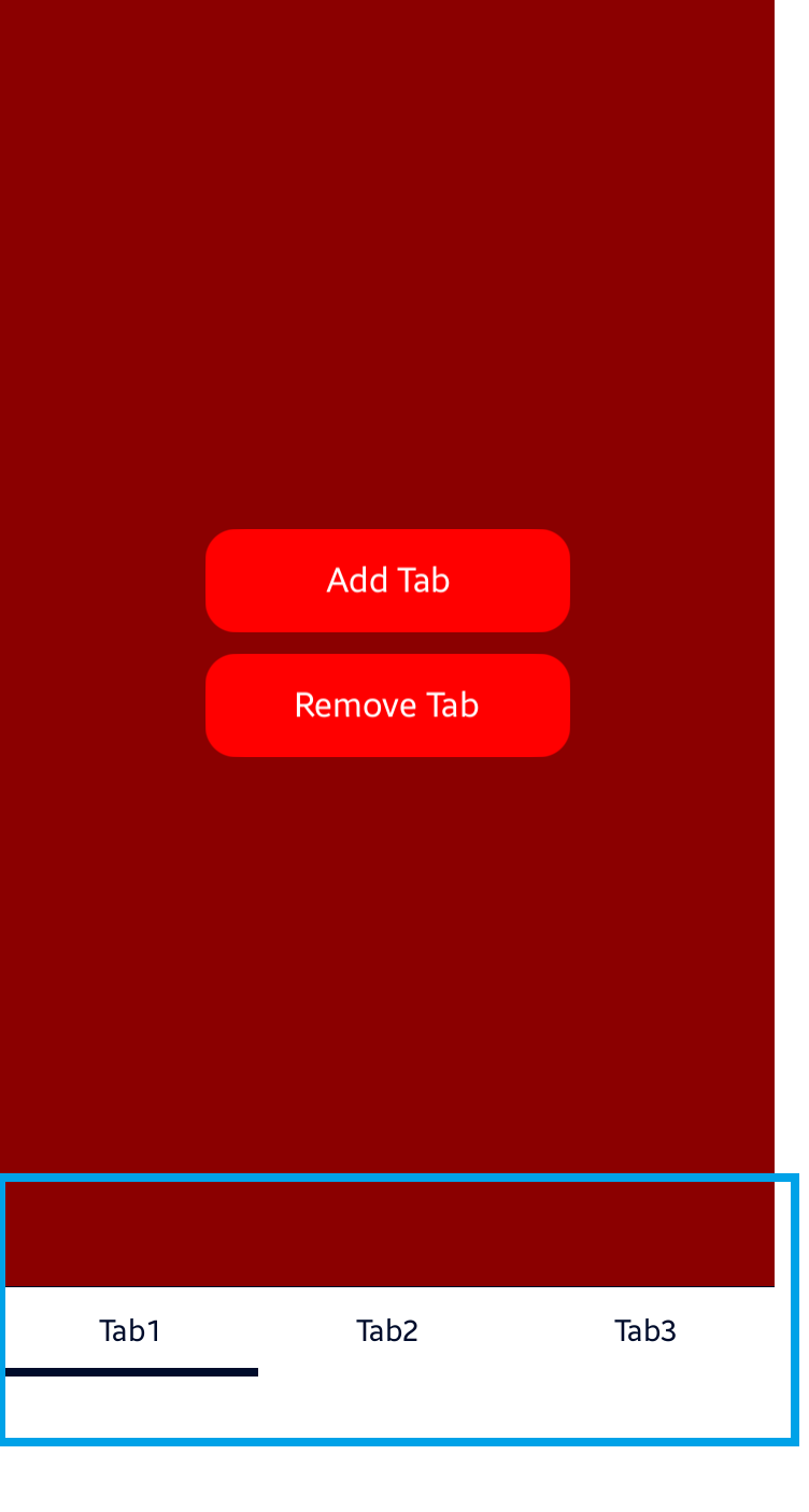
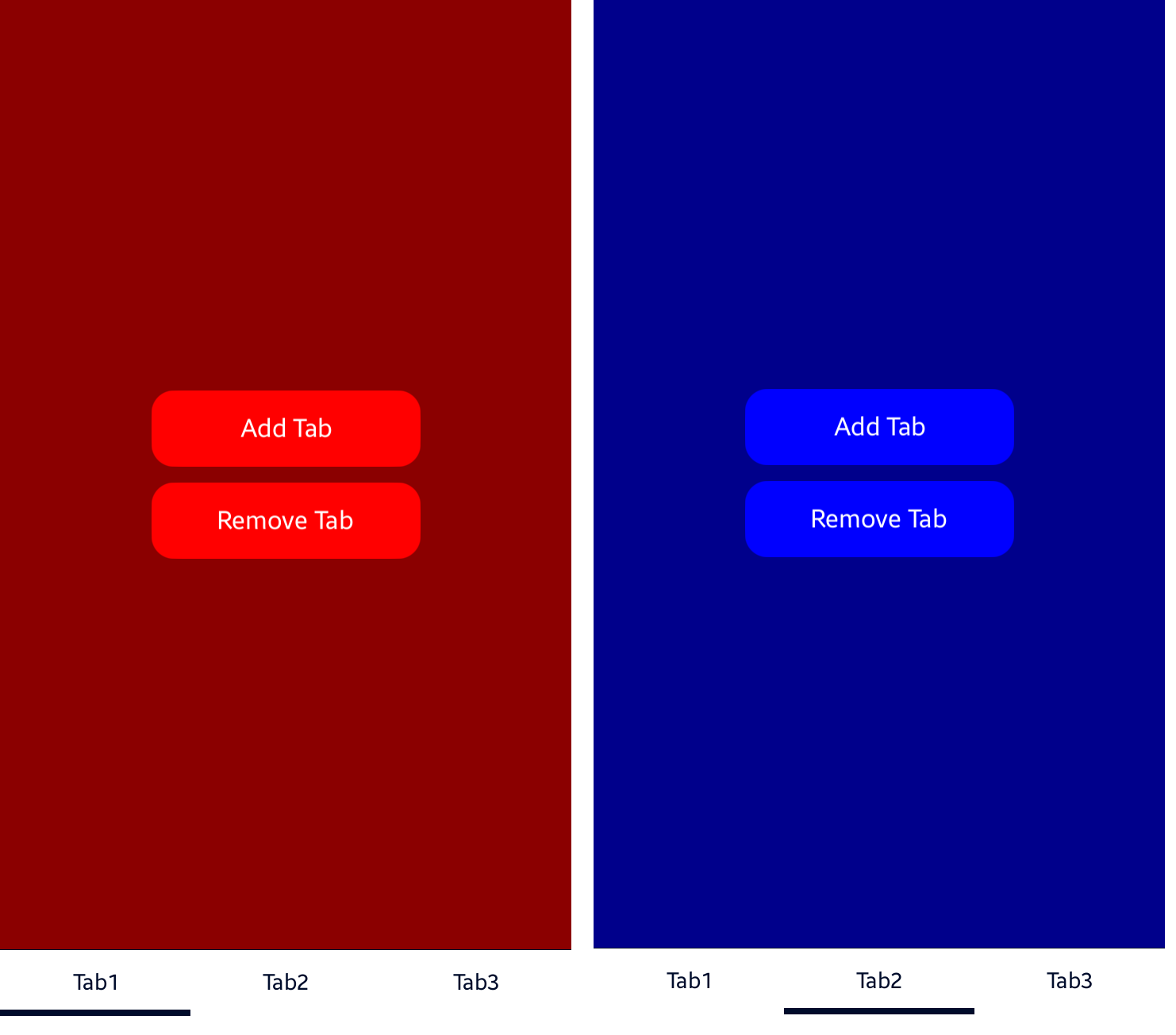
| TabView | TabView is a class which contains a TabBar and TabContent. TabView adds TabButtons and Views to TabBar and TabContent in TabView. TabView removes TabButtons and Views from TabBar and TabContent in TabView. TabView selects a view from the TabContent according to the selected TabButton in the TabBar. Guide / API |
C# code for this page / XAML page |
| TimePicker | TimePicker is a class which provides a function that allows the user to select a time through a scrolling motion by expressing the specified value as a list. TimePicker expresses the current time using the locale information of the system. Guide / API |
 C# code for this page / XAML page |
| TableView | A table view that can align child actors in a grid like layout. Guide / API |
 C# code for this page / XAML page |
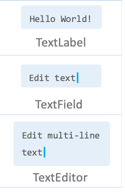
| Text | A text that renders a short text string and provides a editable text. Guide / Text Editor API / Text Field API / Text Label API |
 C# code for this page / XAML page |
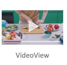
| VideoView | A video view that controls and displays video playback. Guide / API |
 C# code for this page / XAML page |
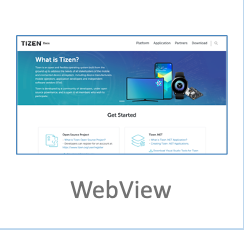
| WebView | A web view for showing web content. Guide / API |
 C# code for this page / XAML page |
The base class for the components is View. This class can also be used to create your own custom UI components. For more information on the view class, see View. In this UI Components guide, both the terms control and component are used to refer to a UI component.
You can customize the look of the UI components with stylesheets. For a reusable rendering logic that can be used by all UI components, take advantage of visuals.
Related information
- Dependencies
- Tizen 4.0 and Higher
Submit your feedback to GitHub