Button
The button UI component works as a clickable input element to trigger events. For more information, see the Button API.
This feature is optional.
Basic Usage
To use a button component in your application:
-
Add a button with the
elm_button_add()function:Evas_Object *button; button = elm_button_add(parent); -
Set a style and fill the button with a text or an image according to the style:
-
Set a style to the button with the
elm_object_style_set()function. If you use the default style, you can skip this step.elm_object_style_set(button, "circle"); -
Set a label to the button with the
elm_object_text_set()function, if the style supports a text part.elm_object_text_set(button, "Home"); -
Set an image object to the button with the
elm_object_part_content_set()function, if the style supports a swallow part.Evas_Object *icon; elm_object_part_content_set(button, "icon", icon);
-
-
Register the callback functions.
The following example shows how to define and register a callback for the
clickedsignal:evas_object_smart_callback_add(button, "clicked", clicked_cb, data); void clicked_cb(void *data, Evas_Object *obj, void *event_info) { dlog_print(DLOG_INFO, LOG_TAG, "Button clicked\n"); }
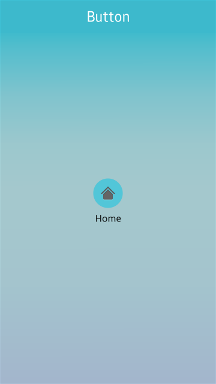
The following example shows a simple use case of the button component.
Example: Button use case
Evas_Object *win;
Evas_Object *conf;
Evas_Object *nf;
Evas_Object *box;
Evas_Object *button;
Evas_Object *icon;

/* Starting right after the basic EFL UI layout code */
/* (win - conformant - naviframe) */

/* Add a box to contain a button and push the box into the naviframe */
box = elm_box_add(nf);
evas_object_show(box);
elm_naviframe_item_push(nf, "Button", NULL, NULL, box, NULL);

/* Add a button and set a style */
button = elm_button_add(box);
elm_object_style_set(button, "circle");

/* Set a text to the button */
elm_object_text_set(button, "Home");

/* Add an icon and set it as a content */
icon = elm_icon_add(button);
elm_icon_standard_set(icon, "home");
elm_object_part_content_set(button, "icon", icon);

evas_object_show(button);
elm_box_pack_end(box, button);
Features
You can use the autorepeat feature in your application. Once a button is pressed, a repeated signal is emitted repeatedly until the button is released.
-
To disable the autorepeat feature:
elm_button_autorepeat_set(button, EINA_FALSE); -
To set the initial timeout before the
repeatedsignal is emitted:elm_button_autorepeat_initial_timeout_set(button, 5.0); -
To set the interval between 2
repeatedsignals:elm_button_autorepeat_gap_timeout_set(button, 0.5);
Styles
The following table lists the available component styles.
Table: Button styles
| Style | Sample | Text part | Swallow part |
|---|---|---|---|
default |
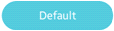 |
default |
icon |
circle |
 |
default |
icon |
editfield_clear |
 |
N/A | icon |
bottom |
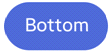 |
default |
icon |
icon_reorder |
- | N/A | N/A |
icon_expand_add |
- | N/A | N/A |
icon_expand_delete |
 |
N/A | N/A |
naviframe/title_left |
 |
default |
N/A |
naviframe/title_right |
 |
default |
N/A |
naviframe/back_btn/default |
 |
N/A | N/A |
dropdown |
 |
default |
N/A |
contacts (Tizen 2.3 only style) |
- | default |
N/A |
naviframe/title_done (Tizen 2.3 only style) |
 |
N/A | N/A |
naviframe/title_cancel (Tizen 2.3 only style) |
 |
N/A | N/A |
naviframe/drawers (Tizen 2.3 only style) |
- | N/A | N/A |
option (Tizen-2.3 only style) |
- | N/A | N/A |
Callbacks
You can register callback functions connected to the following signals for a button object.
Table: Button callback signals
| Signal | Description | event_info |
|---|---|---|
clicked |
The button is clicked (press and release). | NULL |
repeated |
The button is pressed without releasing it. | NULL |
pressed |
The button is pressed. | NULL |
unpressed |
The button is released after being pressed. | NULL |
Note
The signal list in the API reference can be more extensive, but only the above signals are actually supported in Tizen.
Note
Except as noted, this content is licensed under LGPLv2.1+.
Related Information
- Dependencies
- Since Tizen 2.4