Entry
This feature is optional.
The entry component is a box where the user can enter text. It supports the following features:
- Multiline
- Scrolling
- Password mode
- Filtering text
- Read/write from a file
- Theme style overrides
The entry component includes an Evas Textblock in it, which means that it supports the features of the textblock component, such as text wrapping and formatted markup text.
For more information, see the Entry API.
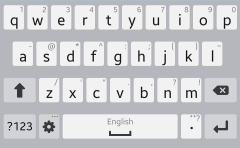
Figure: Entry component
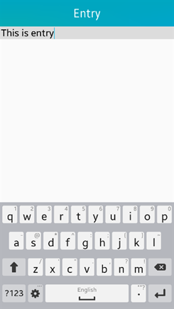
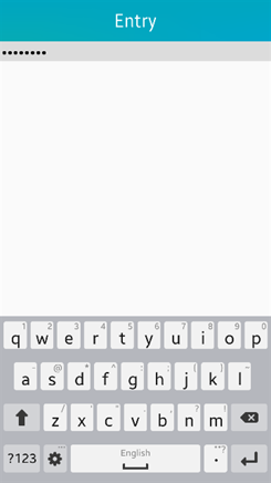
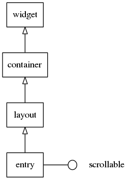
Figure: Entry hierarchy
Adding an Entry Component
To create an entry component, use the elm_entry_add() function. You can set the text inside it with the elm_entry_entry_set() function.
Evas_Object *entry;
Evas_Object *parent;

entry = elm_entry_add(parent);
elm_entry_entry_set(entry, "A short text.");
Managing the Text
To manage the entry component content:
-
Add text to the entry:
-
Append text to the end of the existing content:
elm_entry_entry_append(entry, "END"); -
Insert text at the current cursor position:
elm_entry_entry_insert(entry, "CURSOR");
-
-
Check whether the entry is empty:
Eina_Bool Empty = elm_entry_is_empty(entry);If the entry has content, the function returns the Boolean
EINA_FALSEvariable. -
Select text:
-
Select all the content of the entry component:
elm_entry_select_all(entry); -
Select a part of the text with the
elm_entry_select_region_set()function.The following example selects the first 20 characters of the entry content:
elm_entry_select_region_set(entry, 0, 20); -
Clear the current selection:
elm_entry_select_none(entry);
-
-
Retrieve the currently selected text:
const char *selection;

selection = elm_entry_selection_get(entry);
If the entry text is empty, the function returns
NULL. -
Copy or cut the selection to the clipboard:
elm_entry_selection_cut(entry);Paste the selection in the same or a different entry:
elm_entry_selection_paste(entry); -
Filter the text.
You can filter the size and individual characters within the entry text by appending a filter with the
elm_entry_markup_filter_append()function.-
To limit the size of the entry to 8 characters:
static Elm_Entry_Filter_Limit_Size limit_size = { .max_char_count = 8, .max_byte_count = 0 }; /* Append a new callback to the list, this function is called each time a text is inserted in the entry. Pass the previously created limit_size struct to set the maximum number of characters allowed to 8 */ elm_entry_markup_filter_append(entry, elm_entry_filter_limit_size, &limit_size); -
To define a list of accepted or rejected characters, append the filter with the
Elm_Entry_Filter_Accept_Setstructure.The following example shows how to reject the ‘+’, ‘-’, ‘*’, and ‘/’ characters:
static Elm_Entry_Filter_Accept_Set
accept_set =
{
  .accepted = NULL,
  .rejected = "+*-/"
};

elm_entry_markup_filter_append(entry, elm_entry_filter_accept_set, &accept_set);
-
You can define a file (for example, /tmp/test.txt) to save the entry content. The content in the file is implicitly loaded and displayed. After the file is set, any content changes in the entry are automatically saved after a short delay.
/* Set the file in which the entry text is saved */
/* Implicitly load the existing file content */
elm_entry_file_set(entry, "/tmp/test.txt", ELM_TEXT_FORMAT_MARKUP_UTF8);
You can also deactivate the automatic saving feature and explicitly save the content when needed:
/* Disable autosaving */
elm_entry_autosave_set(entry, EINA_FALSE);

/* Trigger saving when needed */
elm_entry_file_save(entry);
Managing the Cursor
The cursor represents the current position in the entry, where the next action, for example, text insertion or deletion, is done. Usually, the cursor is represented as a blinking character, but its appearance depends on the theme configuration.
To manage the cursor position:
-
Move the cursor to the beginning of the entry:
elm_entry_cursor_begin_set(entry); -
Move the cursor to the end of the entry:
elm_entry_cursor_end_set(entry); -
Move the cursor 1 line down or up:
elm_entry_cursor_down(entry); elm_entry_cursor_up(entry); -
Move the cursor 1 character left or right:
elm_entry_cursor_prev(entry); elm_entry_cursor_next(entry); -
Set the cursor at a specific position (15th character, for example):
elm_entry_cursor_pos_set(entry, 15); -
Make a text selection while moving the cursor.
The following example starts a selection at the current cursor position, moves 5 characters right, and ends the selection:
elm_entry_cursor_selection_begin(entry);

for (i = 0; i < 5; i++)
    elm_entry_cursor_next(entry);

elm_entry_cursor_selection_end(entry);
Configuring the Entry
To configure the entry functionality:
-
Make the entry uneditable by the user.
By default, the user can enter text in the entry component when it is in focus.
elm_entry_editable_set(entry, EINA_FALSE);Note
Even when the entry component is set to be uneditable by the user, you can still use the
elm_entry_entry_append()andelm_entry_entry_insert()functions to modify its text programmatically. -
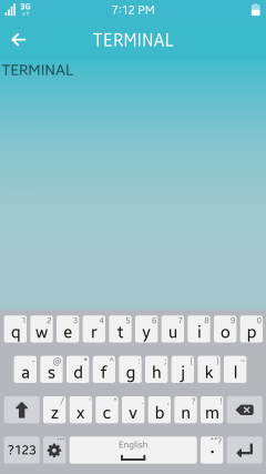
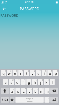
Set the password mode.
If the password mode is set, the entry component hides what the user is typing. In this mode, the display of any text is replaced by asterisks (*), and the entry is a single line (there is no line wrap).
elm_entry_password_set(entry, EINA_TRUE);When the password mode is enabled, the
elm_object_text_get()function returns an UTF-8 string for user convenience. -
Define the line mode and wrapping.
The entry component has 2 line modes: single and multiline:
-
To set the entry to the single line mode:
elm_entry_single_line_set(entry, EINA_TRUE);In this mode, the text does not wrap when reaching the edge, but the entry grows horizontally instead. Pressing the Enter key in this mode generates an
activateevent instead of adding a new line. -
To set the entry to the multiline mode with wrapping:
elm_entry_single_line_set(entry, EINA_FALSE);
elm_entry_line_wrap_set(entry, ELM_WRAP_WORD);
In this mode, the text wraps at the end of the entry and pressing the Enter key creates a new line.
In multiline entries, the
elm_entry_line_wrap_set()function provides a way to cut the text implicitly into a new line when it reaches the far edge of the UI component. The following wrap modes are available:ELM_WRAP_NONE: No wrapELM_WRAP_CHAR: Wrap between charactersELM_WRAP_WORD: Wrap in allowed wrapping points (as defined in the Unicode standard)ELM_WRAP_MIXED: Word wrap, and if that fails, character wrap
-
Modifying Formatting and Using Special Markups
You can format the entry text in many ways:
-
Format the entry text with markup elements that are defined in the theme.
For example, you can use the
<br>element to insert a line break. For a list of available markup elements, see Formatted text. -
Add special markups within the entry text:
-
Anchors:
<a href = ..>...</a>The anchors generate an
anchor,clickedsignal when the user clicks them. Thehrefattribute is used to identify the anchor. The anchor also reacts to theanchor,in(mouse in),anchor,out(mouse out),anchor,down(mouse down), andanchor,up(mouse up) events. -
Items:
<item size = .. vsize = .. href = ..>...</item>The items provide a way to insert any
Evas_Objectin the text. TheEvas_Objectname must be specified in thehrefattribute.The
elm_entry_item_provider_append()function appends a custom item provider to the list for that entry. You can also prepend a custom item provider to the list with theelm_entry_item_provider_prepend()function. Theelm_entry_item_provider_remove()function removes a custom item provider from the list.static Evas_Object* item_provider(void *images EINA_UNUSED, Evas_Object *en, const char *item) { Evas_Object *o = NULL; char buf[1024]; if (!strcmp(item, "itemprovider")) { snprintf(buf, sizeof(buf), "%s/tizen.png", ICON_DIR); o = evas_object_image_filled_add(evas_object_evas_get(en)); evas_object_image_file_set(o, buf, NULL); } return o; } Evas_Object *entry; Entry = elm_entry_add(layout); elm_object_text_set(entry, "Item Provider" "<item size=50x50 vsize=full href=itemprovider></item>"); elm_entry_item_provider_append(entry, item_provider, NULL);
-
-
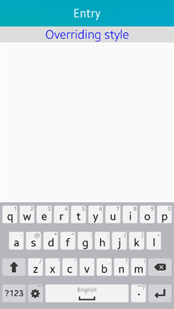
Override the textblock object style.
To tweak the style of the text within the entry component, you can override parts of the theme style to the textblock object using the
elm_entry_text_style_user_push()function. The function pushes a new style on top of the user style stack that overrides the current style. Remove the style at the top of the user style stack with theelm_entry_text_style_user_pop()function.Evas_Object *entry; Entry = elm_entry_add(layout); elm_entry_text_style_user_push(entry, "DEFAULT='font=Tizen:style=Light font_size=50 color=#00f align=center'");The
DEFAULTelement sets the style properties to a default style that is applied to the complete text. For more information on style properties, such as font, font size, and color, see Textblock Objects.Figure: Overriding style
-
Modify the content and text parts of the default theme:
-
You can modify 2 content parts of the default theme:
iconandend.The following example shows how to set an icon in the
endcontent part:Evas_Object *icon; ic = elm_icon_add(entry); elm_image_file_set(ic, "icon.png", NULL); elm_object_part_content_set(entry, "end", icon); -
You can modify 2 text parts of the default theme:
default(entry text) andguide(entry placeholder).The following example shows how to set the placeholder text to
Hello World:elm_object_part_text_set(entry, "guide", "Hello World");
-
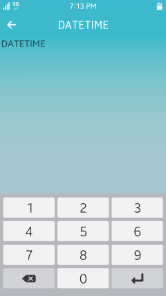
Setting the Input Panel Layout and Return Key Type
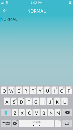
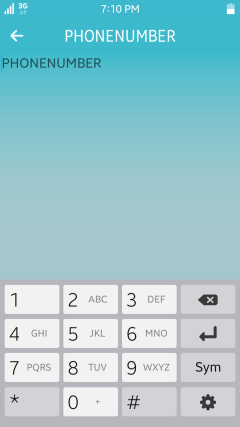
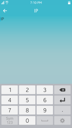
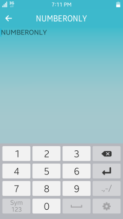
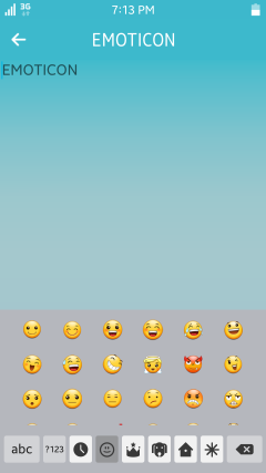
The input panel has different input types, such as number, date, URL, and emoticon. You can specify the keyboard layout type you want for the entry component with the Elm_Input_Panel_Layout enumerator, which defines the available input types.
To set the input panel layout to the phone number layout:
elm_entry_input_panel_layout_set(entry, ELM_INPUT_PANEL_LAYOUT_PHONENUMBER);
Figure: Input panel layouts


You can change the return key type in the input panel layout. You can specify the return key type you want for the entry component with the Elm_Input_Panel_Return_Key_Type enumerator, which defines the available return key types.
To set the return key type to the join key:
elm_entry_input_panel_return_key_type_set(entry, ELM_INPUT_PANEL_RETURN_KEY_TYPE_JOIN);
Figure: Join and Send return key types


The following component styles are available.
Table: Entry styles
| Style | Sample | Text part | Notes |
|---|---|---|---|
elm/entry/base/default |
 |
elm.guide: for the guide textelm.text: for the main text |
The guide text is automatically erased when the main text is entered. |
Callbacks
You can register callback functions connected to the following signals for an entry object.
Table: Entry callback signals
| Signal | Description | event_info |
|---|---|---|
aborted |
The Escape key is pressed on a single line entry. | NULL |
activated |
The Enter key is pressed on a single line entry. | NULL |
anchor,clicked |
An anchor is clicked. | Elm_Entry_Anchor_Info object |
anchor,down |
The mouse button is pressed on an anchor. | Elm_Entry_Anchor_Info object |
anchor,hover,opened |
The anchor is clicked. | Elm_Entry_Anchor_Info object |
anchor,in |
The mouse cursor is moved into an anchor. | Elm_Entry_Anchor_Info object |
anchor,out |
The mouse cursor is moved out of an anchor. | Elm_Entry_Anchor_Info object |
anchor,up |
The mouse button is released on an anchor. | Elm_Entry_Anchor_Info object |
changed |
The text within the entry is changed. | NULL |
changed,user |
The text within the entry is changed because of user interaction. | Edje_Entry_Change_Info object |
clicked |
The entry is clicked (mouse press and release). | NULL |
clicked,double |
The entry is double-clicked. | NULL |
clicked,triple |
The entry is triple-clicked. | NULL |
cursor,changed |
The cursor position is changed. | NULL |
cursor,changed,manual |
The cursor position is changed manually. | NULL |
focused |
The entry receives focus. | Elm_Focus_Info object |
unfocused |
The entry loses focus. | NULL |
language,changed |
The program language is changed. | NULL |
longpressed |
The mouse button is pressed and held for a couple of seconds. | NULL |
maxlength,reached |
The maximum length is reached. | NULL |
preedit,changed |
The pre-edit string is changed. | NULL |
press |
The mouse button is pressed on the entry. | NULL |
redo,request |
The request is redone. | NULL |
selection,changed |
The current selection is changed. | NULL |
selection,cleared |
The current selection is cleared. | NULL |
selection,copy |
A copy of the selected text into the clipboard is requested. | NULL |
selection,cut |
A cut of the selected text into the clipboard is requested. | NULL |
selection,paste |
A paste of the clipboard content is requested. | NULL |
selection,start |
A selection is begun and no previous selection exists. | NULL |
text,set,done |
The whole text is set to the entry. | NULL |
theme,changed |
The theme is changed. | NULL |
undo,request |
The request is undone. | NULL |
Note
The signal list in the API reference can be more extensive, but only the above signals are actually supported in Tizen.
The following example shows how to define and register a callback for the focused signal:
evas_object_smart_callback_add(entry, "focused", focused_cb, data);

/* Callback for the "focused" signal */
/* Called when the entry receives the focus */
void
focused_cb(void *data, Evas_Object *obj, void *event_info)
{
    dlog_print(DLOG_INFO, LOG_TAG, "Entry focused\n");
}
Note
Except as noted, this content is licensed under LGPLv2.1+.
Related Information
- Dependencies
- Since Tizen 2.4