Text
There are three text components to display and edit text on the screen, which are as follows:
-
The TextLabel displays a short text string.
-
The TextField is to edit a single line text.
-
The TextEditor is to edit multi-line text.
TextLabel
TextLabel is a class that displays a short text string. The Tizen.NUI.BaseComponents namespace and Tizen.NUI assembly contains the class:
                avrasm

                    Copy


            xmlns:base="clr-namespace:Tizen.NUI.BaseComponents;assembly=Tizen.NUI"
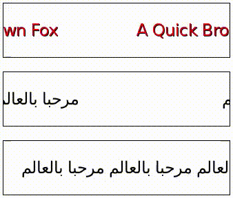
The TextLabel class is lightweight, non-editable, and does not respond to user input. Text labels support multiple languages and scripts including right-to-left scripts such as Arabic. For more information on how to display a text using a text label, see NUI hello world tutorial.
Figure: Text label positioned to top left

Create TextLabel
To create a text label, follow the steps below:
-
Create an instance of the
TextLabelclass and define the label text as a parameter. To make text visible, set theTextColorproperty toColor.White:routerosCopy<base:TextLabel x:Name="txt" Text="Hello World" TextColor="White"/>You can also create the
TextLabelclass instance separately and define the label text by setting itsTextproperty:groovyCopy<base:TextLabel x:Name="txt"/>C#Copytxt.Text = "Hello World";Caution
To display the label properly, the
Textproperty must be a UTF-8 string. AnyCR+LFnew line characters are replaced byLF. -
Define the label position on-screen with the
ParentOriginproperty of theTextLabelclass:routerosCopy<base:TextLabel x:Name="txt" ParentOrigin="TopLeft"/>
Set font of TextLabel
You can request a specific font using the FontFamily, the FontStyle, and the PointSize properties of the TextLabel class. The properties are described below:
-
FontFamilyis a string with the font family name, such asFreeSerif. -
FontStyleis a JSON-formatted string with the font style. The following list describes some possible keys and common values for them:-
The
widthkey defines the width occupied by each glyph. Some commonly used values includecondensed,semiCondensed,normal,semiExpanded, andexpanded. -
The
weightkey defines the thickness or darkness of the glyphs. Some commonly used values includethin,light,normal,regular,medium, andbold. -
The
slantkey defines whether to use italics. Some commonly used values includenormal,roman,italic, andoblique.Note
Usually
italicis a separate font, whileobliqueis generated by applying a slant to thenormalfont.
-
-
PointSizeis a typefloat. To calculate the point size from the height in pixels, use the following formula, wherevertical_dpiis the vertical resolution of a device in dots per inch:C#Copypoint_size = 72 * pixels / vertical_dpi;
The following example code specifies the font properties:
Figure: Text with specifed font properties

xml
Copy
<base:TextLabel x:Name="txt" Text="Hello world" TextColor="White" FontFamily="FreeSerif" PointSize="12">
<TextLabel.FontStyle>
<PropertyMap>
<KeyValue Key="width" Value="expanded" />
<KeyValue Key="weight" Value="bold" />
<KeyValue Key="slant" Value="italic" />
</PropertyMap>
</TextLabel.FontStyle>
</TextLabel>
If no font is specified, default styles are used, and a suitable font for displaying the text label is automatically selected from the platform. However, the automatically selected font may not render all the characters contained within the text label. For example, Latin fonts often do not provide Arabic glyphs.
Set font styles of TextLabel
Setting a font size programmatically is not ideal for applications that support multiple screen resolutions, and for platforms that support multiple logical font sizes. In addition, making systemwide changes to your font settings override the font sizes that have been programmatically set.
A more flexible approach is to prepare various JSON stylesheets and request a different style for each platform. To change the font style for standard text controls, create the theme.json file in the resources directory and use the following JSON syntax:
C#
Copy
{
"styles": {
"CustomLabel": {
"fontFamily": "FreeSerif",
"fontStyle": {
"width": "expanded",
"weight": "bold",
"slant": "italic"
},
"pointSize": 12,
"textColor": [ 1, 1, 1, 1 ]
}
}
}
StyleManager provides the ApplyTheme method, where path to stylesheet is passed. Since stylesheet is loaded, CustomLabel style can be used on the created label by using the SetStyleName method of TextLabel:
C#
Copy
Tizen.NUI.StyleManager.Get().ApplyTheme(DirectoryInfo.Resource + "/theme.json");
TextLabel label = new TextLabel("Hello World");
label.SetStyleName("CustomLabel");
Window.Instance.Add(label);
However, the same pointSize is unlikely to be suitable for all text controls in an application. To define custom styles for existing controls, set a style name for each case, and provide a style override in a JSON stylesheet.
You can provide further flexibility for the various screens by mapping the logical size to a physical size in the stylesheet.
Align text in TextLabel
To align the text in a text label, follow these steps:
-
To enable text wrapping, use the
MultiLineproperty of theTextLabelclass:routerosCopy<base:TextLabel x:Name="txt" Text="Hello world" MultiLine="True"/> -
To align the text horizontally to the beginning, center, or end of the available area, set the
HorizontalAlignmentproperty of theTextLabelclass with the corresponding value of the HorizontalAlignment enumeration:routerosCopy<base:TextLabel x:Name="txt" Text="Hello world" HorizontalAlignment="Begin"/> <base:TextLabel x:Name="txt" Text="Hello world" HorizontalAlignment="Center"/> <base:TextLabel x:Name="txt" Text="Hello world" HorizontalAlignment="End"/>The following table summarizes the available values of the
HorizontalAlignmentenumeration for both left-to-right (Latin) and right-to-left (Arabic) script. In addition, for the illustrated examples, it is assumed that the label size is greater than the minimum required size:You can scroll this table.Alignment Left-to-right script example Right-to-left script example Begin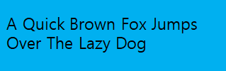

Center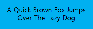

End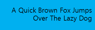

UTF-16 or UTF-32 character encoding
The text property can accept UTF-16 or UTF-32 character encoding:
                groovy

                    Copy


            <base:TextLabel x:Name="txt"/>
                C#

                    Copy


            txt.Text = "\U0001f601";      //UTF-32
txt.Text += "\ud83d\ude01";   //UTF-16
Use decorations for TextLabel
To use the text decoration, set the applicable property as described below:
-
To add a drop shadow to the text, set the
Shadowproperty:routerosCopy<base:TextLabel x:Name="txt" Text="Text with Color Shadow"/>C#CopyPropertyMap shadow = new PropertyMap(); shadow.Add("offset", new PropertyValue(new Vector2(2, 2))); shadow.Add("color", new PropertyValue(Color.Red)); txt.Shadow = shadow;Figure: Text with red shadow

Shadow parameters can also be set using a JSON string.
-
To underline the text label, set the
Underlineproperty:xmlCopy<base:TextLabel x:Name="txt" Text="Text with Underline" TextColor="White"> <base:TextLabel.Underline> <PropertyMap> <KeyValue Key="enable" Value="True"/> </PropertyMap> <base:TextLabel.Underline> </base:TextLabel>C#CopyPropertyMap underline = new PropertyMap(); underline.Add("enable", new PropertyValue("True")); txt.Underline = underline;By default, the underline height is based on the font metrics and the minimum height is one pixel. The underline color is based on the text color. For example, the following text figures are in one pixel height and the color is the same as the text color:
Figure: Text with underline

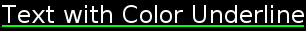
You can set the underline color and height using a property map:
xmlCopy<base:TextLabel x:Name="txt" Text="Text with Color Underline" TextColor="White"> <base:TextLabel.Underline> <PropertyMap> <KeyValue Key="enable" Value="True"/> <KeyValue Key="color" Value="Green"/> <KeyValue Key="height" Value="2.0"/> </PropertyMap> <base:TextLabel.Underline> </base:TextLabel>Figure: Text with colored underline
-
To enable text scrolling, set the
EnableAutoScrollproperty toTrue:routerosCopy<base:TextLabel x:Name="txt" EnableAutoScroll="True">After scrolling is enabled, scrolling continues until the loop count is reached or
EnableAutoScrollis set toFalse. WhenEnableAutoScrollis set toFalse, the text completes its current scrolling loop before it stops scrolling.Figure: Auto-scrolling text
Auto-scrolling enables text to scroll within the text table. You can use it to show the full content if the text exceeds the boundary of the control. You can also scroll text that is smaller than the control. To ensure that the same part of the text is not visible in more than one place at the same time, you can configure the gap between repetitions. The left-to-right text always scrolls left and the right-to-left text always scrolls right.
You can set the scroll speed, gap, and loop count in the stylesheet or using the following properties:
AutoScrollSpeedproperty defines the scrolling speed in pixels per second.AutoScrollLoopCountproperty specifies the number of times the text completes a full scroll cycle. For example, if this property is set to3, the text scrolls across the control three times and then stops. If this property is set to0, the text scroll continues untilEnableAutoScrollis set toFalse.- If
EnableAutoScrollis set toFalse, the text stops to scroll and maintains the original loop count value for the next start.
- If
AutoScrollGapproperty specifies the amount of whitespace in pixels. The whitespace gets displayed before the scrolling text appears again. This gap automatically increases, if the given value is not large enough to prevent the same part of the text from appearing twice at the same time.
routerosCopy<base:TextLabel x:Name="txt" Text="Hello World" EnableAutoScroll="True" AutoScrollSpeed="100" AutoScrollLoopCount="0" AutoScrollGap="250" TextColor="White"/>Auto-scrolling does not work with multi-line text; it is shown with the
Beginalignment instead.
Use markup to style TextLabel
You can use markup elements to change the style of the text. Since the text controls do not process markup elements by default, you must first set the EnableMarkup property of the TextLabel class to True:
                routeros

                    Copy


             <base:TextLabel x:Name="txt" EnableMarkup="True"/>
NoteThe markup processor does not check for markup validity, and styles are rendered in priority order. Incorrect or incompatible elements can cause the text to be rendered incorrectly.
The following markup elements are currently supported:
-
<color>Sets the color for the characters inside the element. Use the
valueattribute to define the color. The supported attribute values arered,green,blue,yellow,magenta,cyan,white,black, andtransparent. Web colors and colors represented in 32-bit hexadecimal0xAARRGGBBformat are also supported.The following examples show text in red color:
routerosCopy<base:TextLabel x:Name="txt" EnableMarkup="True" Text="<color value='red'>Red Text</color>"/>routerosCopy<base:TextLabel x:Name="txt" EnableMarkup="True" Text="<color value='0xFFFF0000'>Red Text</color>"/> -
<font>Sets the font values for the characters inside the element.
The following attributes are supported:
family: Font namesize: Font size in pointsweight: Font weightwidth: Font widthslant: Font slant
For more information on the attribute values, see select font.
The following example sets the font family and weight:
routerosCopy<base:TextLabel x:Name="txt" EnableMarkup="True" Text="<font family='SamsungSans' weight='bold'>Hello world</font>"/> -
<b>Sets Bold decoration for the characters inside the element.
The following example shows how to apply it:
routerosCopy<base:TextLabel x:Name="txt" EnableMarkup="True" Text="<b>Hello world</b>"/> -
<i>Sets Italic decoration for the characters inside the element.
The following example shows how to apply it:
routerosCopy<base:TextLabel x:Name="txt" EnableMarkup="True" Text="<i>Hello world</i>"/> -
<background>Sets the background color for the characters inside the element.
The following example shows how to apply it:
routerosCopy<base:TextLabel x:Name="txt" EnableMarkup="True" Text="<background color='yellow'>Hello world</background>"/> -
<u>Sets the underlined values for the characters inside the element.
The following attributes are supported:
color: The color of underline.height: The height of underline.type: The type of underline. The supported attribute values aresolid,dashedanddouble.dash-gap: The gap in pixels between the dashes of the dashed underline. Only valid when “DASHED” underline type is used.dash-width: The width in pixels of the dashes of the dashed underline. Only valid when “DASHED” underline type is used.
The following example shows how to apply it:
nixCopy<base:TextLabel x:Name="txt" EnableMarkup="True" Text="<u color='green' height='2.0f' type='dashed' dash-gap='2.0f' dash-width='3.0f'>Hello world</u>"/> -
<s>Sets the strikethrough values for the characters inside the element.
The following attributes are supported:
color: The color of strikethrough.height: The height of strikethrough.
The following example shows how to apply it:
routerosCopy<base:TextLabel x:Name="txt" EnableMarkup="True" Text="<s color='green' height='2.0f' >Hello world</s>"/> -
<char-spacing>Sets the character spacing values for the characters inside the element.
Use the
valueattribute to define the spaces between characters in Pixels.A positive value will make the characters far apart (expanded) and a negative value will bring them closer (condensed).
The following example shows how to apply it:
routerosCopy<base:TextLabel x:Name="txt" EnableMarkup="True" Text="<char-spacing value='5.0f'>Hello world</char-spacing>"/> -
<p>Use paragraph tag to set many styles on a paragraph’s level for the lines inside the element.
The following attributes are supported:
align: Use thealignattribute to define the horizontal alignment of a paragraph. The supported attribute values arebegin,centerandend.rel-line-height: The relative height of the line (a factor that will be multiplied by text height).
The following example shows how to apply alignment:
routerosCopy<base:TextLabel x:Name="txt" EnableMarkup="True" Text="text outside<p align='end'>Paragraph end</p>text outside<p align='center'>Paragraph center</p>text outside<p align='begin' >Paragraph begin</p>"/>The following example shows how to apply relative height of line:
routerosCopy<base:TextLabel x:Name="txt" EnableMarkup="True" Text="<p>line 1</p><p rel-line-height=0.5>line\n2</p>line 3<p rel-line-height=3>line\n4</p>line 5"/> -
<item>Defines an embedded item within the text.
The following attributes are supported:
url: The URL path of the image.width: The width of the item.height: The height of the item.color-blending: Use the color-blending attribute to define whether the color of the image is multiplied by the color of the text.
The following example shows how to apply it:
scilabCopy<base:TextLabel x:Name="txt" EnableMarkup="True" Text="<item 'width'=26 'height'=26 'url'='path/image.png' 'color-blending'='multiply'/>"/>Note
The URL of the image is optional. If there is no image the layout engine will use the width and height to create a space inside the text. This gap can be filled later.
Note
A color blending mode can be set. The default is NONE, the image will use its own color. If MULTIPLY is set, the color of the image will be multiplied by the color of the text.
-
<span>Use span tag to set many styles on character’s level for the characters inside the element.
The following attributes are supported:
font-family: The font family attribute.font-size: The font size attribute.font-width: The font width attribute.font-slant: The font slant attribute.text-color: The frontcolor value attribute.background-color: The undeline color attribute.u-color: The undeline height attribute.u-height: The font slant attribute.u-type: The undeline type attribute.u-dash-gap: The undeline dash-gap attribute.u-dash-width: The undeline dash-width attribute.s-color: The strikethrough color attribute.s-height: The strikethrough height attribute.char-space-value: The character-spacing value attribute.
The following example shows how to apply it:
nixCopy<base:TextLabel x:Name="txt" EnableMarkup="True" Text="<span font-size='20' font-family='DejaVu Sans' font-width='condensed' font-slant='italic' text-color='green' char-space-value='10.0f'>Hello world</span>"/>
Use markup to represent encoded characters
Markup text is not allowed to contain some characters unless they are representing tags or entities such as “<”, “>”, or “&”. To include these characters as a part of the text, you must use reserved entities such as <, >, or &. The following example uses reserved entities:
routeros
Copy
<base:TextLabel x:Name="txt" EnableMarkup="True" Text="<>"/>
Markup text can include character with UTF-32 representation as entities contain decimal or hexadecimal values.
To represent decimal value, you can use: &# + utf32_decimal_value + ;
To represent hexadecimal value, you can use: &#x + utf32_hexadecimal_value + ;
The following example uses UTF-32 entities:
routeros
Copy
<base:TextLabel x:Name="txt" EnableMarkup="True" Text="☺ ☺"/>
TextLabel properties
For text decorations, the TextLabel class provides several properties. All the properties are editable and none of them are animatable:
| Property | Type | Description |
|---|---|---|
Text |
String | Specifies the text to display in UTF-8 format. |
FontFamily |
String | Specifies the requested font family. |
FontStyle |
PropertyMap | Specifies the requested font style. |
MultiLine |
Boolean | Specifies whether or not to use the multi-line layout option. |
HorizontalAlignment |
HorizontalAlignment | Specifies the horizontal line alignment. |
VerticalAlignment |
VerticalAlignment | Specifies the vertical line alignment. |
TextColor |
Color | Specifies the color of the text. |
Shadow |
PropertyMap | Specifies the shadow of the text. |
Underline |
PropertyMap | Specifies underline of the text. |
EnableMarkup |
Boolean | Specifies whether to enable or disable the markup string to process text within the markup tags using DALi application.Note: By default, the markup string is disabled. |
EnableAutoScroll |
Boolean | Specifies whether to enable or disable the auto scrolling. |
AutoScrollSpeed |
Integer | Specifies the scrolling speed in pixels per second. |
AutoScrollLoopCount |
Integer | Specifies the number of complete loops to scroll, when scrolling is enabled. |
AutoScrollGap |
Float | Specifies the gap before scrolling wraps. |
LineSpacing |
Float | Specifies the default spacing between lines in points. |
Underline |
PropertyMap | Specifies the default underline parameters. |
Shadow |
PropertyMap | Specifies the default shadow parameters. |
Emboss |
String | Specifies the default emboss parameters. |
Outline |
PropertyMap | Specifies the default outline parameters. |
PixelSize |
Float | Specifies the size of font in pixels. |
Ellipsis |
Boolean | Specifies whether to enable or disable ellipsis, if required. |
AutoScrollLoopDelay |
Float | Specifies the auto-scroll loop delay. |
AutoScrollStopMode |
AutoScrollStopMode | Specifies the auto-scroll stop mode. |
TextField
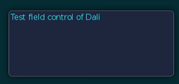
The TextField class provides a control that allows single line editable text field.
Figure: TextField
TextField events
The following table lists the basic signals provided by the TextField class:
| Input signal | Description |
|---|---|
TextChanged |
Emitted when the text changes. |
MaxLengthReached |
Emitted when the inserted text exceeds the maximum character limit. |
Create TextField
Before the text is entered, the TextField class displays a placeholder text. An alternative placeholder is displayed when TextField gets the keyboard focus. For example, the TextField that is used to enter a username initially displays the text Unknown Name and then the text Enter Name, when the cursor is visible.
The following example illustrates the creation of a TextField object:
                routeros

                    Copy


            <base:TextField x:Name="field" BackgroundColor="White"
    PlaceholderText="Unknown Name" PlaceholderTextFocused="Enter Name"/>
When the TextField is tapped, it automatically gets the keyboard focus. Key events correspond to entering the text. Additionally, the placeholder text is removed as soon as the text is entered. The text entered can be retrieved by using the TEXT property:
                C#

                    Copy


            string fieldTextString = field.Text;
Align text in TextField
The TextField class displays a single line of text that scrolls in either of the following case:
-
If there is not enough space for the text to get displayed.
-
If there is enough space, the text is aligned horizontally to the beginning, end, or center of the available area.
The following example illustrates text alignment:
                routeros

                    Copy


            <base:TextField x:Name="field" HorizontalAlignment="Begin"/>
Use input properties in TextField
To change the text settings for new input text, you can use the input properties of the TextField class, such as InputColor, InputPointSize, and so on.
To use these properties there are some specific conditions. For instance, you can use these properties either when the TextChanged event occurs or when the Clicked event of button occurs.
The following example illustrates how to use the InputColor property in a TextField:
                routeros

                    Copy


            <base:TextField x:Name="field" TextChanged="OnTextChanged"/>
                C#

                    Copy


            private void OnTextChanged(object sender, TextField.TextCHangedEventArgs e)
{
    // Do something in response to text change
    e.TextField.InputColor = Color.Yellow;
}
TextField properties
To change the look and feel of the text and text related elements, use the TextField properties.
Use decorations for TextField
For text decorations, the following TextField class properties are available. All properties are editable and none of them are animatable:
| Property | Type | Description |
|---|---|---|
Text |
String | Specifies the text to display in UTF-8 format. |
PlaceholderText |
String | Specifies the text to display when the TextField is empty and inactive. |
PlaceholderTextFocused |
String | Specifies the text to display when the TextField is empty with key-input focus. |
FontFamily |
String | Specifies the requested font family. |
FontStyle |
PropertyMap | Specifies the requested font style. |
PointSize |
Float | Specifies the size of font in points. |
MaxLength |
Integer | Specifies the maximum number of characters that can be inserted. |
ExceedPolicy |
Integer | Specifies how the text is truncated when it does not fit. |
HorizontalAlignment |
HorizontalAlignment | Specifies the horizontal line alignment. |
VerticalAlignment |
VerticalAlignment | Specifies the vertical line alignment. |
TextColor |
Color | Specifies the color of the text. |
PlaceholderTextColor |
Vector4 | Specifies the color of the placeholder text. |
PrimaryCursorColor |
Vector4 | Specifies the color that is applied to the primary cursor. |
SecondaryCursorColor |
Vector4 | Specifies the color that is applied to the secondary cursor. |
EnableCursorBlink |
Boolean | Specifies whether to enable or disable the cursor blink. |
CursorBlinkInterval |
Float | Specifies the time interval in seconds between the cursor on or off states. |
CursorBlinkDuration |
Float | Specifies the time duration in seconds after which the cursor stops blinking. |
CursorWidth |
Integer | Specifies the width of the cursor. |
GrabHandleImage |
String | Specifies the image to display for the grab handle. |
GrabHandlePressedImage |
String | Specifies the image to display when the grab handle is pressed. |
ScrollThreshold |
Float | Specifies whether the horizontal scrolling will occur, if the cursor is closer to the control border. |
ScrollSpeed |
Float | Specifies the scroll speed in pixels per second. |
SelectionHandleImageLeft |
PropertyMap | Specifies the display image used for the left selection handle. |
SelectionHandleImageRight |
PropertyMap | Specifies the display image used for the right selection handle. |
SelectionHandlePressedImageLeft |
PropertyMap | Specifies the display image used when the left handle is pressed. |
SelectionHandlePressedImageRight |
PropertyMap | Specifies the display image used when the right handle is pressed. |
SelectionHandleMarkerImageLeft |
PropertyMap | Specifies the display image used for left selection handle marker. |
SelectionHandleMarkerImageRight |
PropertyMap | Specifies the display image used for right selection handle marker. |
SelectionHighlightColor |
Vector4 | Specifies the selected highlight color. |
DecorationBoundingBox |
Rectangle | Specifies the position of decoration such as handles and so on within the on-screen area. |
InputMethodSettings |
PropertyMap | Specifies the settings related to the system input method, key, and value. |
InputColor |
Vector4 | Specifies the color of the new input text. |
EnableMarkup |
Boolean | Specifies whether to enable or disable the markup string to process text within the markup tags using DALi application. Note: By default, the markup string is disabled. |
InputFontFamily |
String | Specifies the font family of the new input text. |
InputFontStyle |
PropertyMap | Specifies the font style of the new input text. |
InputPointSize |
Float | Specifies the font size of the new input text in points. |
Underline |
PropertyMap | Specifies the default underline parameters. |
InputUnderline |
String | Specifies the underline parameters of the new input text. |
Shadow |
PropertyMap | Specifies the default shadow parameters. |
InputShadow |
String | Specifies the shadow parameters of the new input text. |
Emboss |
String | Specifies the default emboss parameters. |
InputEmboss |
String | Specifies the emboss parameters of the new input text. |
Outline |
PropertyMap | Specifies the default outline parameters. |
InputOutline |
String | Specifies the outline parameters of the new input text. |
HiddenInputSettings |
PropertyMap | Specifies hiding the input characters and showing default character for the password or pin entry. |
PixelSize |
Float | Specifies the size of font in pixels. |
EnableSelection |
Boolean | Specifies whether to enable or disable text selection. |
Placeholder |
PropertyMap | Specifies the attributes of the Placeholder property. The attributes of this property are text, color, font family, font style, point size, and pixel size. |
Ellipsis |
Boolean | Specifies whether to enable or disable ellipsis, if required. |
TranslatablePlaceholderText |
String | Specifies the TranslatablePlaceholderText property that sets the SID value. |
TranslatableText |
String | Specifies the TranslatableText property that sets the SID value. |
TextEditor
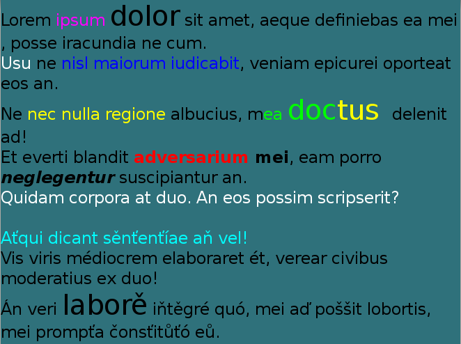
The TextEditor class provides a control that allows multi-line text editing. It is similar to the TextField control, where different formatting can be applied to different parts of the text. For example, you can change the font color, font style, point size, and font family.
The TextEditor also supports markup, and text can be scrolled vertically within it.
Figure: TextEditor
TextEditor events
The following table lists the basic signals provided by the TextEditor class:
| Input signal | Description |
|---|---|
TextChanged |
Emitted when the text changes. |
ScrollStateChanged |
Emitted when TextEditor scrolling is started or finished. |
Create TextEditor
The following example shows how to create a TextEditor object:
                routeros

                    Copy


            <base:TextField x:Name="editor" Position2D="10,10" Size2D="400,400"
    BackgroundColor="Red" PointSize="10" TextColor="White"
    Text="This is a multiline text.\n I can write several lines.\n"/>
TextEditor properties
You can modify the TextEditor appearance and behavior using its properties.
The following table lists the available TextEditor properties:
| Property | Type | Description |
|---|---|---|
Text |
String | Specifies the text to display in UTF-8 format. |
TextColor |
Vector4 | Specifies the color of the text. |
FontFamily |
String | Specifies the requested font family. |
FontStyle |
PropertyMap | Specifies the requested font style. |
PointSize |
Float | Specifies the size of font in points. |
HorizontalAlignment |
HorizontalAlignment | Specifies the horizontal line alignment. |
ScrollThreshold |
Float | Specifies whether the horizontal scrolling will occur, if the cursor is closer to the control border. |
ScrollSpeed |
Float | Specifies the scroll speed in pixels per second. |
PrimaryCursorColor |
Vector4 | Specifies the color that is applied to the primary cursor. |
SecondaryCursorColor |
Vector4 | Specifies the color that is applied to the secondary cursor. |
EnableCursorBlink |
Boolean | Specifies whether to enable or disable the cursor blink. |
CursorBlinkInterval |
Float | Specifies the time interval in seconds between cursor on or off states. |
CursorBlinkDuration |
Float | Specifies the time duration in seconds after which the cursor stops blinking. |
CursorWidth |
Integer | Specifies the width of the cursor. |
GrabHandleImage |
String | Specifies the display image used for the grab handle. |
GrabHandlePressedImage |
String | Specifies the display image used when the grab handle is pressed. |
SelectionHandleImageLeft |
PropertyMap | Specifies the display image used for the left selection handle. |
SelectionHandleImageRight |
PropertyMap | Specifies the display image used for the right selection handle. |
SelectionHandlePressedImageLeft |
PropertyMap | Specifies the display image used when the left handle is pressed. |
SelectionHandlePressedImageRight |
PropertyMap | Specifies the display image used when the right handle is pressed. |
SelectionHandleMarkerImageLeft |
PropertyMap | Specifies the display image used for the left selection handle marker. |
SelectionHandleMarkerImageRight |
PropertyMap | Specifies the display image used for the right selection handle marker. |
SelectionHighlightColor |
Vector4 | Specifies the selected highlight color. |
DecorationBoundingBox |
Rectangle | Specifies the position of decoration such as handles and so on within the on-screen area. |
EnableMarkup |
Boolean | Specifies whether to enable or disable the markup string to process text within the markup tags using DALi application. Note: By default, the markup string is disabled. |
InputColor |
Vector4 | Specifies the color of the new input text. |
InputFontFamily |
String | Specifies the font family of the new input text. |
InputFontStyle |
PropertyMap | Specifies the font style of the new input text. |
InputPointSize |
Float | Specifies the font size of the new input text in points. |
LineSpacing |
Float | Specifies the default extra space between lines in points. |
InputLineSpacing |
Float | Specifies the extra space between lines in points. |
Underline |
PropertyMap | Specifies the default underline parameters. |
InputUnderline |
String | Specifies the underline parameters of the new input text. |
Shadow |
PropertyMap | Specifies the default shadow parameters. |
InputShadow |
String | Specifies the shadow parameters of the new input text. |
Emboss |
String | Specifies the default emboss parameters. |
InputEmboss |
String | Specifies the emboss parameters of the new input text. |
Outline |
PropertyMap | Specifies the default outline parameters. |
InputOutline |
String | Specifies the outline parameters of the new input text. |
SmoothScroll |
Boolean | Specifies whether to enable or disable the smooth scroll animation. |
SmoothScrollDuration |
Float | Specifies the duration of smooth scroll animation. |
EnableScrollBar |
Boolean | Specifies whether to enable or disable the scroll bar. |
ScrollBarShowDuration |
Float | Specifies the duration of the scroll bar to show. |
ScrollBarFadeDuration |
Float | Specifies the duration of the scroll bar to fade out. |
PixelSize |
Float | Specifies the size of font in pixels. |
LineCount |
Integer | Specifies the line count of text. |
EnableSelection |
Boolean | Specifies whether to enable or disable text selection. |
Placeholder |
PropertyMap | Specifies the attributes of the Placeholder property. The attributes of this property are text, color, font family, font style, point size, and pixel size. |
LineWrapMode |
LineWrapMode | Specifies the line wrap mode when text lines are greater than the layout width. |
TranslatablePlaceholderText |
String | Specifies the TranslatablePlaceholderText property that sets the SID value. |
TranslatableText |
String | Specifies the TranslatableText property that sets the SID value. |
Use clipboard and SelectText APIs
These are a set of APIs that provide developers with the functionality of copy, cut, paste & select text. A sample code on how to benefit from them is shown below.
Developers can define an action for users by writing the code below, i.e. when the user clicks a button.
The following code is an example on how to copy and cut the text from source to destination text fields:
                C#

                    Copy


            // Create two TextField
var textFieldSrc = new TextField(); // Source TextField
textFieldSrc.Text = "Welcome! This is a great world!";

var textFieldDest = new TextField(); // Destination TextField
textFieldDest.Text = "";
SelectText is an API that takes two parameters, the start index and the end index.
This API selects text based on the start and end index declared by the user.
NoteThe selected text includes the start index, but it does not include the end index.
The following code shows how to use SelectText on TextField:
                C#

                    Copy


            // Step 01: Select text from source text field
textFieldSrc.SelectText (9,16); //"This is" is the selected text

 // At this point:
 // The TEXT in textFieldSrc is "Welcome! This is a great world!"
 // The TEXT in textFieldDest is ""
TextUtils.CopyToClipboard is an API that takes one parameter, either TextField or TextEditor.
Using this API, you can copy the text into the clipboard that was selected based on the declared indexes in the previous code.
The following code shows how to use CopyToClipboard with TextField:
                C#

                    Copy


            // Step 02: Copy text from source text field
 string copiedText = TextUtils.CopyToClipboard(textFieldSrc);

 // At this point:
 // The TEXT in textFieldSrc is "Welcome! This is a great world!"
 // The TEXT in textFieldDest is ""
TextUtils.PasteTo is an API that takes one parameter, either TextField or TextEditor.
Using this API, you can paste the most recently copied/cut text item from the clipboard into the text control.
NoteThe pasted text will be inserted in the current cursor position and if the text control has no focus, the text will be appended to the last cursor position and the text control will gain focus. If some text inside the text control is selected, it will be replaced by the pasted text.
The following code shows how to use PasteTo with TextField:
                C#

                    Copy


            // Step 03: Paste text into destination text field
 TextUtils.PasteTo(textFieldDest);

 // At this point:
 // The TEXT in textFieldSrc is "Welcome! This is a great world!"
 // The TEXT in textFieldDest is "This is"
TextUtils.CutToClipboard is an API that takes one parameter, either TextField or TextEditor.
This API helps you to cut the previously selected text from the text control into the clipboard. It returns the text that was cut based on the declared indexes.
The following codes show how to use CutToClipboard with TextField:
                C#

                    Copy


            // Step 04: Select text from source text field
textFieldSrc.SelectText (0,8); // "Welcome!" is the selected text

 // At this point:
 // The TEXT in textFieldSrc is "Welcome! This is a great world!"
 // The TEXT in textFieldDest is "This is"
                C#

                    Copy


            // Step 05: Cut text from source text field
 string cutText = TextUtils.CutToClipboard(textFieldSrc);

 // At this point:
 // The TEXT in textFieldSrc is " This is a great world!"
 // The TEXT in textFieldDest is "This is"
                C#

                    Copy


            // Step 06: Paste text into destination text field
 TextUtils.PasteTo(textFieldDest);

 // At this point:
 // The TEXT in textFieldSrc is " This is a great world!"
 // The TEXT in textFieldDest is "This isWelcome!"
Related information
- Dependencies
- Tizen 6.5 and Higher