CheckBox
Checkbox is a UI component connected with the click events. The base class for a CheckBox class is a Tizen.NUI.Components.Button. The Button properties can be used to specify the checkbox. In opposite to a button, that can contain both an icon and a text, a checkbox can only contain an icon. The default checkbox created with NUI is as follows:


Create with property
To create checkbox using property, follow these steps:
-
Create an instance of a
CheckBoxclass using the default constructor:groovyCopy<comp:CheckBox x:Name="_checkBox"/> -
Set the checkbox properties:
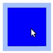
routerosCopy<comp:CheckBox x:Name="_checkBox" Text="False" WidthSpecification="200" HeightSpecification="200" IsSelected="False" />C#Copy// Path to the directory with images string _URL = Tizen.Applications.Application.Current.DirectoryInfo.Resource + "images/"; // Set the icon images for different checkbox states StringSelector _iconURL = new StringSelector() { Normal = _URL + "blue.png", Selected = _URL + "blue_checked.png", Pressed = _URL + "red.png", Disabled = _URL + "green.png", DisabledSelected = _URL + "yellow.png" }; _checkBox.IconURLSelector = _iconURL; _checkBox.Icon.Opacity = 1.0f; _checkBox.Icon.Size = new Size2D(160,160); _checkBox.BackgroundColor = new Color(0.57f, 0.7f, 1.0f, 0.8f);To set the absolute path of the images that are used, the
Tizen.Applications.Application.Current.DirectoryInfo.Resourcepath is used. For more information, see Class Application and Class DirectoryInfo.
The following output is generated when the checkbox is created using properties:
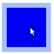
A checkbox selection can be disabled by adding the following property:
                ini

                    Copy


            IsSelectable="False"
The result is as follows:
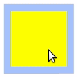
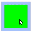
To disable the checkbox completely, use the following property:
                protobuf

                    Copy


            // CheckBox is disabled
IsEnabled="False"
This sets the checkbox state to Disabled or DisabledSelected, depending on the IsSelected value. Adding the preceding option changes the checkbox appearance as follows:
 |
 |
|---|---|
IsEnabled set to FalseIsSelected set to True |
IsEnabled set to FalseIsSelected set to False |
Respond to clicked event
When you click a checkbox, the CheckBox instance receives a clicked event. You can declare the clicked event handler as follows:
                routeros

                    Copy


            <comp:CheckBox x:Name="_checkBox"
 Text="False"
 WidthSpecification="200"
 HeightSpecification="200"
 IsSelected="False"
 Clicked="OnClicked"
 />
where OnClicked is a function defined by the user:
                cs

                    Copy


            private void OnClicked(object sender, EventArgs e)
{
   // Do something in response to checkbox click
}
Related information
- Dependencies
- Tizen 6.5 and Higher