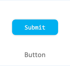
Button
Button is a common component and describes what action occurs when you select it.
A Button can either contain a text or an icon, and can be created using property.
Add namespace
To implement Button, include Tizen.NUI.Components and namespace in your application:
                avrasm

                    Copy


            xmlns:comp="clr-namespace:Tizen.NUI.Components;assembly=Tizen.NUI.Components"
Create with property
To create a Button using property, follow these steps:
-
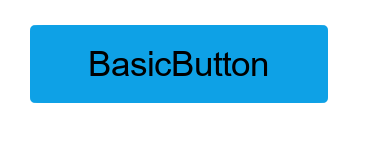
Create Button using the default constructor with properties:
routerosCopy<comp:Button x:Name="btn" Text="BasicButton" WidthSpecification="300" HeightSpecification="80" IsSelectable="True" PointSize = "20"/>C#Copybtn.TextColorSelector = new ColorSelector { Normal = new Color(0, 0, 0, 1), Pressed = new Color(0, 0, 0, 0.7f), Selected = new Color(0.058f, 0.631f, 0.92f, 1), Disabled = new Color(0, 0, 0, 0.4f) }; -
The following output is generated when the Button is created using property:
Respond to clicked event
When you click a Button, the Button instance receives a clicked event. You can declare the clicked event handler as follows:
C#Copybtn.Clicked += OnClicked;
                C#

                    Copy


            private void OnClicked(object sender, ClickedEventArgs e)
{
    // Do something in response to button click
}
Respond to state changed event
Button has eight different states as Normal, Focused, Disabled, Selected, Pressed, DisabledFocused, SelectedFocused, and DisabledSelected.
When you change the Button state to focus or disable, the Button instance receives a state changed event:
C#Copybtn.ControlStateChangedEvent += OnStateChange;
                C#

                    Copy


            private void OnStateChange(object sender, Control.ControlStateChangedEventArgs e)
{
    // Do something in response to state change
}
Related information
-
Dependencies
- Tizen 6.5 and Higher
-
API References