Check
The check UI component accepts user input by the method of toggling. It is similar to the radio component, except that it does not work as a group. For more information, see the Check API.
This feature is optional.
Basic Usage
To use a check component in your application:
-
Add a check component with the
elm_check_add()function:Evas_Object *check; check = elm_check_add(parent); -
Set a style and fill the check component with a text or an image according to the style:
-
Set a style to the check component with the
elm_object_style_set()function. If you use the default style, you can skip this step.elm_object_style_set(check, "favorite"); -
Set a label to the check component with the
elm_object_text_set()orelm_object_part_text_set()function:/* Default style */ elm_object_text_set(check, "Check"); /* on&off style */ elm_object_part_text_set(check, "on", "True"); elm_object_part_text_set(check, "off", "False"); -
Set an icon to the button with the
elm_object_part_content_set()function and pass theiconpart name as a parameter.Evas_Object *icon; elm_object_part_content_set(check, "icon", icon);
-
-
Register the callback functions.
The following example shows how to define and register a callback for the
changedsignal:evas_object_smart_callback_add(check, "changed", changed_cb, data); void changed_cb(void *data, Evas_Object *obj, void *event_info) { dlog_print(DLOG_INFO, LOG_TAG, "The value has changed\n"); }
The following example shows a simple use case of the check component.
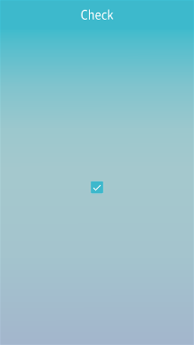
Example: Check use case
Evas_Object *win;
Evas_Object *conf;
Evas_Object *nf;
Evas_Object *box;
Evas_Object *check;

/* Starting right after the basic EFL UI layout code */
/* win - conformant - naviframe */

/* Add a box to pack a check */
box = elm_box_add(nf);
elm_object_content_set(nf, box);
evas_object_show(box);
elm_naviframe_item_push(nf, "Check", NULL, NULL, box, NULL);

check = elm_check_add(box);
evas_object_show(check);
elm_box_pack_end(box, check);
Styles
The following table lists the available component styles.
Table: Check styles
| Style | Sample | Text part | Swallow part |
|---|---|---|---|
default |
 |
default |
icon |
favorite |
 |
N/A | N/A |
on&off |
 |
onoff |
N/A |
Callbacks
You can register callback functions connected to the following signals for a check object.
Table: Check callback signals
| Signal | Description | event_info |
|---|---|---|
changed |
The check component value changes. | NULL |
Note
The signal list in the API reference can be more extensive, but only the above signals are actually supported in Tizen.
Note
Except as noted, this content is licensed under LGPLv2.1+.
Related Information
- Dependencies
- Since Tizen 2.4