Flex Layout
FlexLayout is a flexible box layout that provides a more efficient way to layout, align, and distribute space among items in the container, even when their size is unknown or dynamic.
A layout provides features such as wrapping that automatically positions items that do not fit on an axis to another row or column.
FlexLayout defines four properties that affect the size, orientation, and alignment of child views.
The properties are defined as follows:
| Property | Type | Description |
|---|---|---|
Direction |
FlexDirection | Orientation of the flex items are laid out in columns or rows. |
Justification |
FlexJustification | Alignment of items along the flex axis when free space is available. |
Alignment |
AlignmentType | Alignment of items along the cross axis when free space is available. |
WrapType |
FlexWrapType | Enable wrapping of items. |
Natural size of items are used, which can be different for each item. Additionally, setting the size of an item has no effect.
Justification applies to the flex Direction axis while Alignment applies to the cross axis. If you change the flex Direction axis, then the base of the Justification axis will also change.
FlexDirection
Direction property specifies the main axis direction along which the flex items are placed.
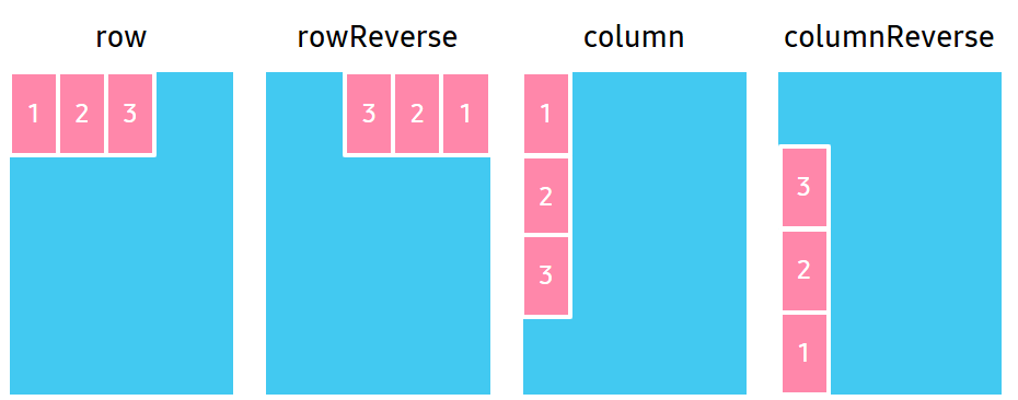
| Property value | Description |
|---|---|
Row |
Place items horizontally in a row. |
RowReverse |
Place items horizontally in a row, but in reverse order. |
Column |
Place items vertically in a column. |
ColumnReverse |
Place items vertically in a column, but in reverse order. |
The following code shows how to set the Direction property using FlexDirection:
                C#

                    Copy


            View layoutView = new View();
var flexLayout = new FlexLayout();
flexLayout.Direction = FlexLayout.FlexDirection.Column;
layoutView.Layout = flexLayout;
                xml

                    Copy


            <View>
    <View.Layout>
        <FlexLayout Direction="Column" />
    </View.Layout>
</View>
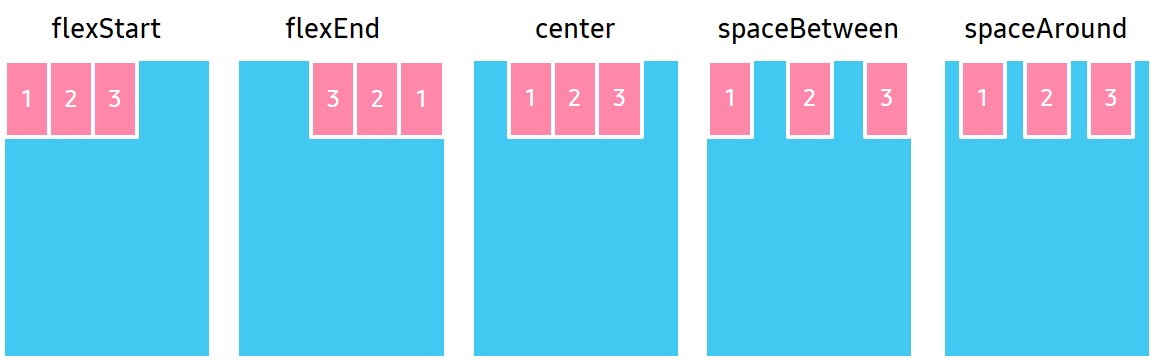
FlexJustification
Justification property specifies the alignment for flex items, when they do not use all available space on the main axis.
| Property value | Description |
|---|---|
FlexStart |
Position items at the beginning of the container. |
FlexEnd |
Position items at the end of the container. |
Center |
Position items at the center of the container. |
SpaceBetween |
Position items with equal spacing between them. |
SpaceAround |
Position items with equal spacing before, between, and after them. |
The following code shows how to set the Justification property using FlexJustification:
                C#

                    Copy


            View layoutView = new View();
var flexLayout = new FlexLayout();
flexLayout.Justification = FlexLayout.FlexJustification.SpaceBetween;
layoutView.Layout = flexLayout;
                xml

                    Copy


            <View>
    <View.Layout>
        <FlexLayout Justification="SpaceBetween"/>
    </View.Layout>
</View>
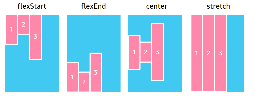
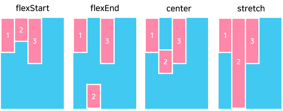
AlignmentType
Alignment property specifies the alignment for flex items when they do not use all the available space on the cross axis.
| Property value | Description |
|---|---|
Auto |
Inherit the same alignment from the parent. |
FlexStart |
Align items to the beginning of the container. |
FlexEnd |
Align items to the end of the container. |
Center |
Align items to the center of the container. |
Stretch |
Stretch items to fit the container. |
The following code shows how to set the Alignment property using AlignmentType:
                C#

                    Copy


            View layoutView = new View();
var flexLayout = new FlexLayout();
flexLayout.Alignment = FlexLayout.AlignmentType.Center;
layoutView.Layout = flexLayout;
                xml

                    Copy


            <View>
    <View.Layout>
        <FlexLayout Alignment="Center"/>
    </View.Layout>
</View>
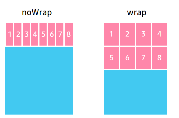
FlexWrapType
WrapType property specifies whether the flex items must wrap if there is not enough room for them on one flex line.
| Property value | Description |
|---|---|
NoWrap |
Reduce item sizes to fit them in a single line along the main axis. |
Wrap |
Show items over multiple lines, if needed. |
The following code shows how to set the WrapType property using FlexWrapType:
                C#

                    Copy


            View layoutView = new View();
var flexLayout = new FlexLayout();
flexLayout.WrapType = FlexLayout.FlexWrapType.NoWrap;
layoutView.Layout = flexLayout;
                xml

                    Copy


            <View>
    <View.Layout>
        <FlexLayout WrapType="NoWrap"/>
    </View.Layout>
</View>
Attached properties
The following properties affect the specified child view areas:
FlexAlignmentSelfFlexPositionTypeFlexAspectRatioFlexBasisFlexShrinkFlexGrow
NoteThe
FlexAlignmentSelf,FlexPositionType,FlexAspectRatio,FlexBasis,FlexShrink, andFlexGrowproperties are added in Tizen 6.0.
Table: Properties and descriptions
| Property | Type | Description |
|---|---|---|
FlexAlignmentSelf |
AlignmentType | The alignment of the item along the cross axis when free space is available. |
FlexPositionType |
PositionType | The position type defines how the item is positioned within its parent. |
FlexAspectRatio |
float | The ratio between the width and the height of an item. |
FlexBasis |
float | Specifies item’s default size before FlexGrow and FlexShrink calculations are performed. |
FlexShrink |
float | Specifies how to shrink children along the main axis in case the total size of the children overflows the size of the flex layout on the main axis. |
FlexGrow |
float | Specifies how the space within a flex layout is distributed among its children along the main axis. |
FlexAlignmentSelf property
The FlexAlignmentSelf property has the same options and effect as the Alignment property, but instead of affecting the children within a flex layout, this property is applied to a single child to change its alignment within its parent. The FlexAlignmentSelf property overrides any option set by the parent with the Alignment property.
The following figure shows how to use the FlexAlignmentSelf property:
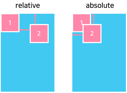
FlexPositionType property
The FlexPositionType property of an element defines how it is positioned within its parent. By default, an element is positioned relatively. This means an element is positioned according to the normal flow of the layout, and its movement depends on the margin.
The offset does not affect the position of any sibling or parent elements. When positioned absolutely, an element doesn’t take part in the normal layout flow. It is instead laid out independently of its siblings.
The following figure shows how to use the FlexPositionType property:
FlexAspectRatio property
The FlexAspectRatio property is defined as the ratio between the width and the height of a node, for example, if a node has an aspect ratio of 2, then its width is twice the size of its height.
The FlexAspectRatio property has the following characteristics:
- Accepts any floating-point value greater than
0. The default value is undefined. - Has a higher priority than
FlexGrowproperty. - If aspect ratio, width, and height are set, then the cross axis dimension is overridden.
FlexBasis property
The FlexBasis property is an axis-independent way of providing the default size of an item along the main axis:
- If
FlexDirectionof flex layout isRow, theFlexBasisproperty of a child is similar to width of the child. - If
FlexDirectionof flex layout isColumn, theFlexBasisproperty of a child is similar to height of the child.
The FlexBasis property specifies the default size of the child, but the child-size can also be changed with the FlexGrow and the FlexShrink property.
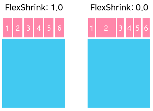
FlexShrink property
The FlexShrink describes how to shrink children along the main axis in case the total size of the children overflows the size of the flex layout on the main axis. The FlexShrink property accepts any floating-point value greater or equal to 0. The default value is 1.
The following figure shows how to use the FlexShrink property:
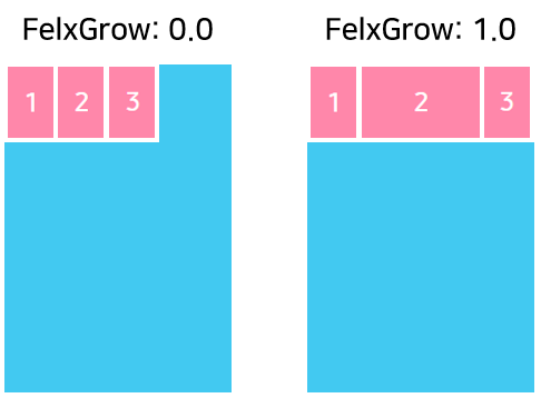
FlexGrow property
The FlexGrow property specifies how the space within a flex layout is distributed among its children along the main axis. After laying out its children, a flex layout distributes any remaining space according to the FlexGrow property values specified by its children. The FlexGrow property accepts any floating-point value greater or equal to 0. The default value is 0.
The following figure shows how to use the FlexGrow property:
Related information
-
Dependencies
- Tizen 5.5 and Higher
-
API References